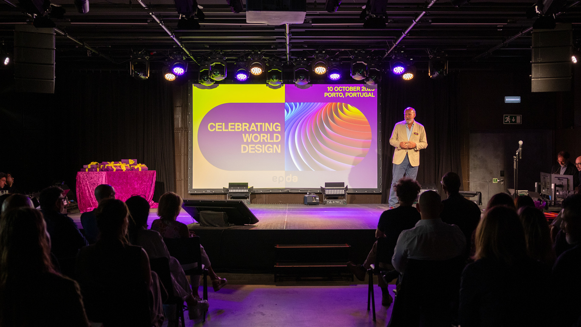
Good day, Ireland! In mid-May, our Managing Directors Nadine and Max and our Creative Director Paul traveled to the epda congress in the Irish metropolis of Dublin. Under the motto “How to navigate in times of change”, the program included exciting expert presentations and lots of networking with design colleagues from all over Europe. We would like to share some of the exciting topics with you here.
Rethinking diversity.
Diversity and inclusion have long since ceased to be trendy topics; rather, these terms reflect the desire to reflect reality, including that of our creative sector. With the figures in her presentation, Boma Krijgsman (Talent, Diversion and Inclusive Manager at JDO in the UK) gave us food for thought in this regard: Only 13% of all design jobs worldwide are held by people from a black, Asian or other minority background, while 88% of all design managers are white. In addition to ethical considerations, there are also economic benefits to better integrating minorities into the design landscape. To name just one example of many: Against the backdrop of our increasingly ageing society, we as designers should be thinking and designing packaging in a much more age-appropriate way.
Generation Shift.
As a panel speaker, our Managing Director Nadine shared her experiences on the topic of “Generation Shift in Agencies” on stage. Whether as a company or agency, it is always a challenge to follow in big footsteps, to maintain a successful company as the next generation, to adapt it to the changing times and to lead it into the future with strength. One of the topics discussed during the panel was the optimal time frame in which a generational change should take place. According to Nadine, there is no general, blanket answer to this. “In my case, it was many years in which my father took me by the hand and never missed an opportunity to share his knowledge and experience with me.” When changing within a family-run company, two things are particularly important to her: “Firstly, respect for the other person's view of things. And secondly, a lot of patience.”
New Technologies.
Few topics are currently more hotly debated than artificial intelligence. The groundbreaking changes will significantly alter the working world of tomorrow and the creative industry in particular is already feeling the effects of the new tools such as Chat-GPT, Midjourney and Adobe's new tools and a new era of the creative process. With his impressive practical examples, Viktor Konovalow (Creative Director at Dragon Rouge, Warsaw) convincingly demonstrated how we as designers can benefit from the new possibilities and that we will by no means become completely obsolete tomorrow. Because what counts in the end is always the initial idea.
While AI is significantly changing the way we work, our consumer behavior is also facing a veritable revolution. The blockchain and the metaverse, as well as the purchasable digital content integrated into them, already represent a huge market. And brands such as Gucci, Starbucks and KIA have already set up entire marketplaces to benefit from this potential tomorrow. Matthias Lechner (founder and Creative Director of NFBrands.X, Austria) provided us with valuable insights on this topic and showed us how we will meet for digital meetings in the metaverse or go shopping there in the future. The highlight here is that even the exclusively digital closet via NFTs has real value. Already today, a million euros a day are spent on skins (clothes for avatars) in the computer game Fortnite.
Conclusion.
We are delighted that we are once again able to meet up regularly with our colleagues from Europe for events despite further crises in the world. And not only because of the highly topical issues and insights, but above all because of the informal atmosphere. More than ever, this shows how important it is to regularly exchange ideas within the industry in order to be optimally equipped as an agency for this exciting and world-changing decade.
You can find more impressions of our epda trip on Instagram. Check out this Reel!
What is the epda?
The European Brand & Packaging Design Association (epda) offers its members a platform for networking and exchanging knowledge on trends and packaging design at European level.
In the current issue 03/2023 of creativ verpacken, our Managing Director Nadine Hartmann reports on how echd has developed a new brand concept for the traditional German family business TITANIA® Fabrik GmbH, one of the largest European manufacturers of personal care products, and has thus been able to significantly strengthen the visibility of the brand at home and abroad.
After the relaunch is always before the relaunch. The ravages of time, new design trends, changing consumer behavior, moving competition, but also a reorientation of one's own company always require a change in one's own brand and packaging appearance. Market leaders maintain their position as the (impulse-giving) top dog, young brands like to disrupt at the POS in order to stand out, and of course there are also the me-too products that are based on the success of established brands.
But what is the right approach here? When does a gentle evolution with a focus on recognition make sense for a relaunch and when is a revolution with a completely new look more promising? I would say “it's complicated” and depends on a number of factors.
The following questions can help you find the right path for your own brand:
- For what exact reasons is the relaunch taking place? - What is the intended goal of the relaunch? - What impact will the rebranding or relaunch have on my overall product range? - Is the brand established and anchored in the product category as learned by the target group? - How flexible or tradition-conscious is the core target group? - Why does the target group buy the product? - Does the brand adequately communicate its core brand values and USPs? - Does the current target group still fit the company's future direction? - What is the successful competition doing better than us?
Timing is king! (Unpredictable) external factors also play an important role and must be included in the success equation:
- Long-term megatrends (e.g. neo-ecology, regionality, organic, zero waste, veganism) - Short-term peak trends (e.g. special colors or cultural hype) - The competition on the shelves, which is also not standing still - Technical developments and innovations in the digital age - Political developments at home and abroad - Completely surprising pandemics that nobody really expected
The analysis of the following case studies of two major brand relaunches illustrates the difference between an evolutionary and revolutionary brand and packaging relaunch
EVOLUTION À LA CAMPBELL'S
An evolution presupposes that many things are already right - an independent, learned design that works successfully on the market and a core user base that swears by the brand. Often the appearance is simply a little outdated and reveals problem areas that no longer reflect the spirit of the times. From this position, it is important to maintain brand recognition, cultivate existing strengths and eliminate existing weaknesses.
Soup manufacturer Campbell's recently completed a comprehensive brand and packaging relaunch of its main product range and, in my opinion, took the right path for the brand. The aim of Campbell's was to counteract the weakening sales figures and the dusty image of the iconic soups, due to the target group's desire for a fundamentally healthier diet. Despite the inconspicuous changes at first glance, the evolutionary rebranding speaks for itself with its modern simplicity. Every element of the information hierarchy was reviewed and improved in detail.
As the important subtleties are often overlooked in evolutionary relaunches, I have summarized them for you in detail:
Trademark
- The legibility of the mark was increased by separating the letters - Nevertheless, the brand-typical characteristics of the lettering are retained - By removing the drop shadow, the brand loses its traditional look and gains a new modernity - The slight enlargement and slightly lower positioning make the brand appear more present and balanced in the overall appearance of the packaging
Medal
- The prominent medal as a historical seal of quality has been modernized - The incorporated highlights and the three-dimensional illustration style make it a more valuable eye-catcher
Information hierarchy and typography
- The category suffix “Condensed” has been placed above the brand and, as it is not so sexy, has been moved slightly to the side visually - This allows the brand to breathe and the reading flow from the brand to the product name is not interrupted - The typography of the product name is now narrower and slightly smaller - This visually strengthens the umbrella brand and the photographic key visuals can be positioned more centrally - The category name “SOUP” has been visually slimmed down considerably and now does not compete with the umbrella brand
Key visuals
- The tasty illustration of the individual ingredients replaces the lavish serving recommendation and thus emphasizes the simple and honest design - Campbell's stands out visually from the competition and thus enhances the taste appeal of its own product line
It's not for nothing that I cited the example of Campbell's. Not only has the brand been established for decades, but it has also achieved worldwide cult status. It is a kind of Coca-Cola can among soups. A revolutionary change of look would take away much more than a new design could give. It's perfectly okay to take much bolder paths for special editions, line extensions or other sub-brands. However, changing the golden cow too much would not only offend the core target group, but also throw a lot of painstakingly built branding overboard.
Sometimes it's not the design that's the problem, but the content or the values a brand stands for. I therefore maintain that this is a successful rebranding and point out that in times of falling sales figures, Campbell's must also focus all its energy on optimizing its inner values.
Knärzje is on the move - literally! In March and May 2023, a poster campaign conceived and designed by echd advertises Knärzje at various German main stations.
In March, the question of the whereabouts of Bernd the Bread creeps into the short-term memory of waiting passers-by in an eye-catching and humorous way. What happens to surplus bread? - Of course, it becomes Knärzje. In May, the posters become a little more philosophical. The focus is on the circular economy and the journey from bread to beer.
But that's not all: as waiting is known to make you thirsty, the Knärzje Original will also be available in all Deutsche Bahn on-board bistros at the same time as the poster campaign, from March to May 2023. Sustainable beer enjoyment in Germany's fastest climate protector.
echd has won an award! With our KNÄRZJE project, we impressed the jury of the German Design Awards 2023 and won the Special Mention in the “Excellent Communications Design: Packaging” discipline. We are very happy about this award, as it also represents a wonderful end to our first year as echd.
About the project KNÄRZJE brews beer from leftover bread and was recently awarded the sustainability prize in a program on VOX. By redesigning the packaging and developing the product communication, we have now taken the brand experience beyond the moment of purchase and consumption. We transferred the brand's commitment to sustainability and climate neutrality to the printed inside of the 4-pack and the back label of the bottles, for example.
Developing an own brand in such a way that it not only covers basic needs, but also addresses current trend themes and adds suitable products to the portfolio is an exciting challenge. In the current issue 01/2023 of creativ verpacken, our Junior AD Ramona reports on how echd created a new, independent brand and packaging appearance for the launch of the new erotic toys of Müller's own brand Young Hearts.
Want to know what makes us tick at echd? Then take a look at our internal interview series “We want to know”. At regular intervals, we ask our colleagues questions, sometimes serious and sometimes not quite so serious.
The days when packaging simply had to be beautiful are over. In an increasingly complex world characterized by new technologies, megatrends and sustainable purchasing decisions, we as a packaging design agency have to look at the big picture.
In the DESIGN AGENCY BOOST BOOK published by the European Brand & Packaging Design Association (epda), 45 experts from the design industry have their say on this and other topics. Including our Managing Director & CCO Max in his article “From big pictures to small boxes”.