With the emotional and customer-oriented packaging design of “Terra Naturi”, we ensure attention on the shelf and clear packaging communication.
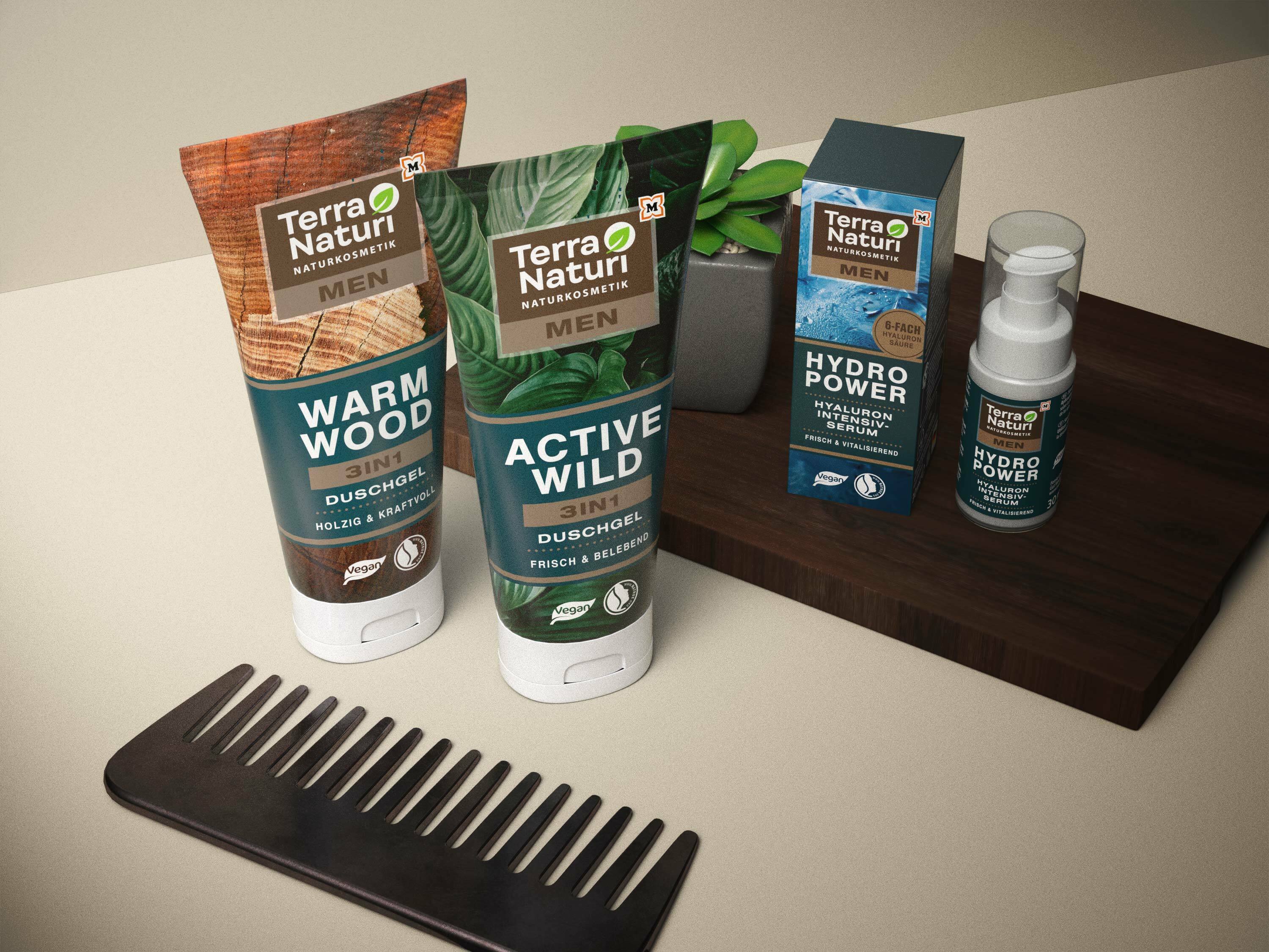
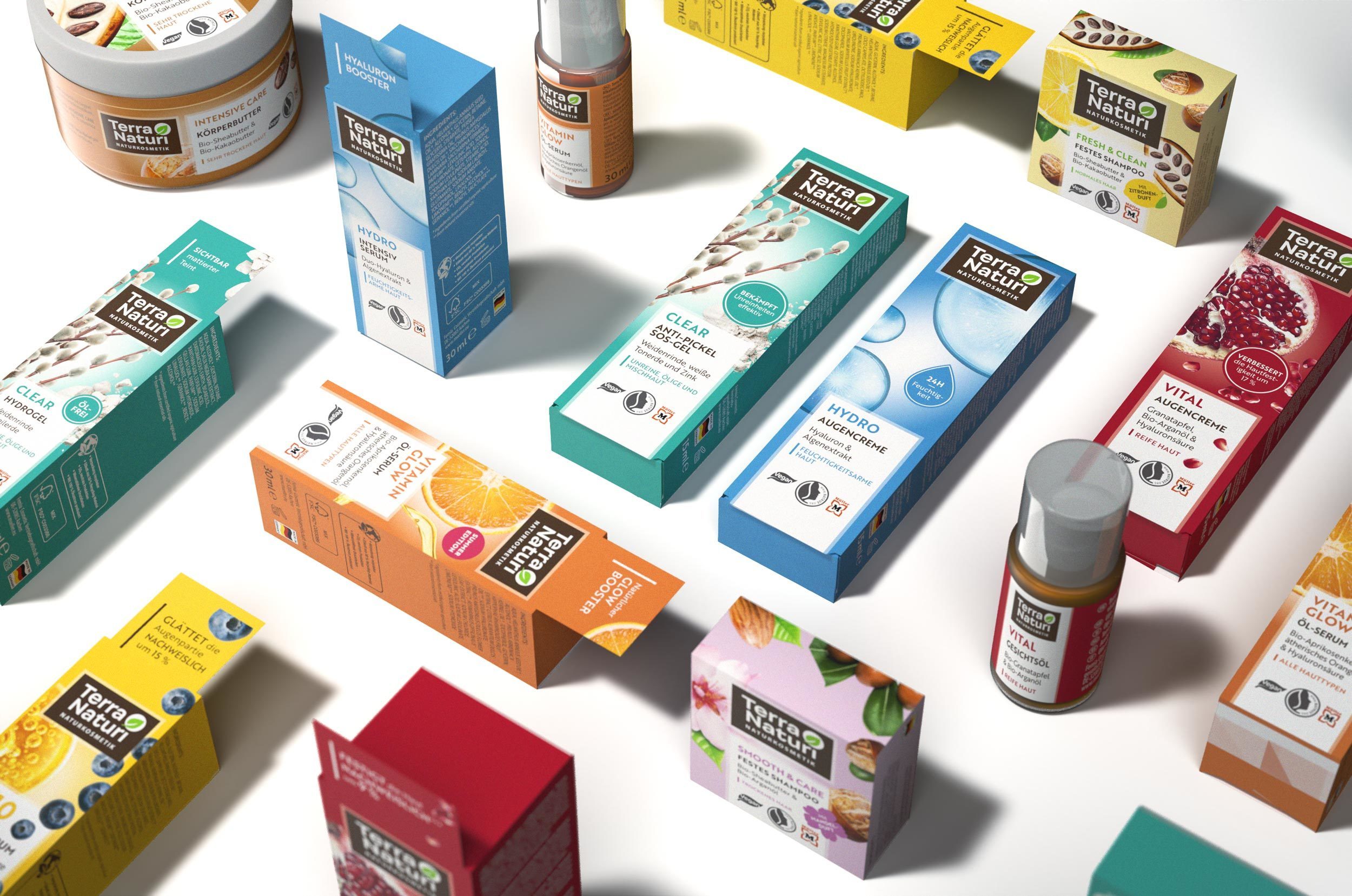
In order to stand out clearly from the competition at the POS and catch the consumer's eye, it was important to develop an expressive and independent packaging design for this project. The emotional appeal through a strong image concept was just as important as a clear structure through the range of more than one hundred products.
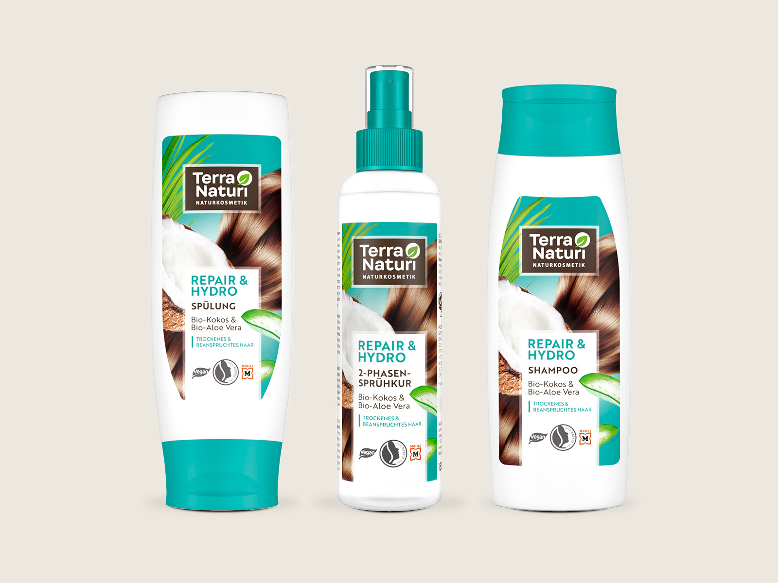
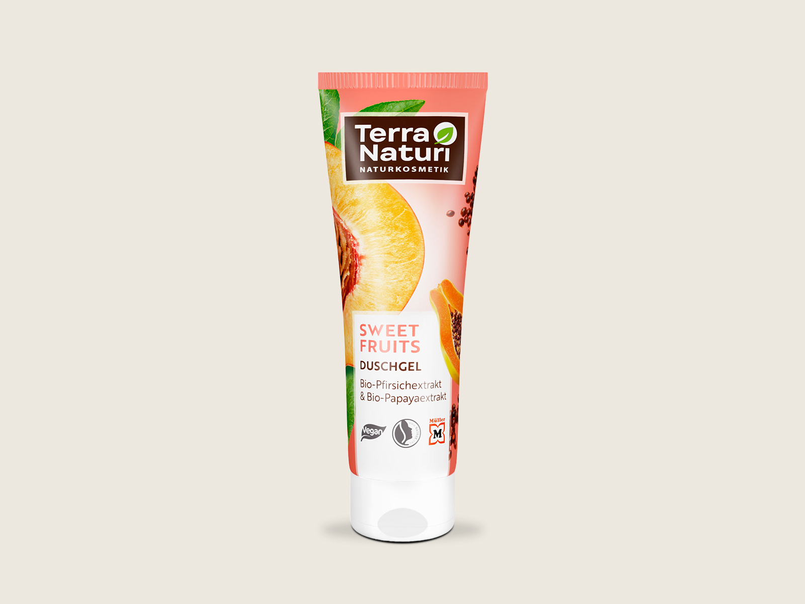
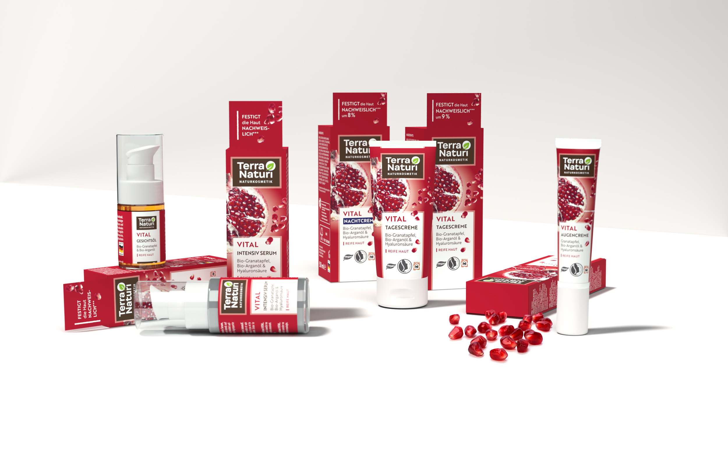
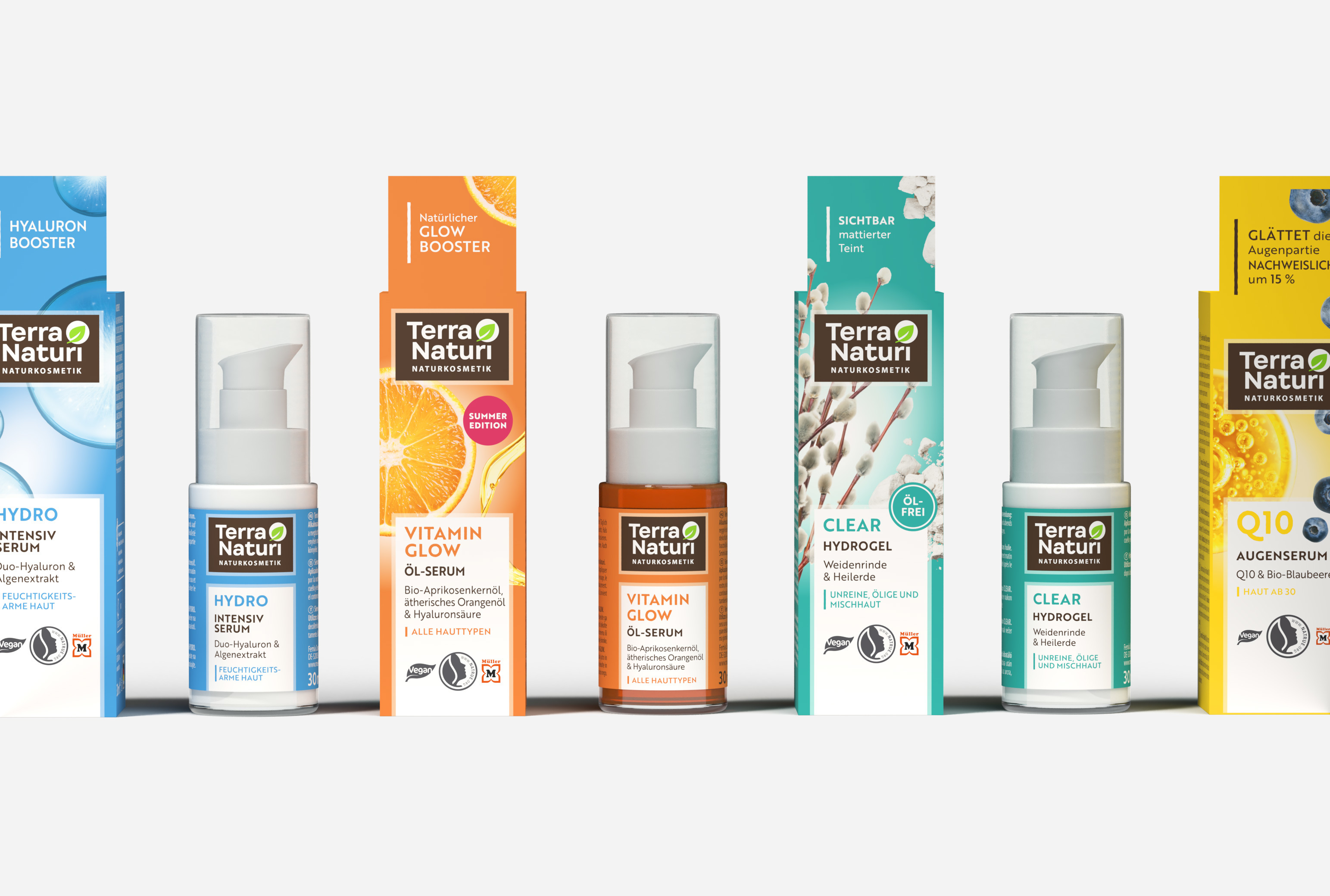
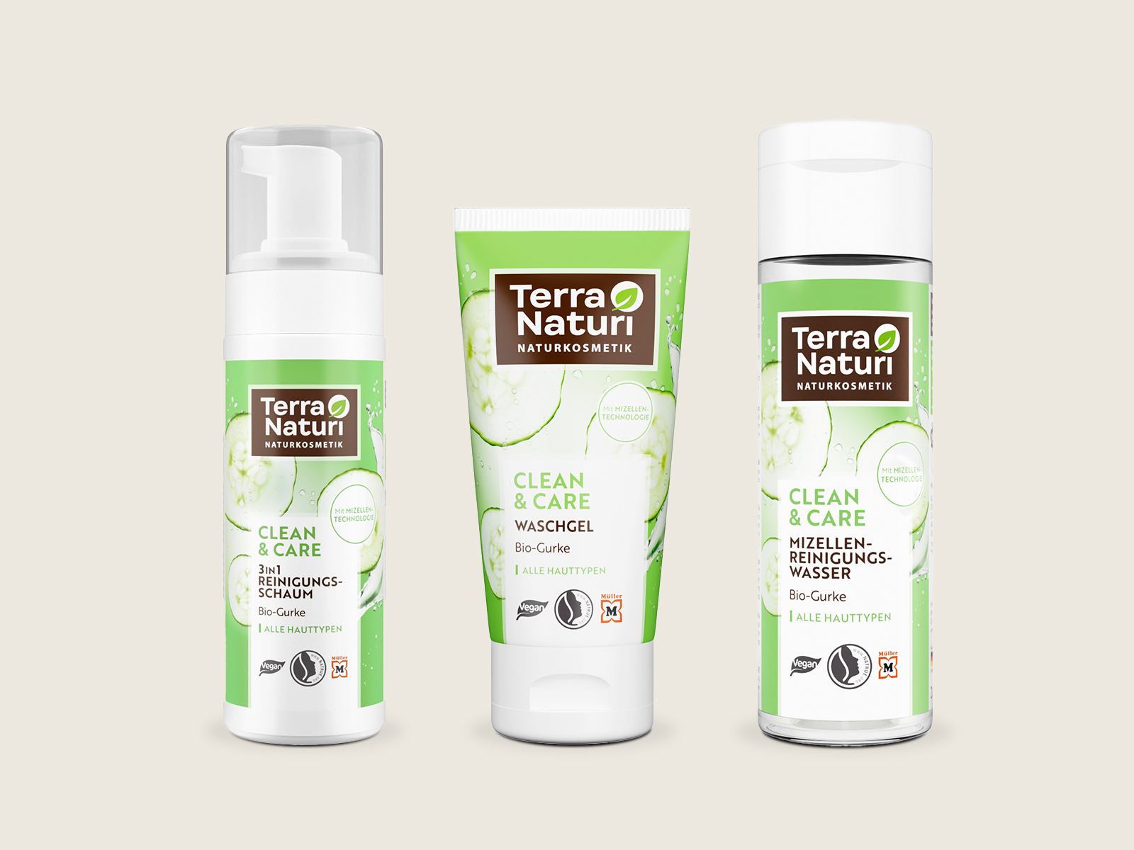
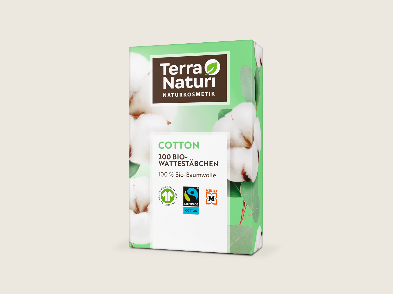
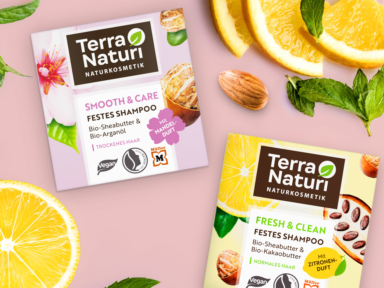
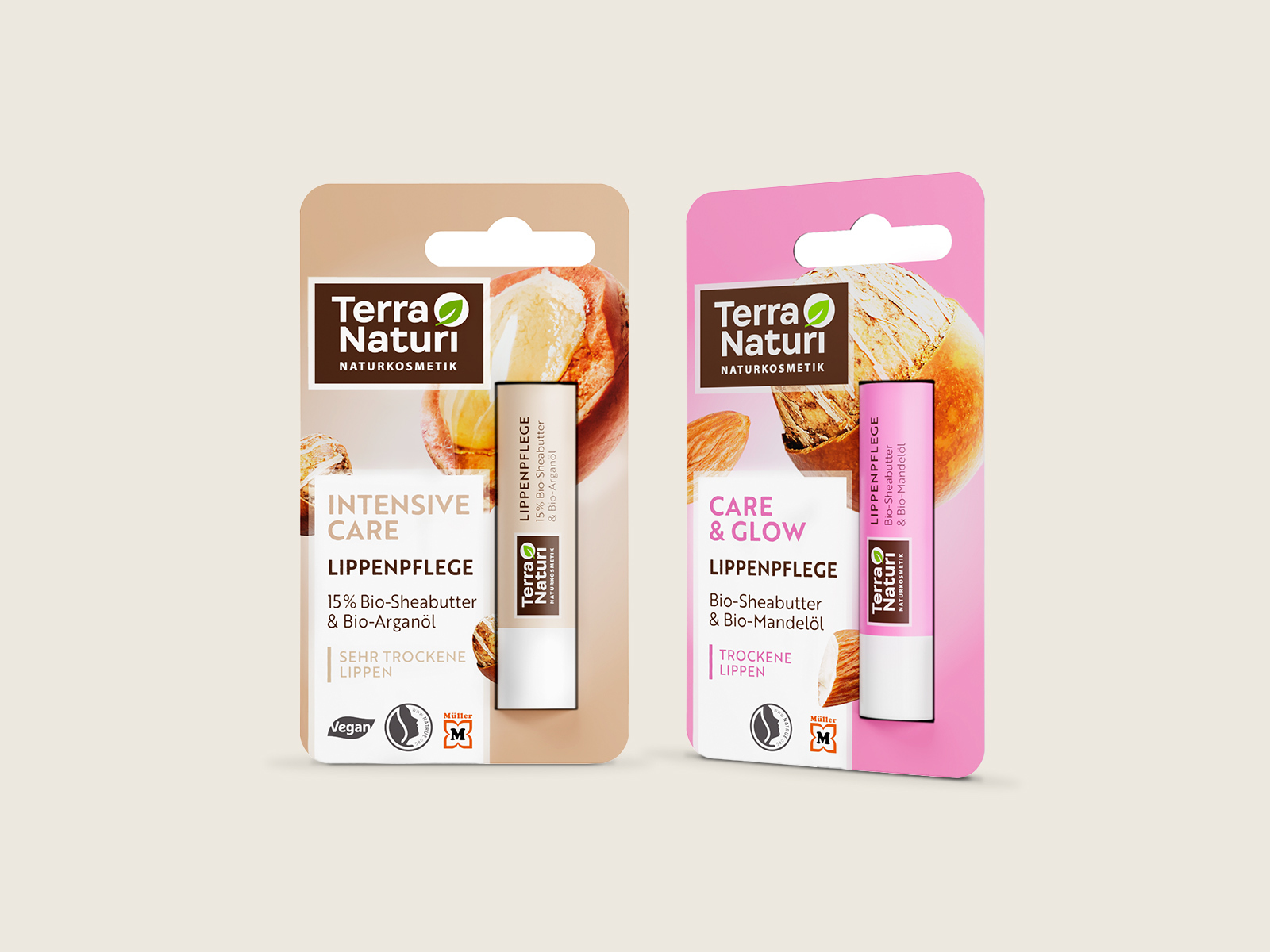
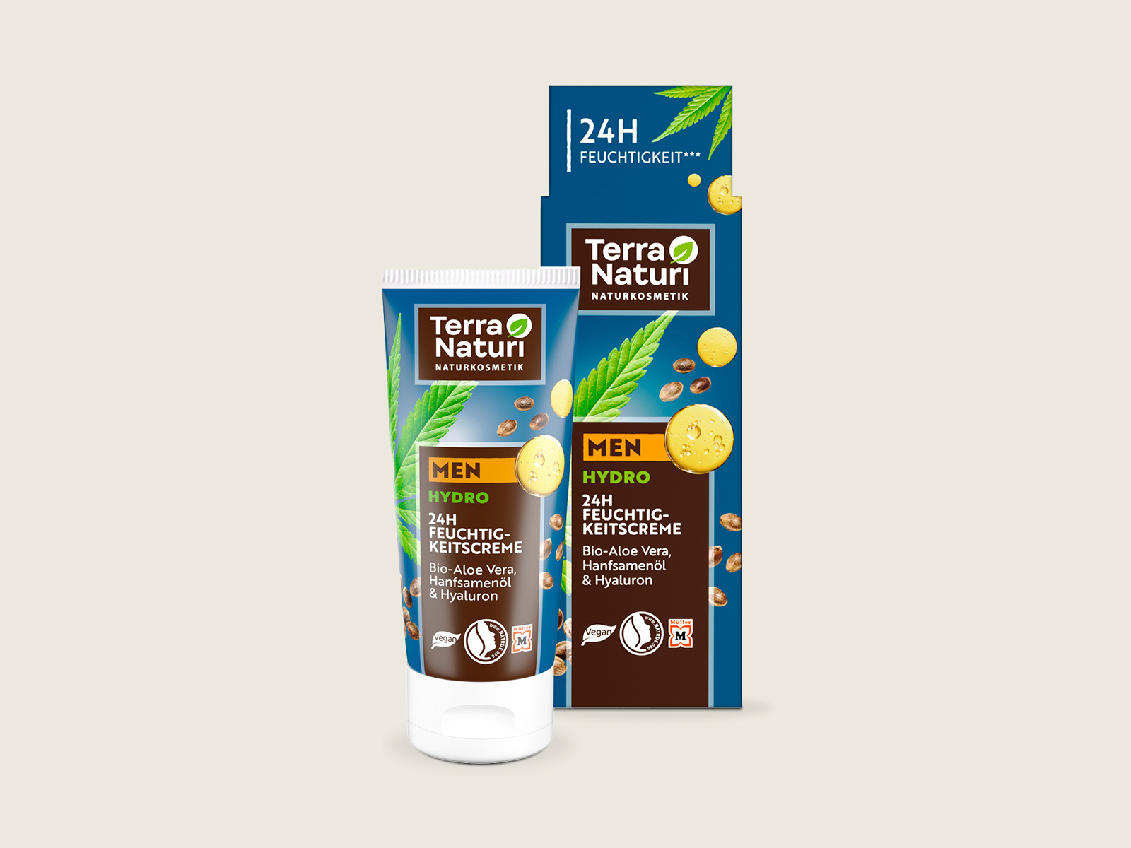
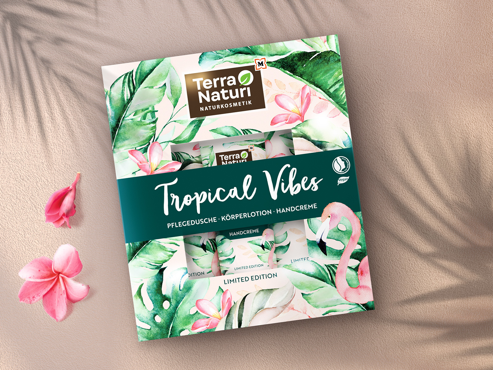
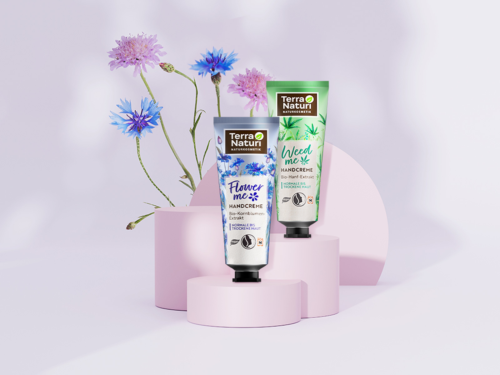
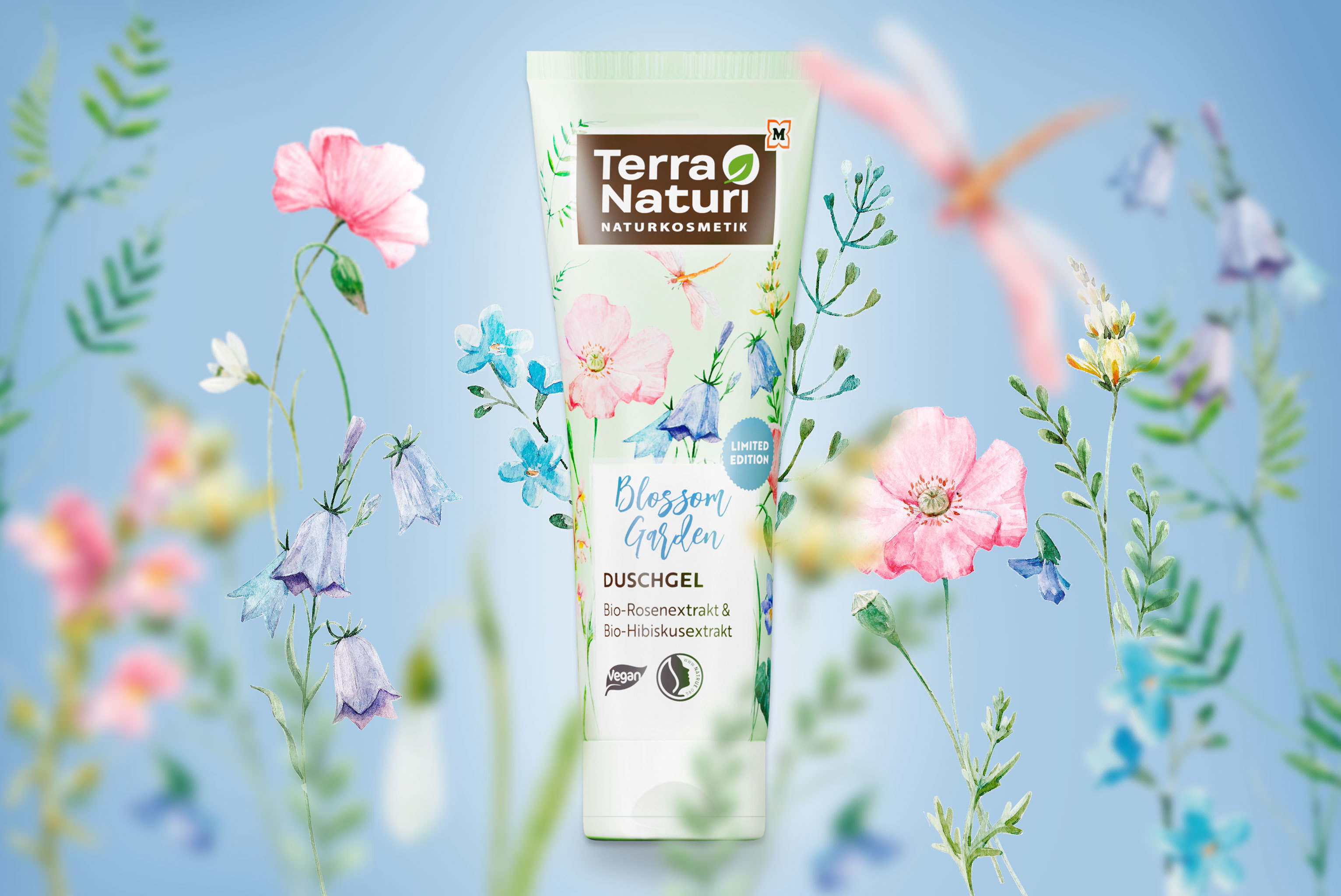
The emotional appeal is created by the large-scale illustration of the main ingredient, which is flooded with light and takes center stage. Thanks to the new packaging architecture, it now appears much freer and larger. The information box contains the prominent series name, which is color-coded to the skin type and thus guides consumers through the diverse range.
The new brand logo has better visual cohesion thanks to the left alignment. To better fill the space at the top, a tighter font was chosen. The green leaf was made friendlier and more recognizable.
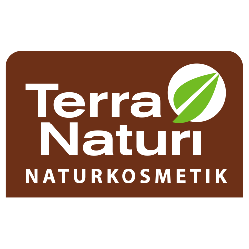
Before
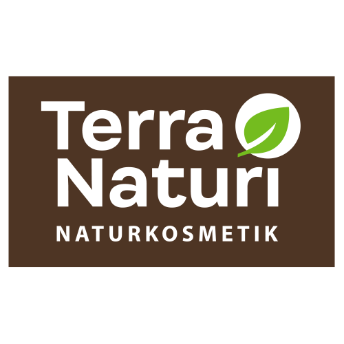
After
The uniform packaging structure is easy to understand and the clear color coding provides good orientation on the shelf. At the same time, variety differentiation is strengthened - regardless of the packaging material.
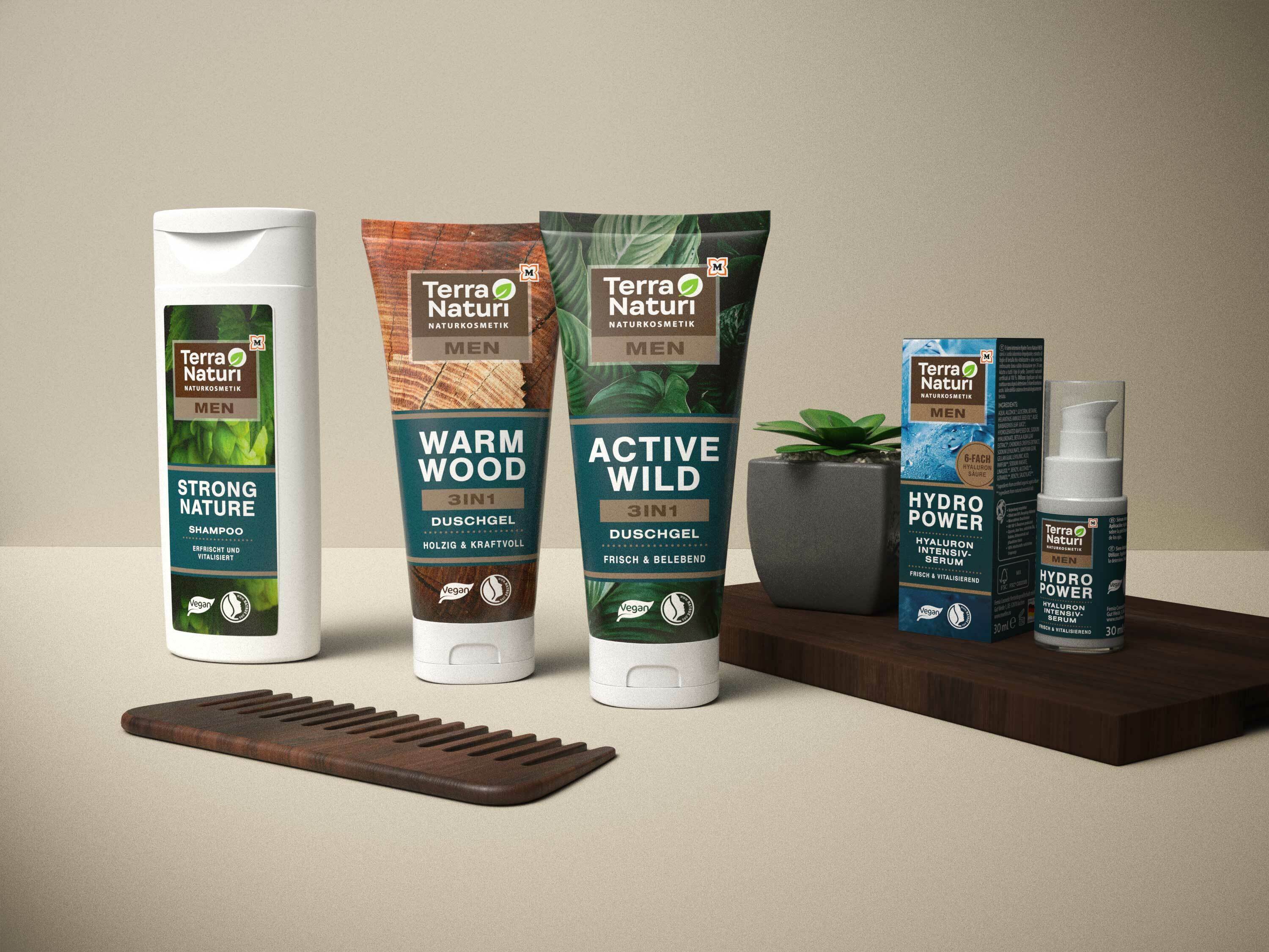
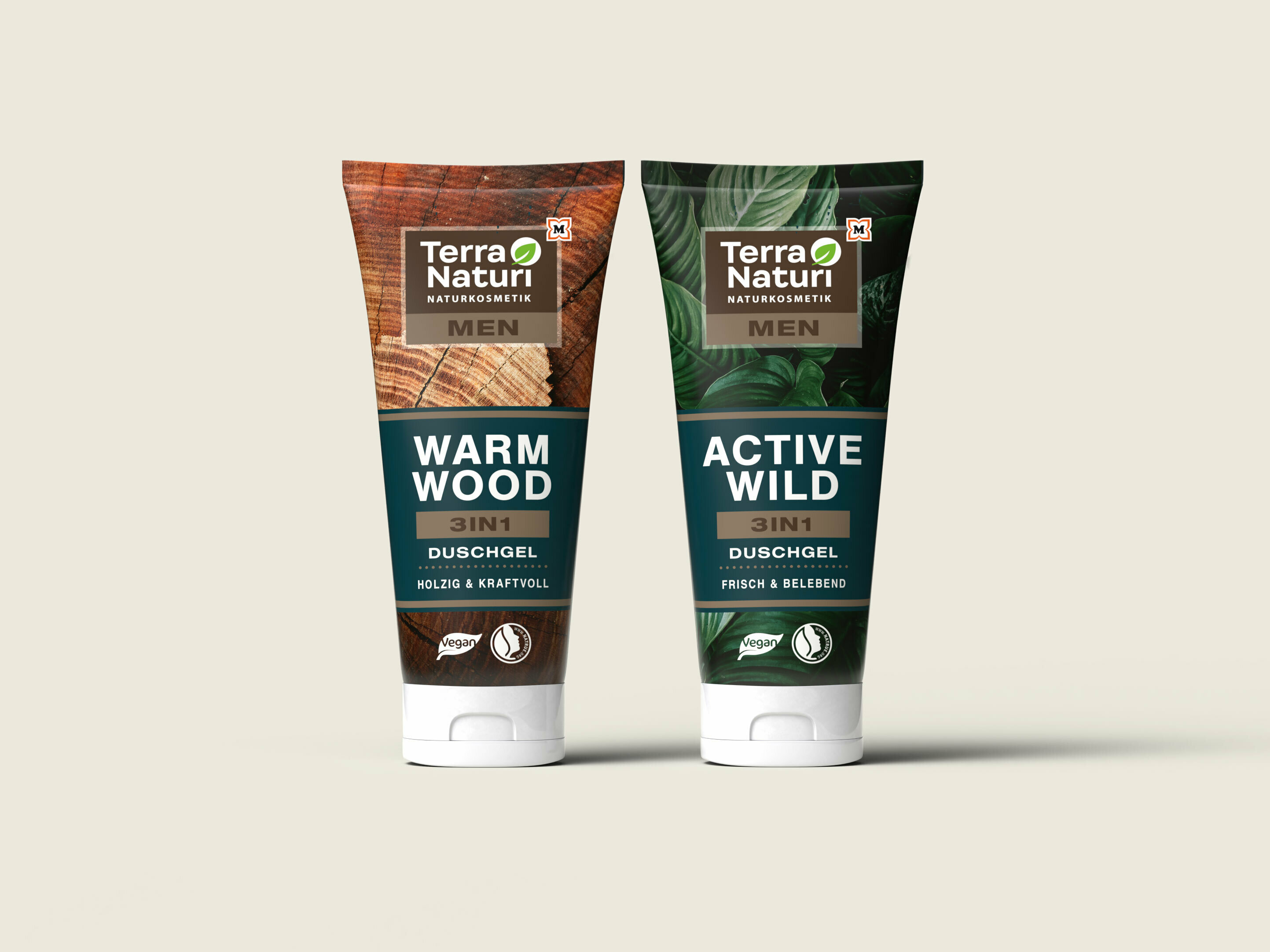
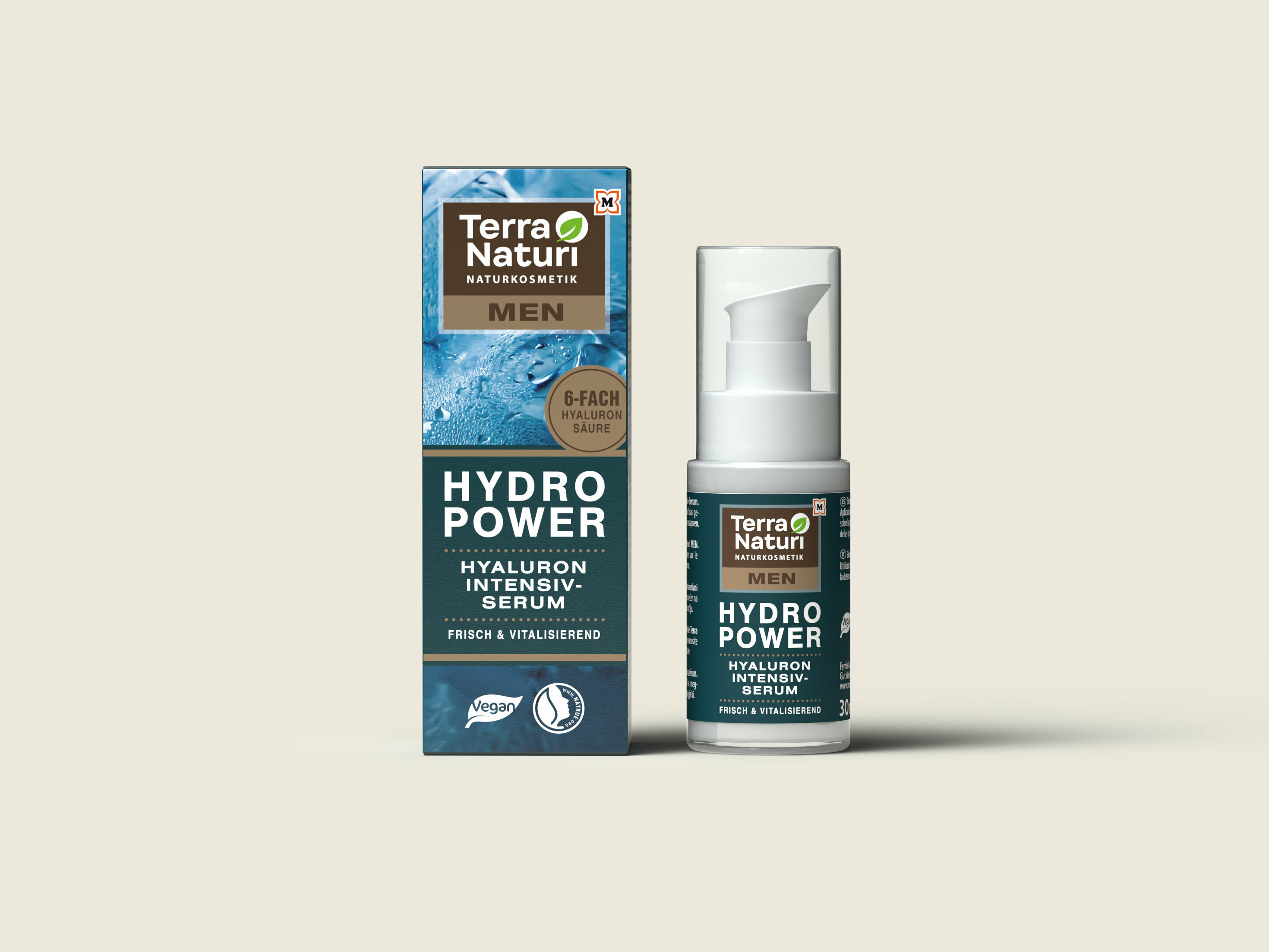
The MEN route is characterized by natural, minimalist imagery, muted colors and more technical fonts. The combination of wood elements with macro shots of flora evoke associations with the outdoors, adventure and wildlife.

Before
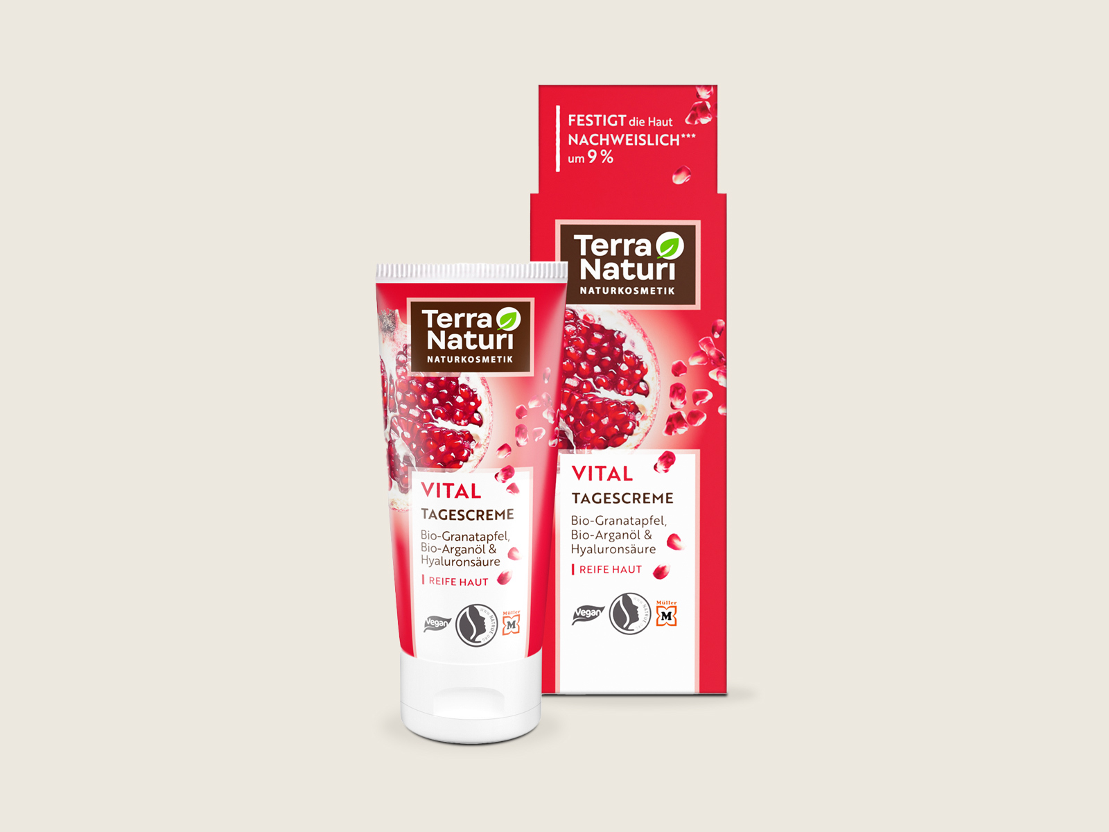
After
Source: