Schaebens' new packaging design emphasizes the themes of effectiveness and competence.
the best-selling facial care brand*, the medium-sized family business Schaebens can look back on a long and successful brand history. However, it is important for a company never to rest on its laurels, but to constantly develop its brand and adapt it to new market conditions and target groups. As part of the 2023 packaging relaunch, the existing appearance should be modernized, the brand-defining elements retained or gently developed and previous weaknesses eliminated. (*www.schaebens.de)
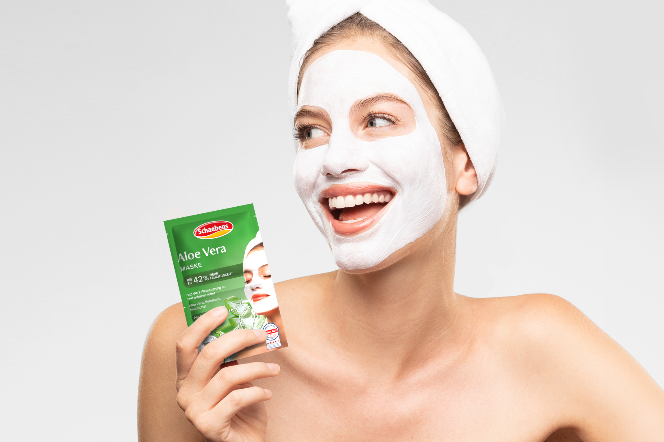
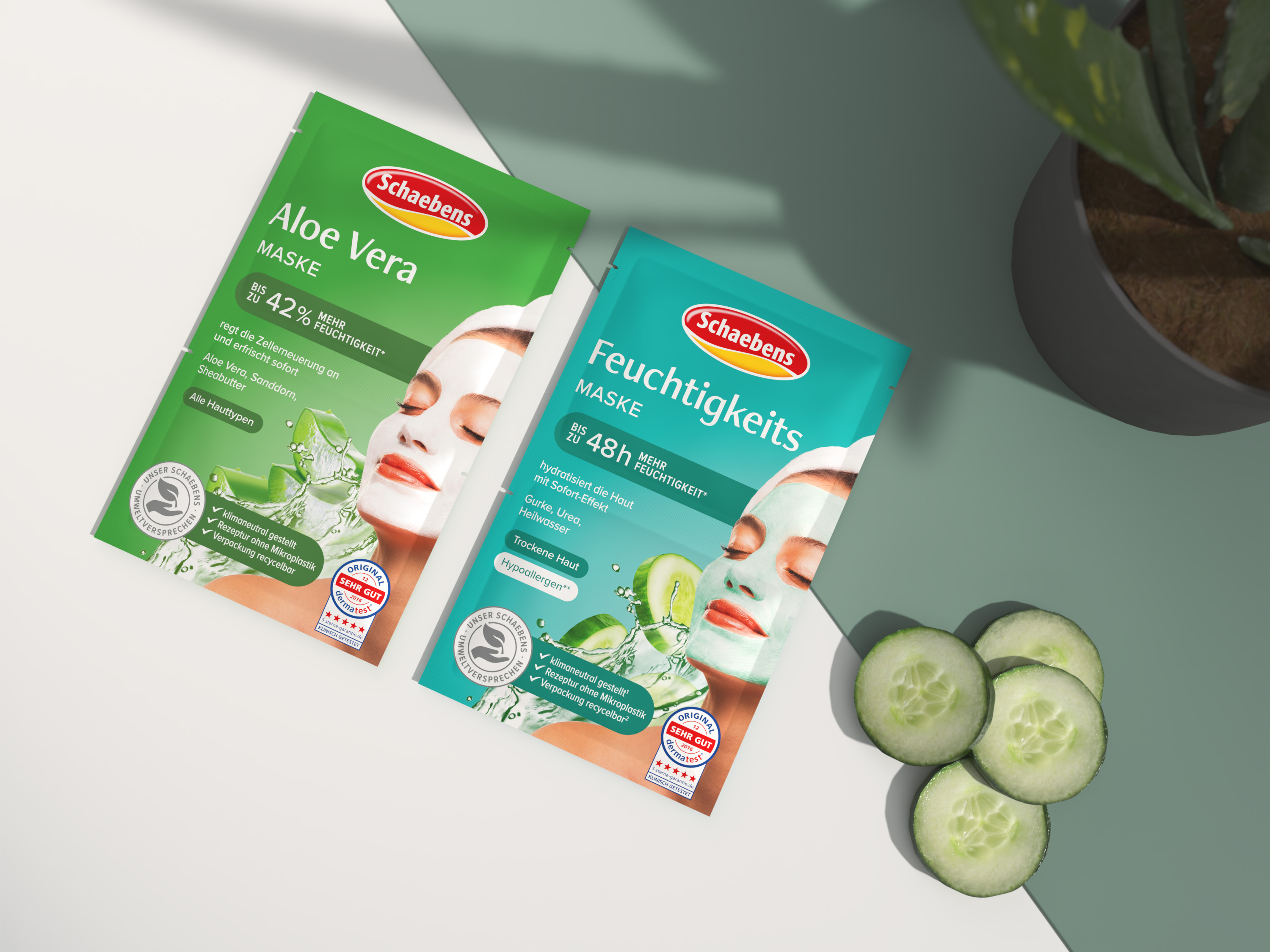
In order to increase the visibility of the masks on the shelf and thus generate new buying impulses, we focused on the product USPs. Our strategy was to confidently and clearly communicate the dermatologically proven efficacy claims of the products that set Schaebens apart from the competition. We achieved this both by creating a uniform information hierarchy and by transferring the most important visual elements to the present day. The renewal of the well-known “masked woman” was a central component of this.
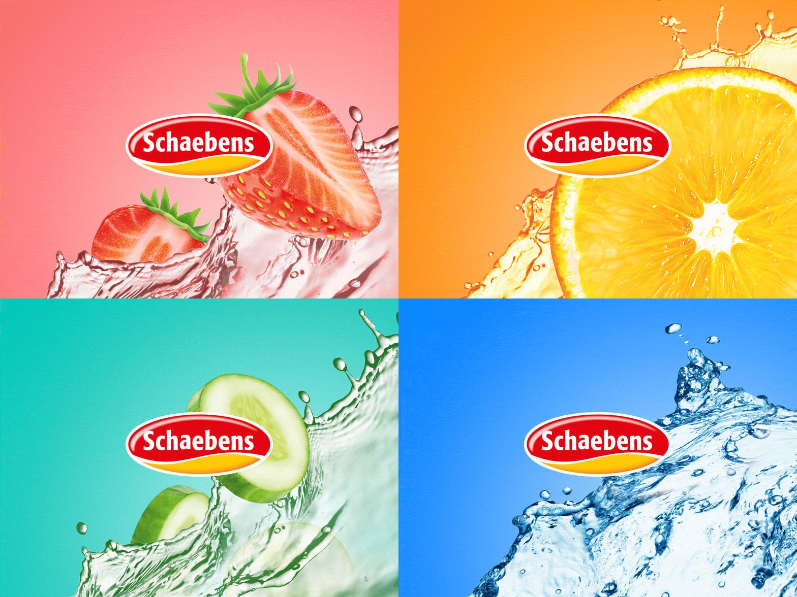
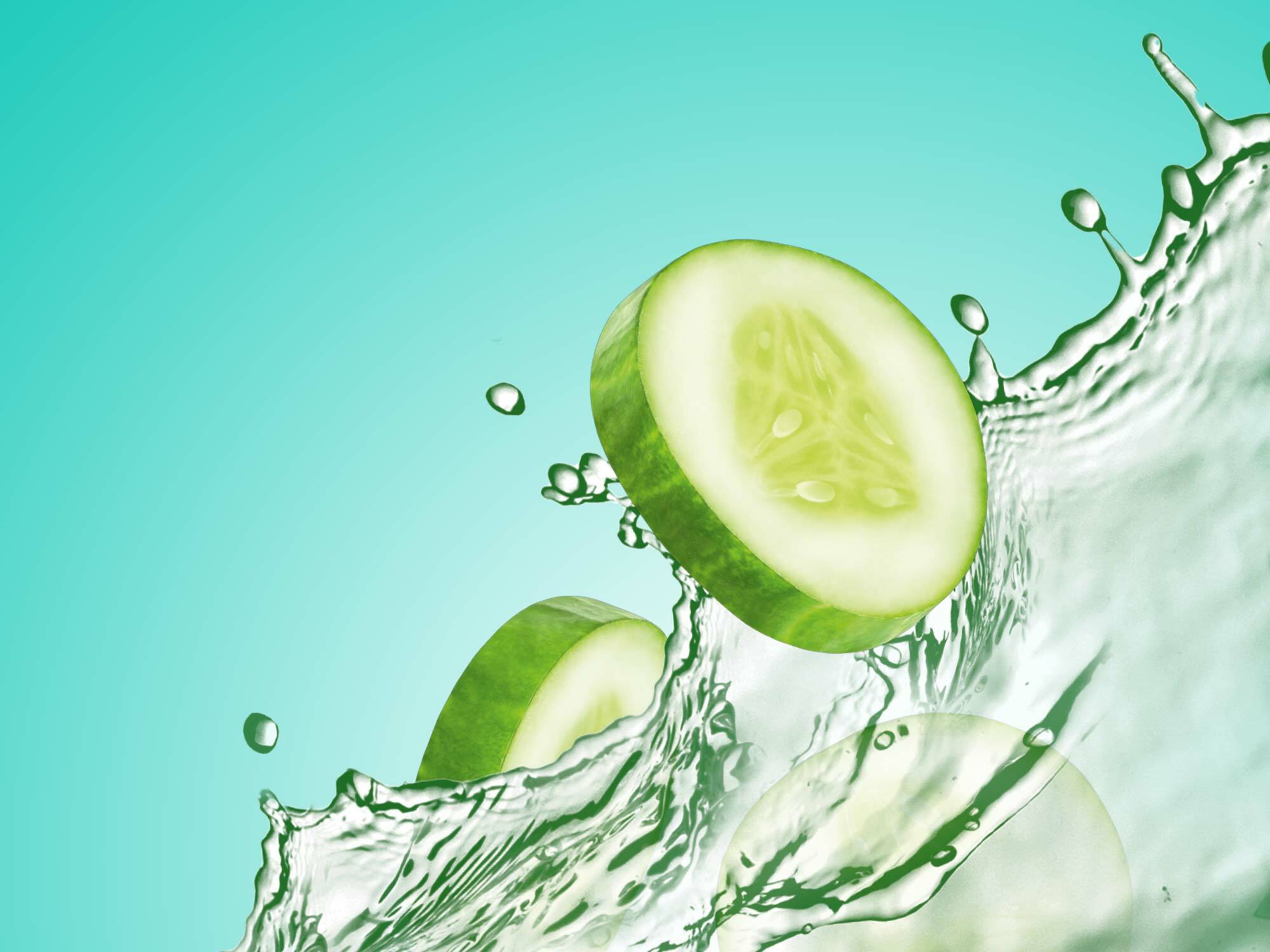
The previously artificial-looking imagery in the background was optimized through the use of exciting image compositions and natural key visuals, which are dynamically placed behind the woman wearing the mask.


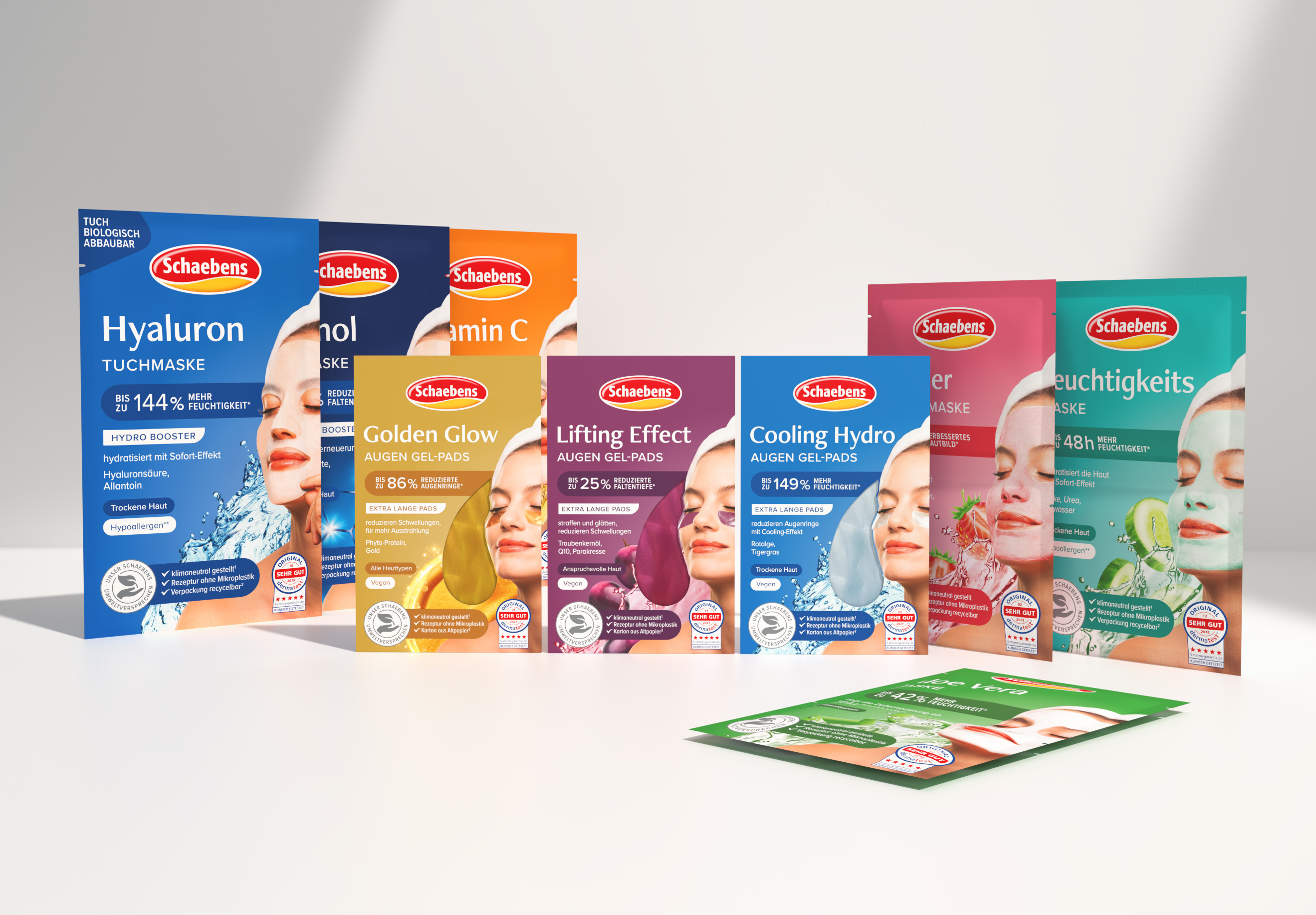
Schaebens is not afraid to prove the effectiveness and quality of its products with dermatological tests. This unique USP, the tested efficacy claim, is communicated more confidently and prominently in the new packaging design.

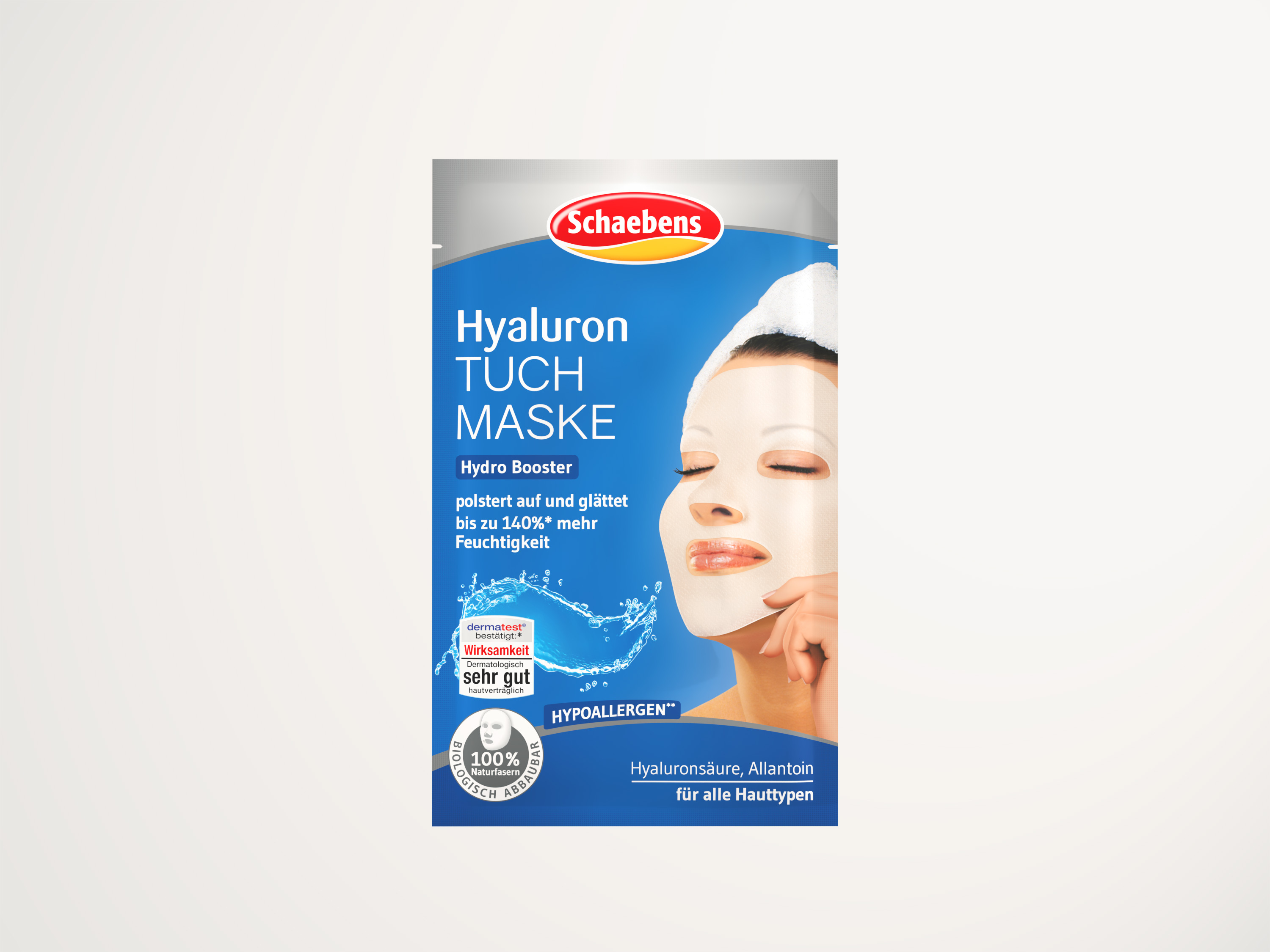
Before
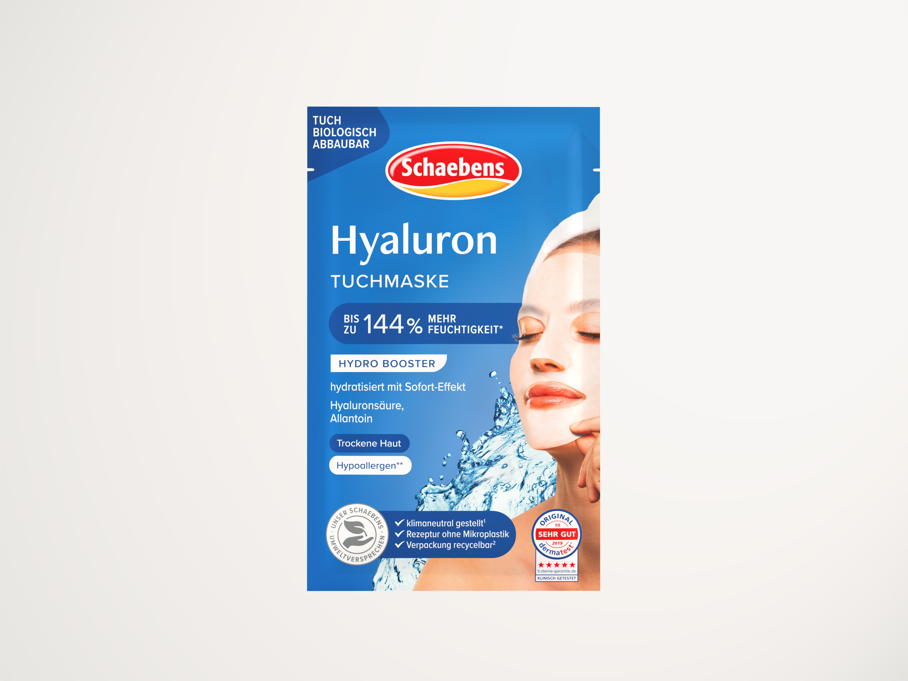
After
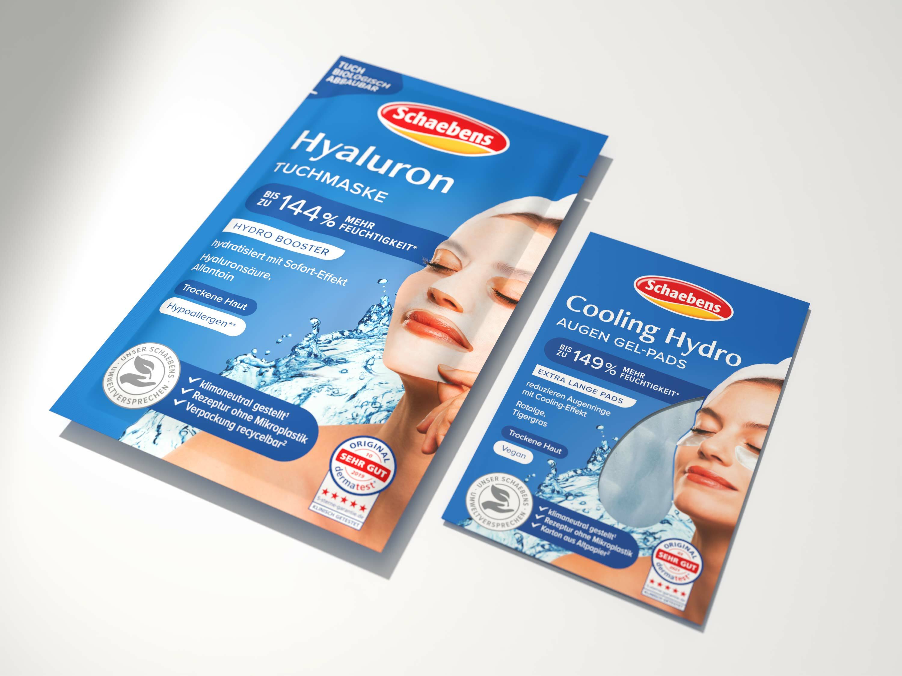
The new, cosmetic-looking typography pays tribute to the learned visual codes of the beauty category and, with its modern appearance, ensures that Schaebens is perceived as a timeless beauty brand.
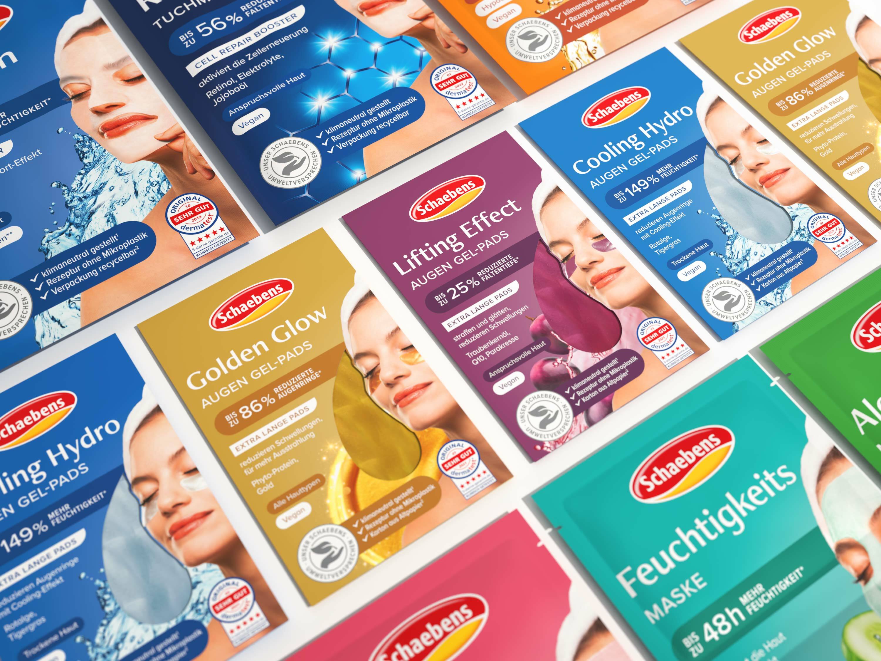
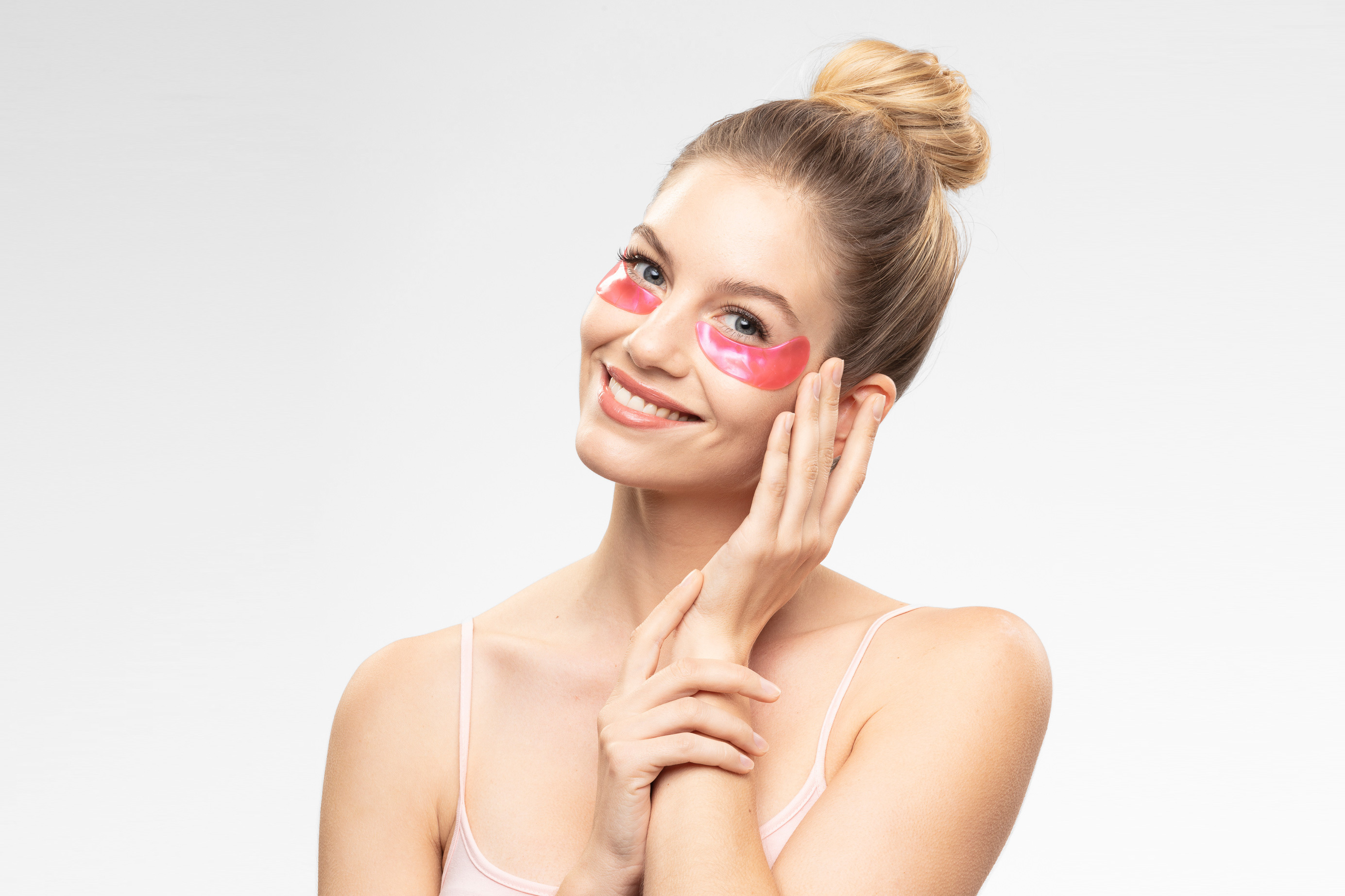
or a stringent information hierarchy on all facial care products, we have also adapted and repositioned the eye pad die cut.

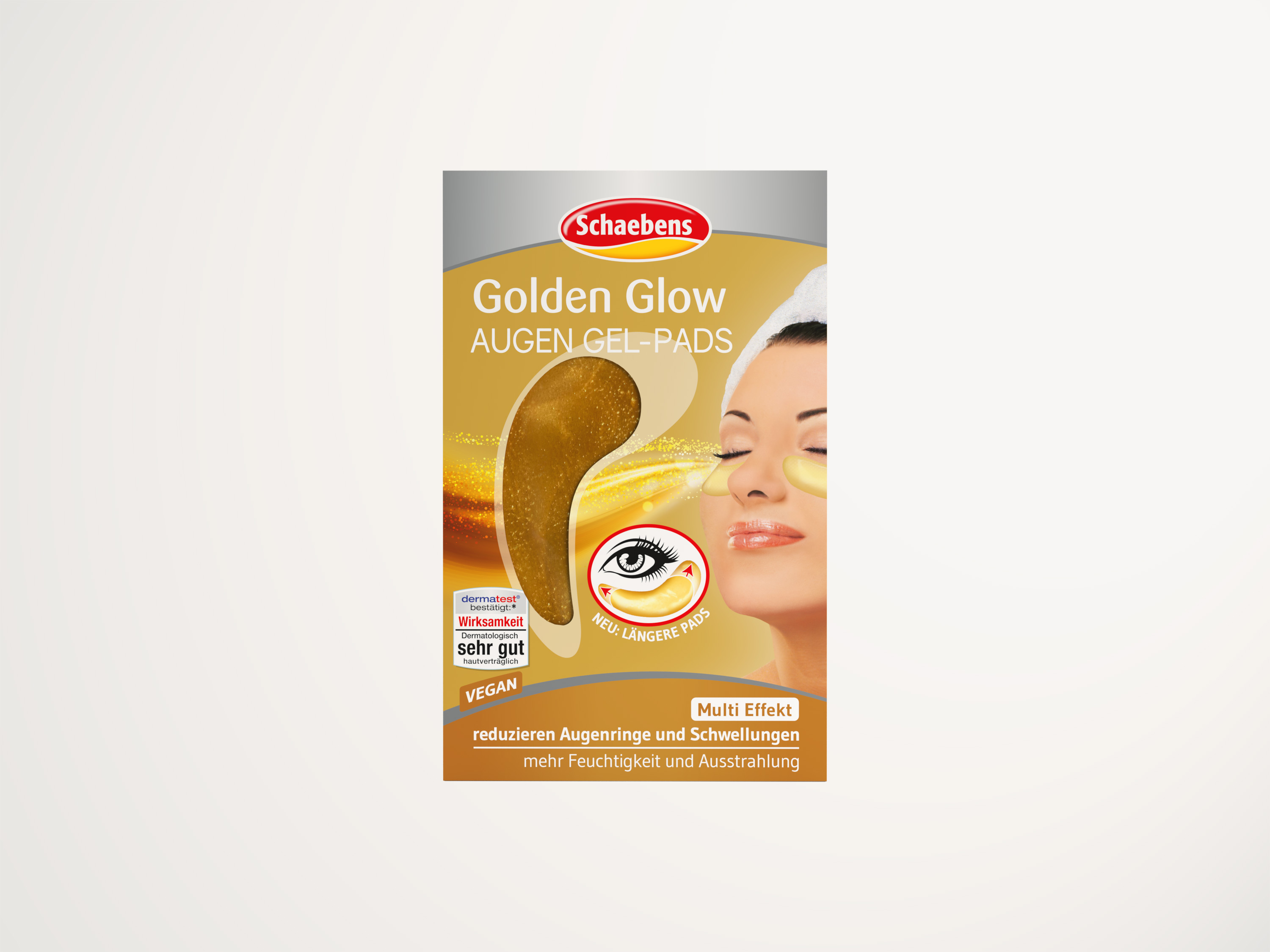
Before
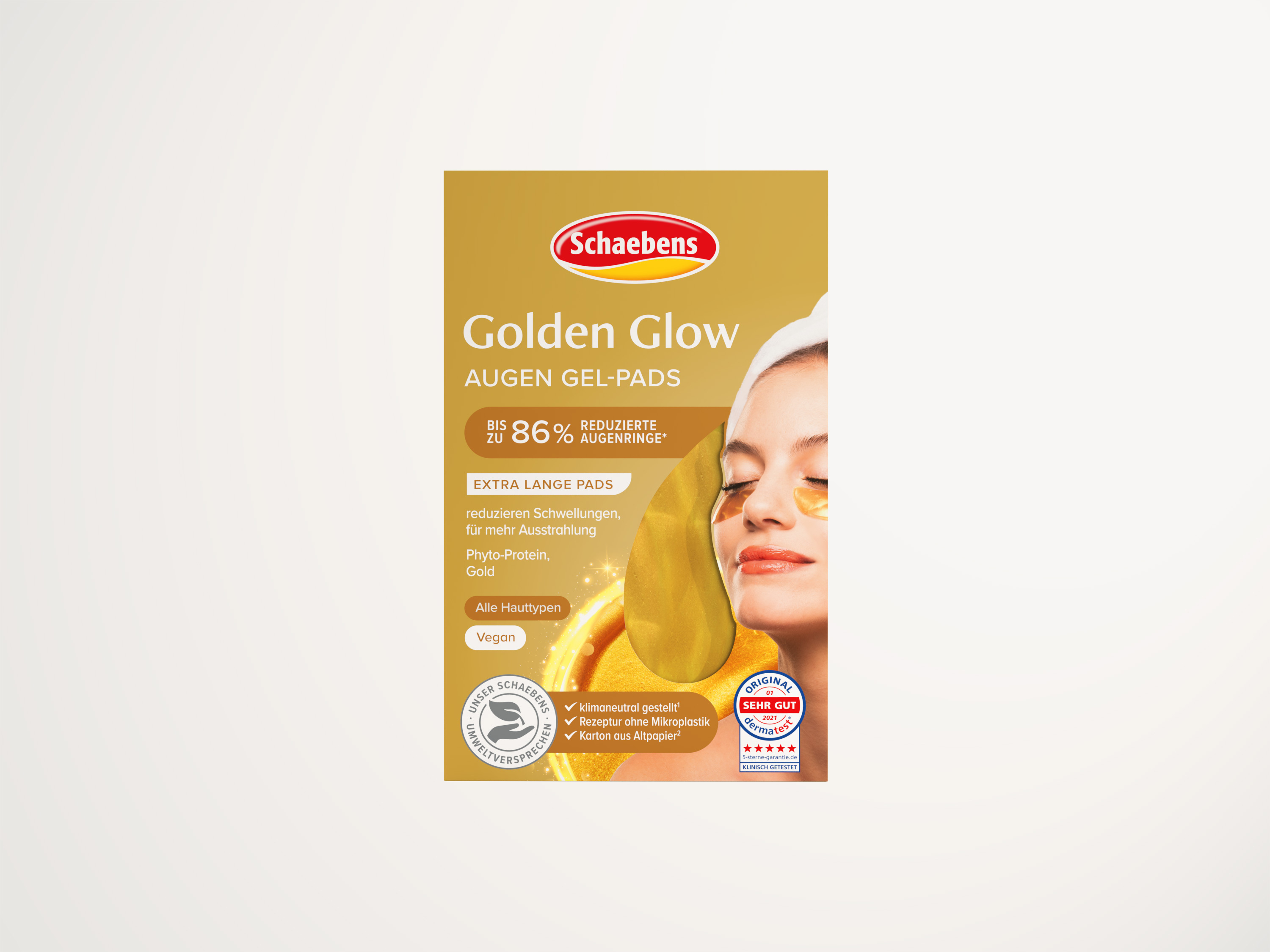
After
Schaebens' efforts to align all of its business activities with the environment should also be given sufficient space in the new packaging design.
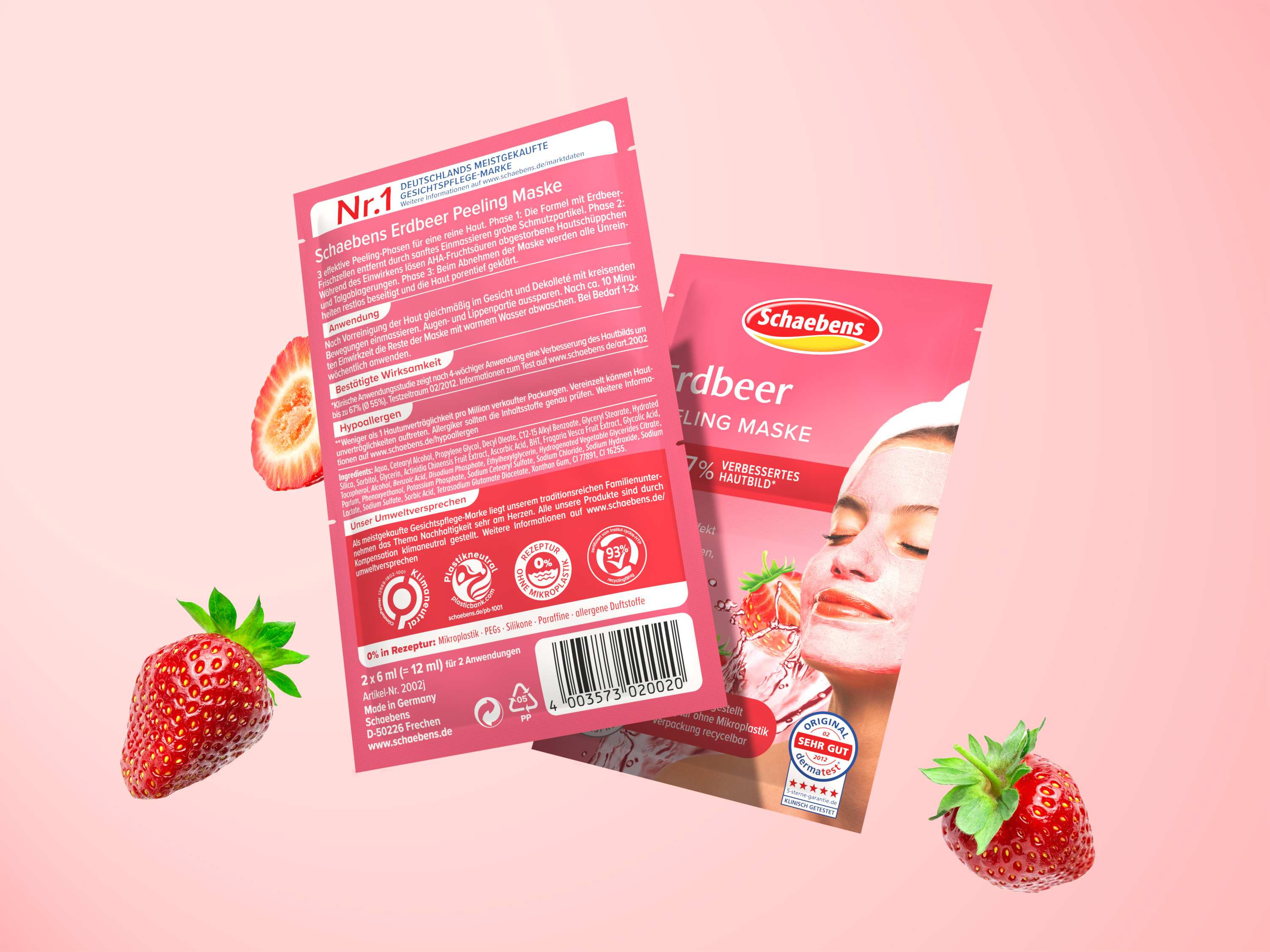
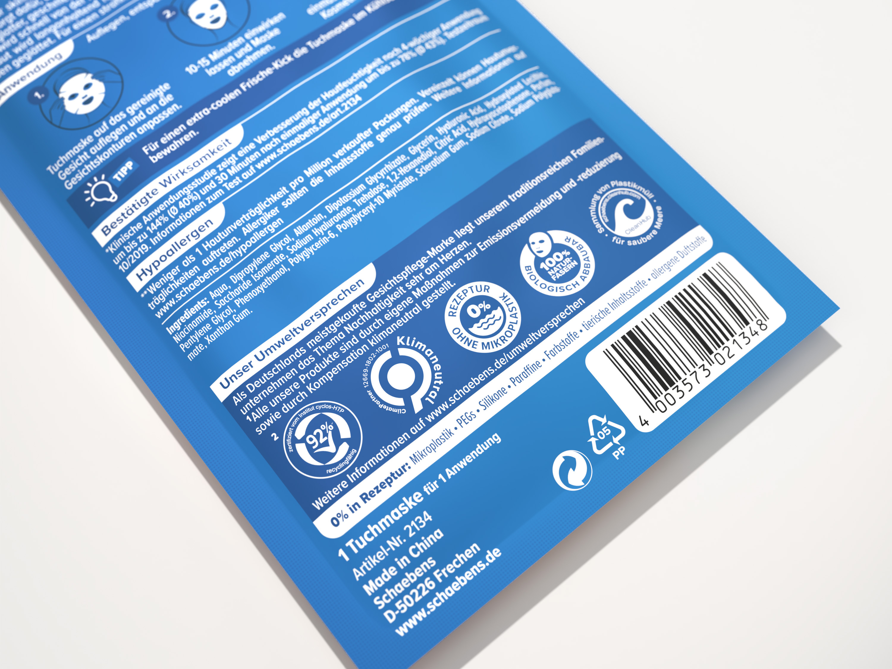
The revised back reflects both the look and the color scheme of the front. By creating different blocks, the appearance is now tidier and more structured.
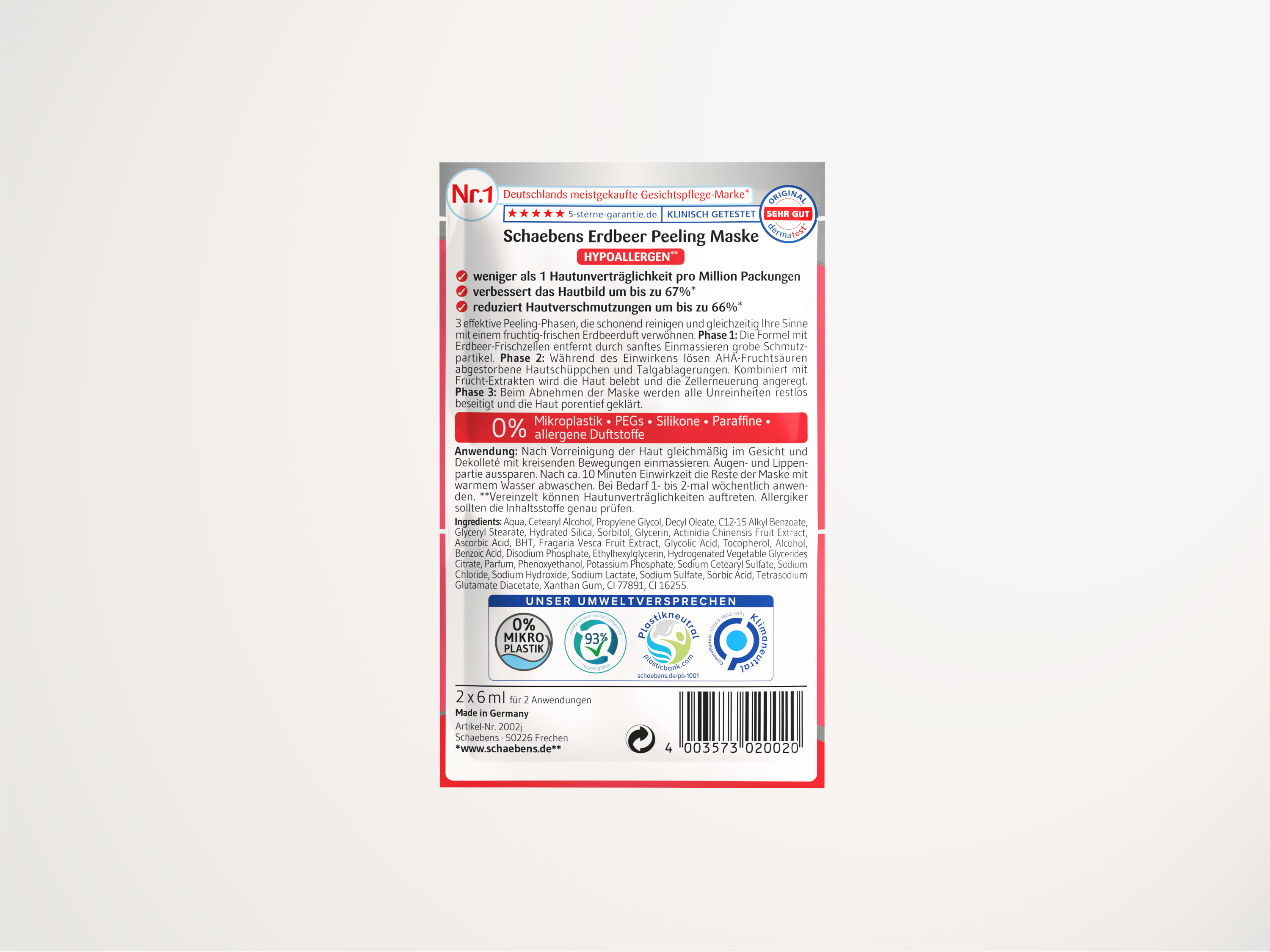
Before
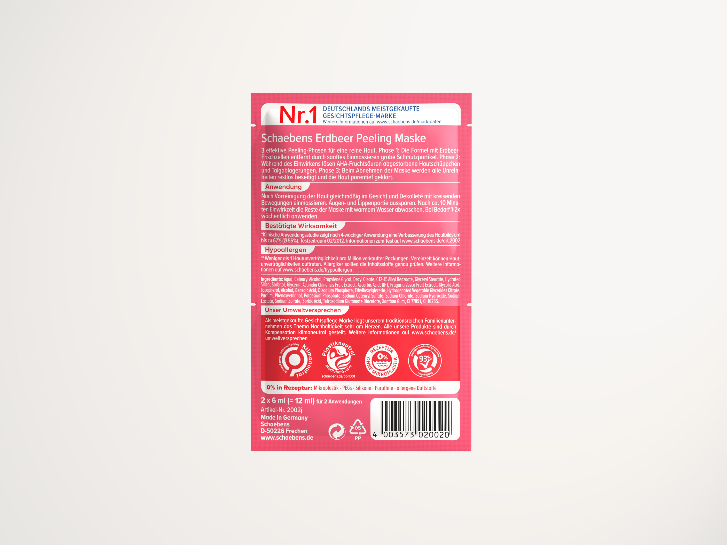
After
The icons have received a fixed placement at the bottom of the front. This also includes Schaebens' important environmental promise, which has also been given sufficient space for communication on the new colored backside.
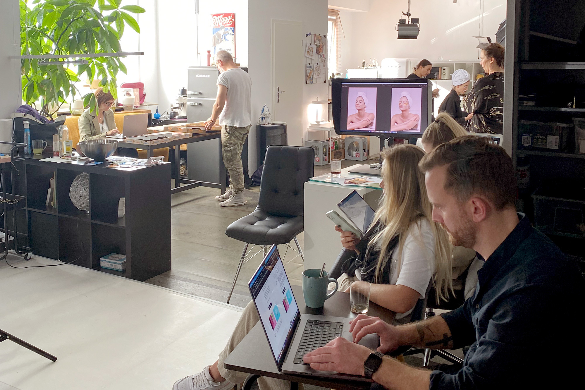
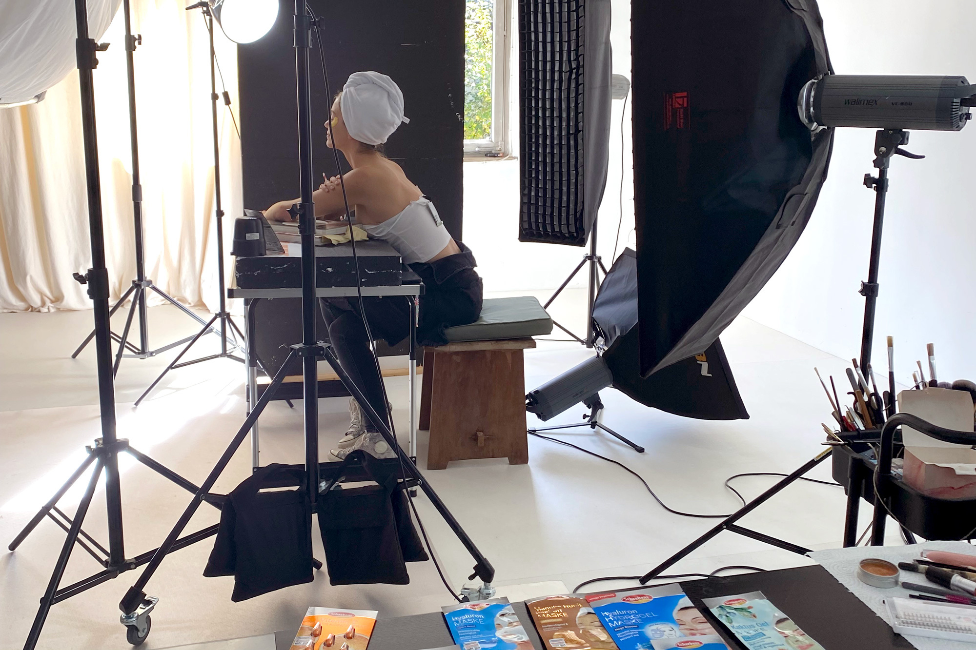
The previous mask-model with the esprit of the 80s was replaced by a young woman with whom the female target group of today can better identify and is thus optimally addressed at the POS. Already during the pitch phase, a professional photo shoot took place under the direction of echd. This enabled us to implement our idea of the new key visual more concretely and incorporate it into the new packaging design.

Source: