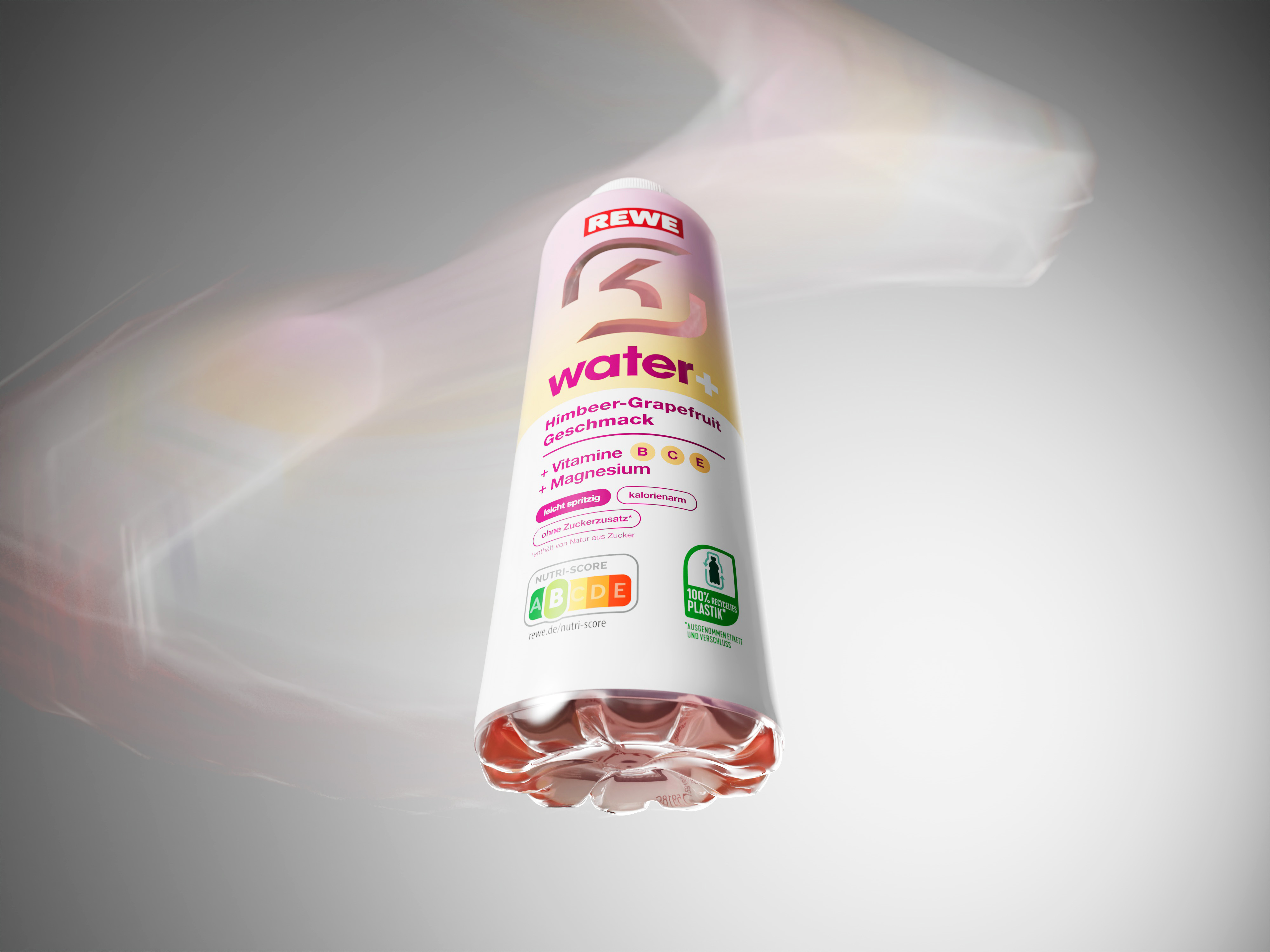
We had the privilege of designing the packaging for a very special vitamin water for REWE – in collaboration with the SK Gaming e-sports team. Two brands, two worlds, one common goal: a design that stands out and connects.
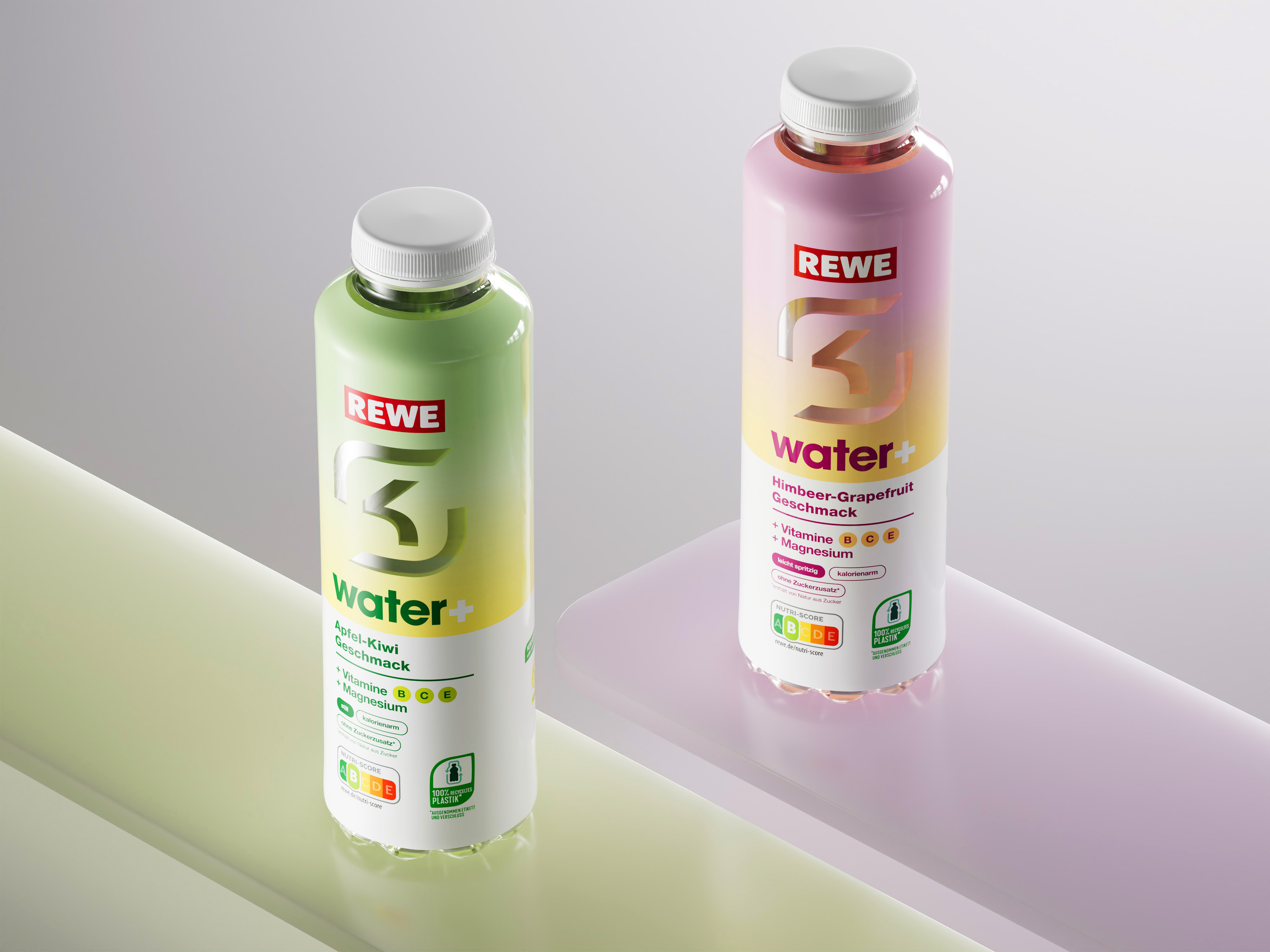
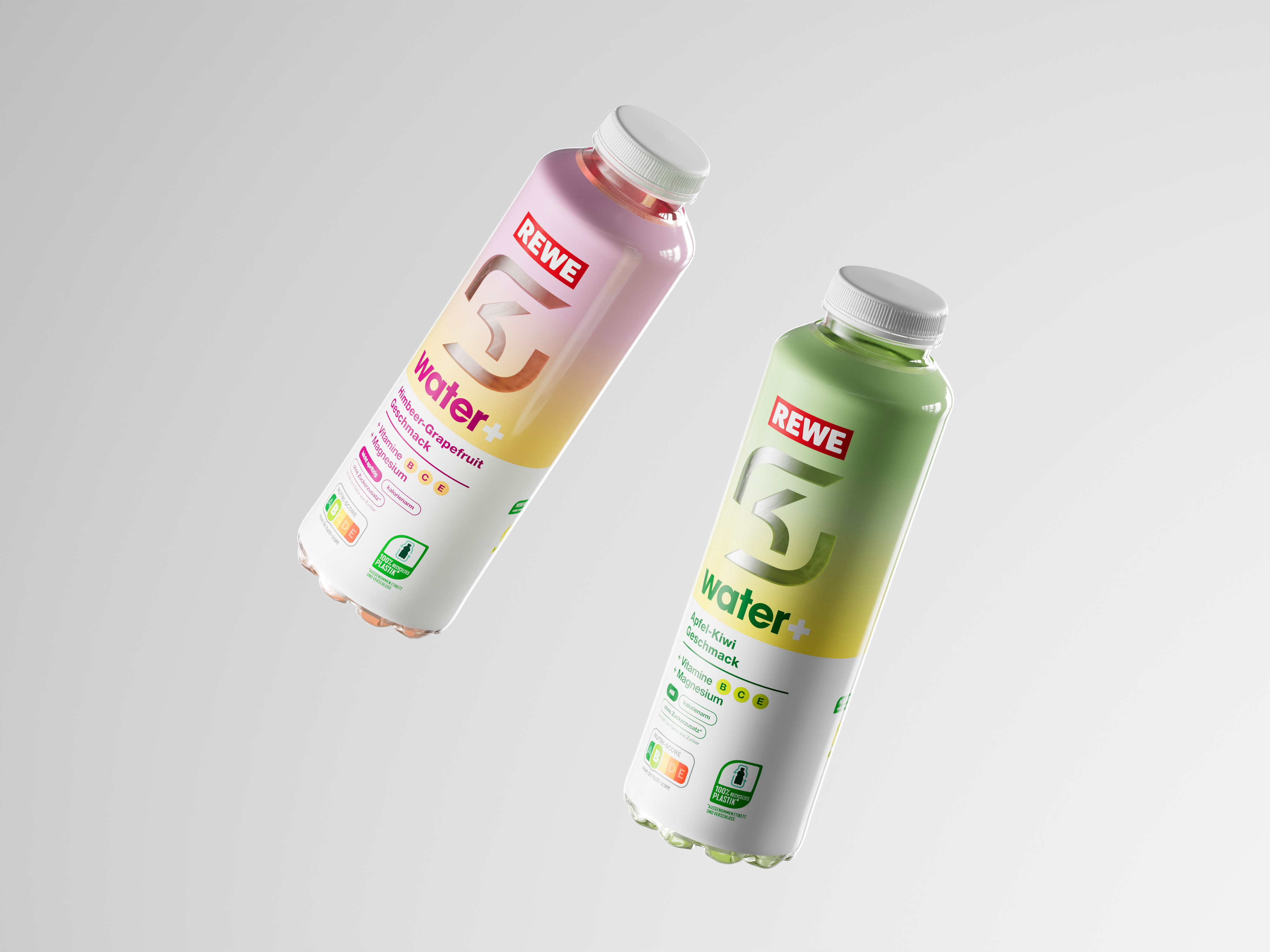
Two brands, two worlds – and one shared product: for the new vitamin water from REWE and SK Gaming, the challenge was to combine two strong visual identities in one packaging design. REWE stands for broad visibility in retail, SK Gaming for e-sports and digital youth culture. The design had to reflect both – without visual overload, but with clear recognizability.
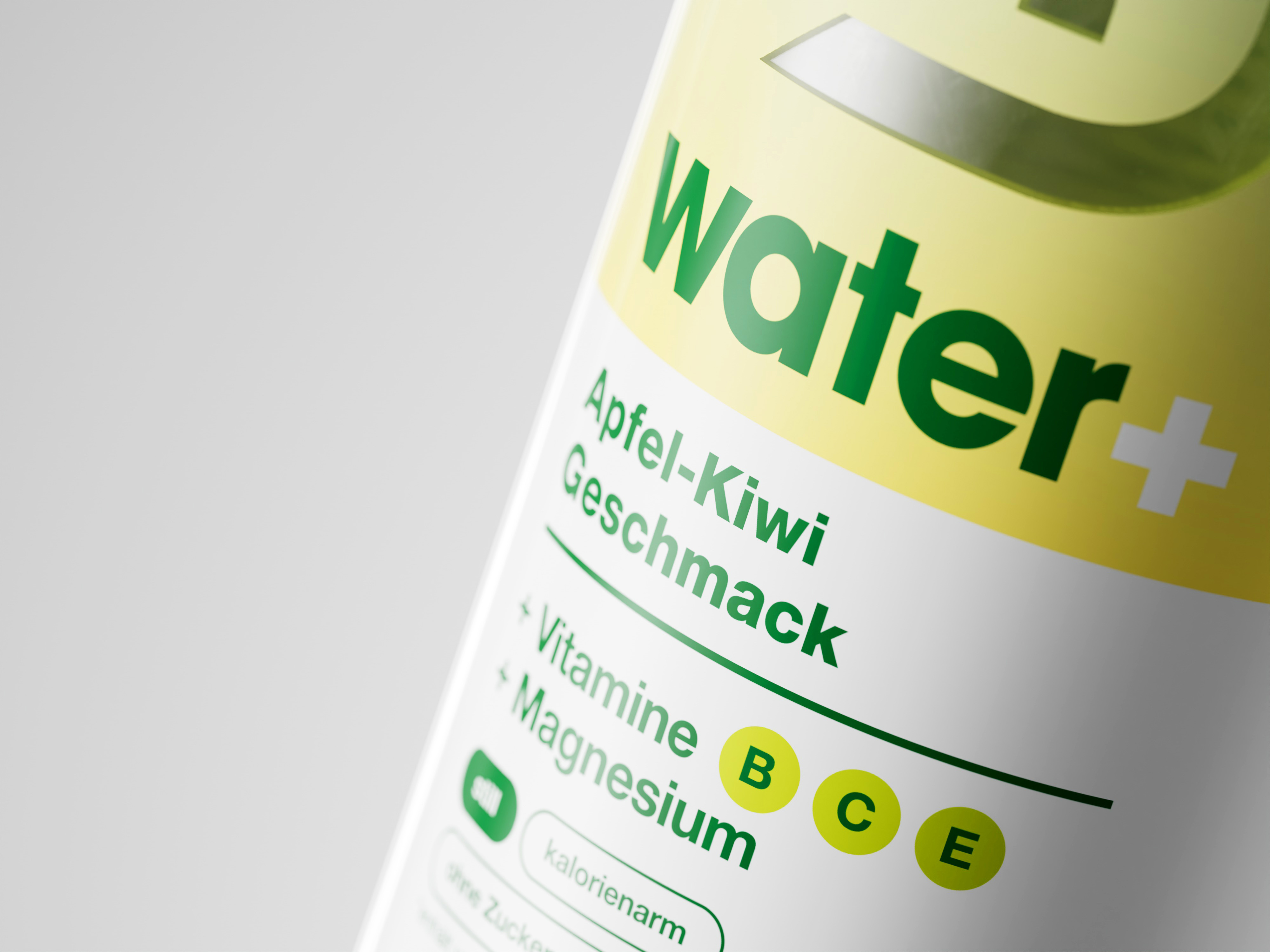
The iconic SK Gaming logo was transformed into a viewing window, combining form with function. The cut-out makes the branding tangible while also allowing the product to be seen. Together with the striking color gradients and clear typography, the result is a design that stands out in stores and visually connects with the target audience.
Source: