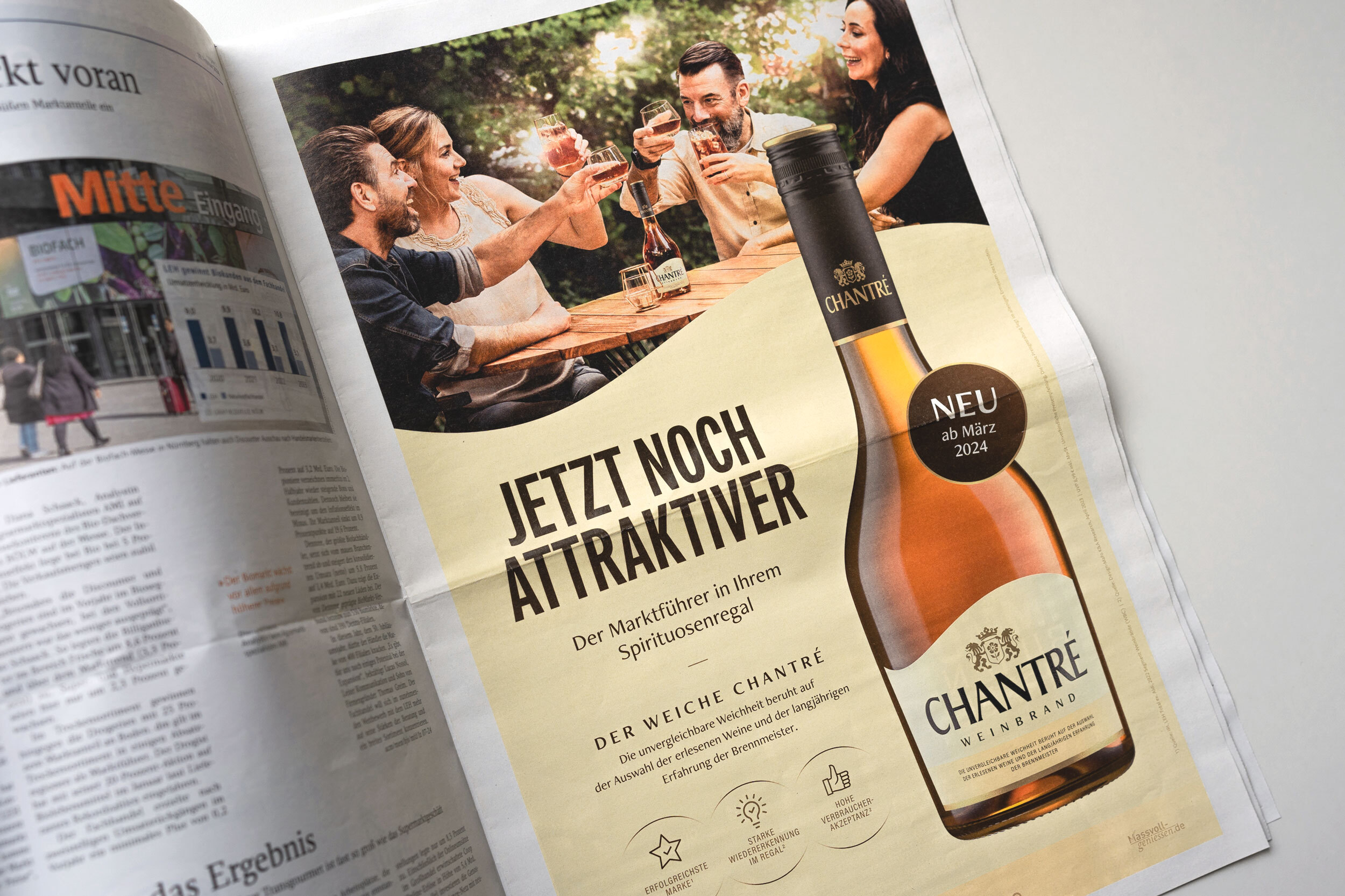
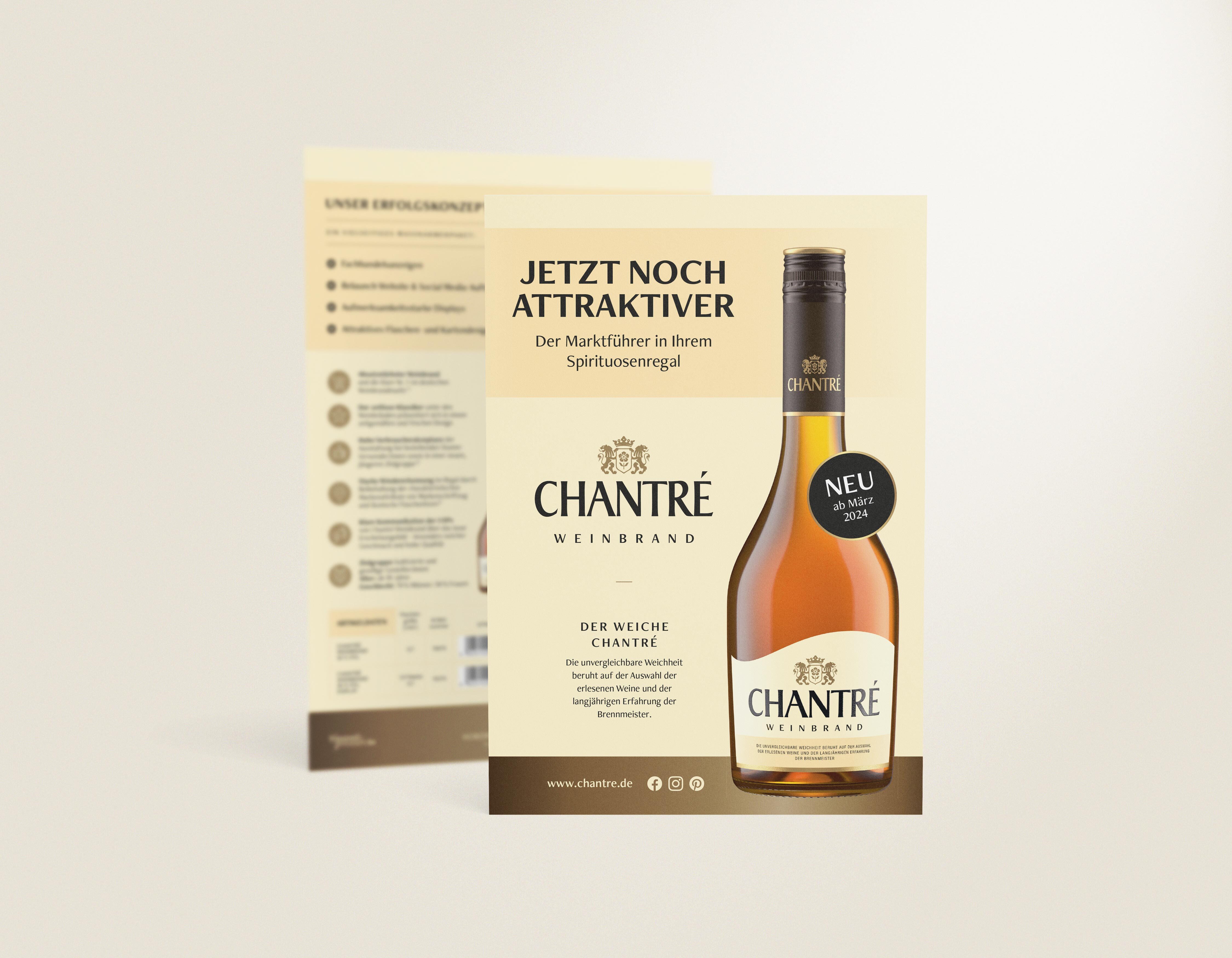
High-quality, modern and with a high recognition value - Germany's best-selling¹ brandy impresses with a new brand and packaging appearance.
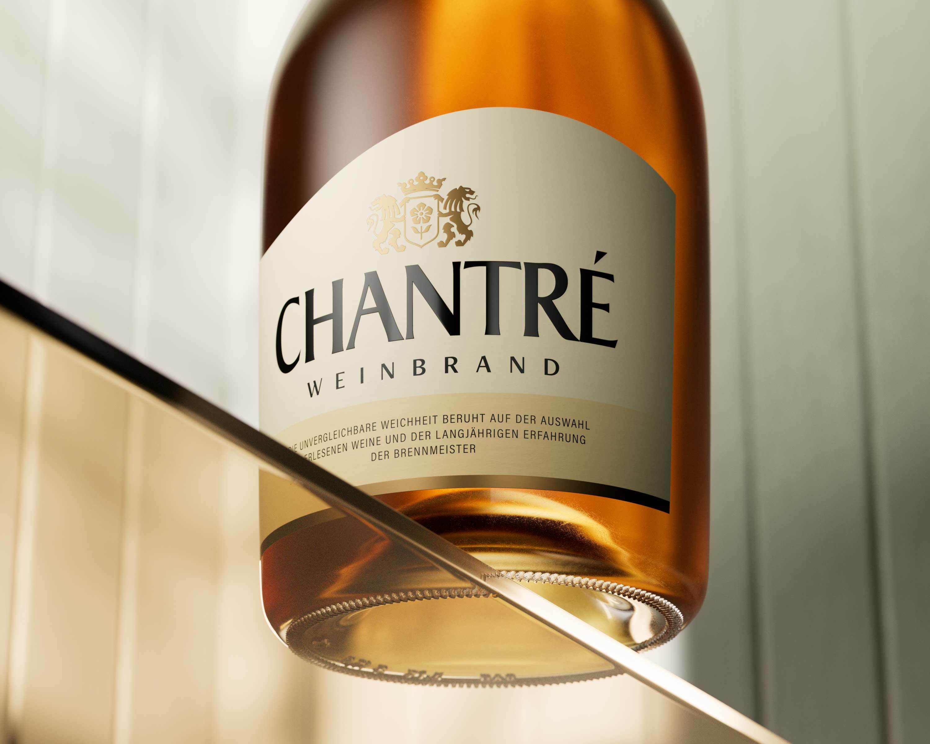


As part of an extensive relaunch, the outdated look of Chantré, Germany's leading brandy, was to be visually and emotionally upgraded. The aim was to appeal to a new, younger target group and breathe new life into the product category. When modernizing the brand and packaging design, the main aim was to ensure brand recognition while retaining essential elements such as the emblem and the characteristic bottle shape.
More contemporary and fresher, without forgetting its traditional roots - in the design of Chantré's new brand and packaging appearance, the traditional look has been replaced by a brighter, lighter and higher-quality overall impression. The focus of the new design is on the softness of the brandy, which is now communicated via the curved shape of the label. In addition, the reduced logo and new fonts contribute to the modern look and feel of the brand.
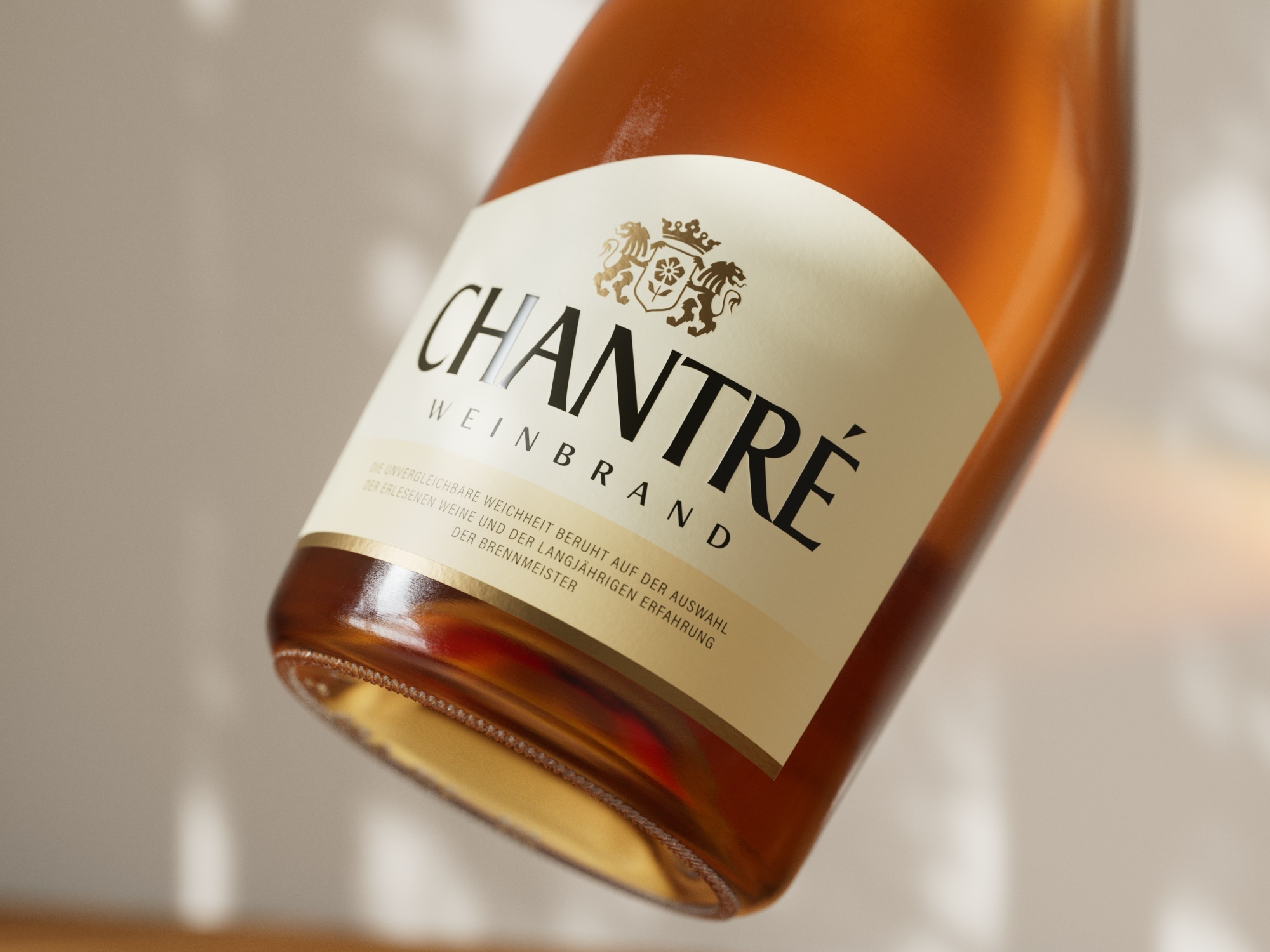
When optimizing the logo and coat of arms, a balance was struck between preserving the tried and tested and developing something new. The typography of the logo was retained, but modernized by slightly adjusting the spacing between the letters and eliminating unnecessary effects such as shadows. In addition to the lettering, the coat of arms, a brand component with a high recognition value, was also upgraded in terms of color and visuals so that it could be used in a variety of media from now on.
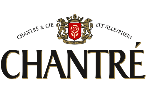
Before
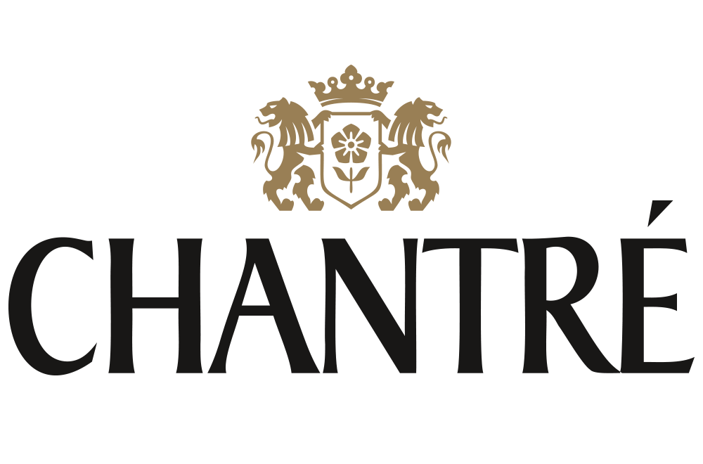
After
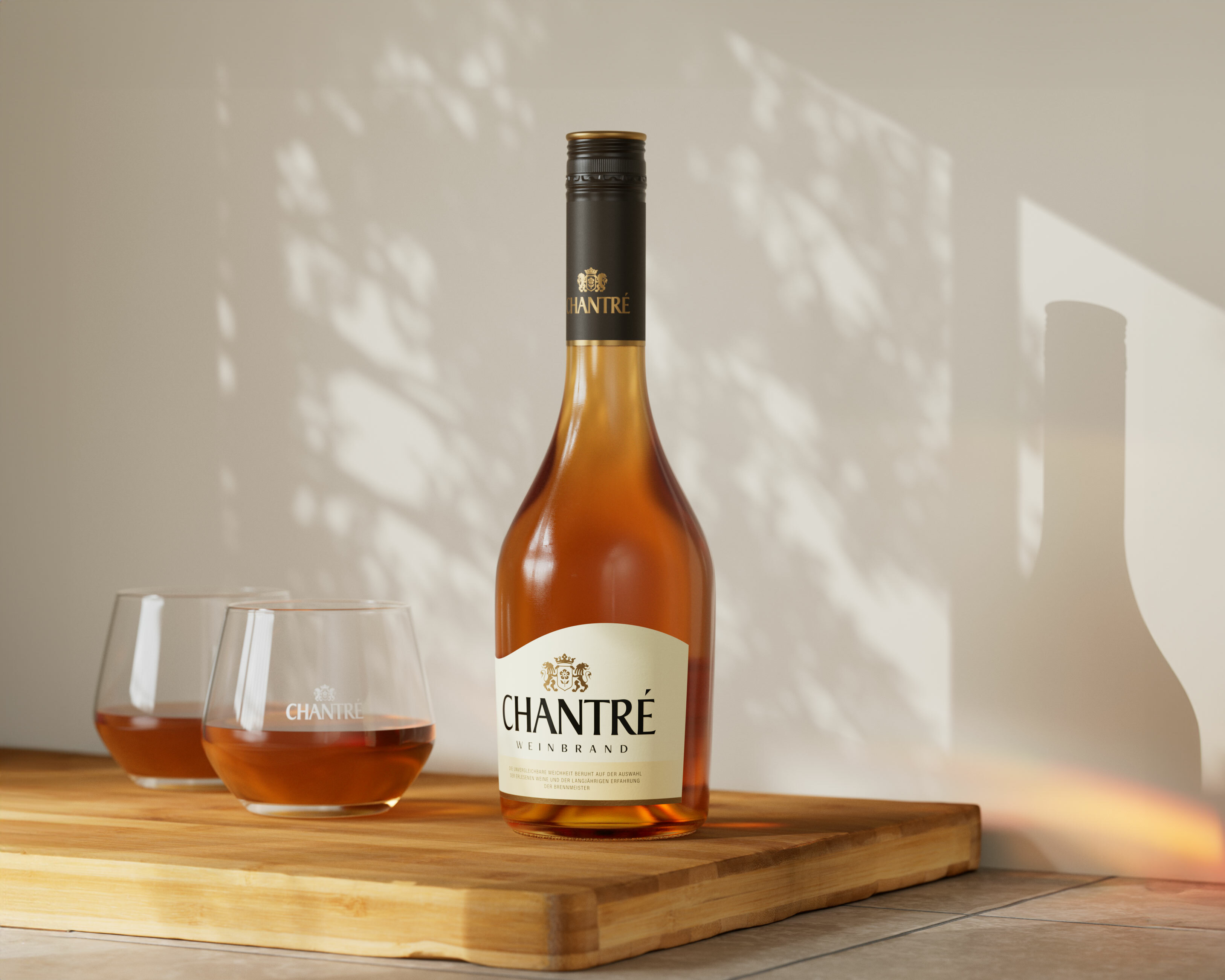
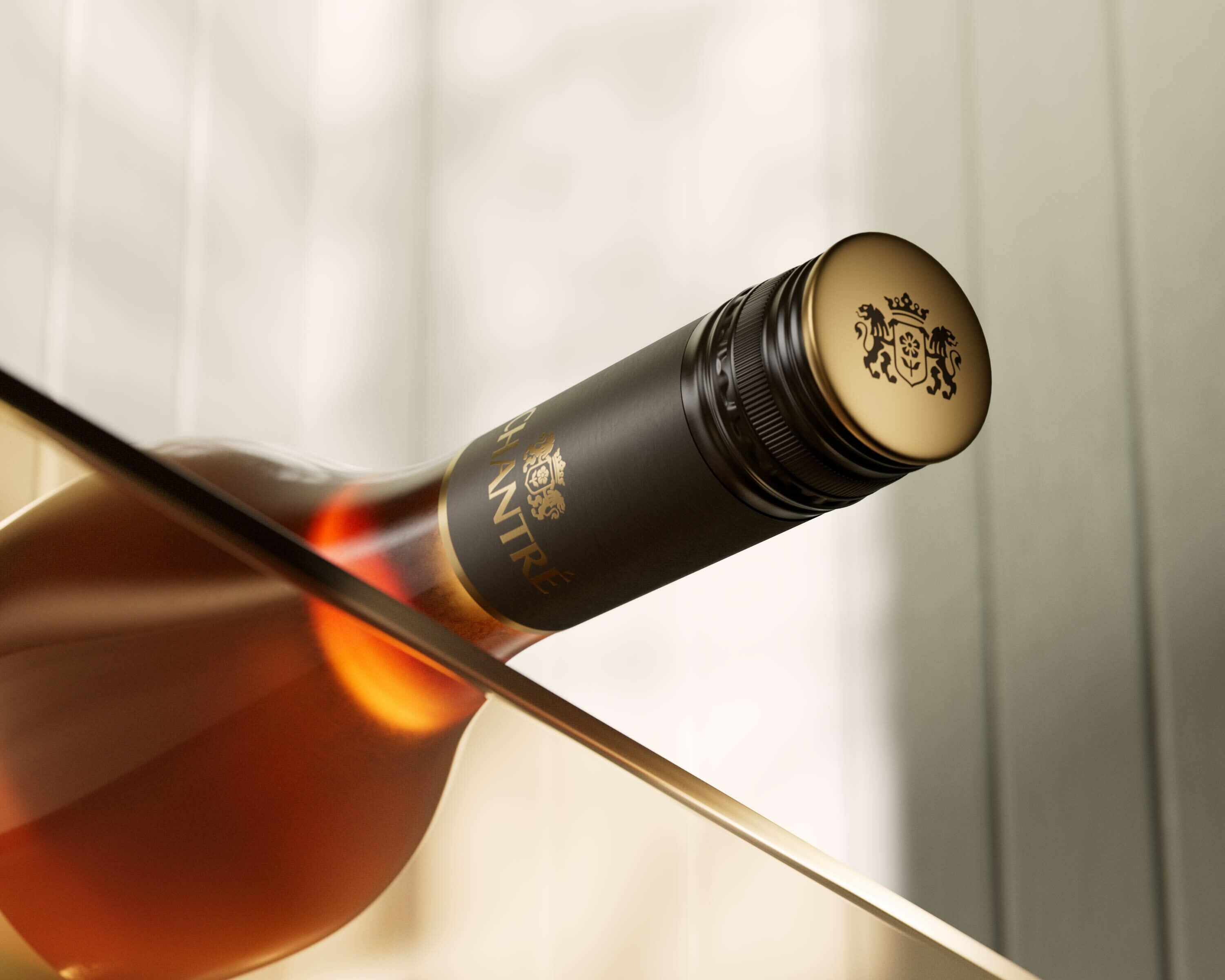
The neck label has been extended and now features a high-quality matt black finish with the closure. The wave shape of the now lighter body label symbolizes and underlines the softness of the brandy.
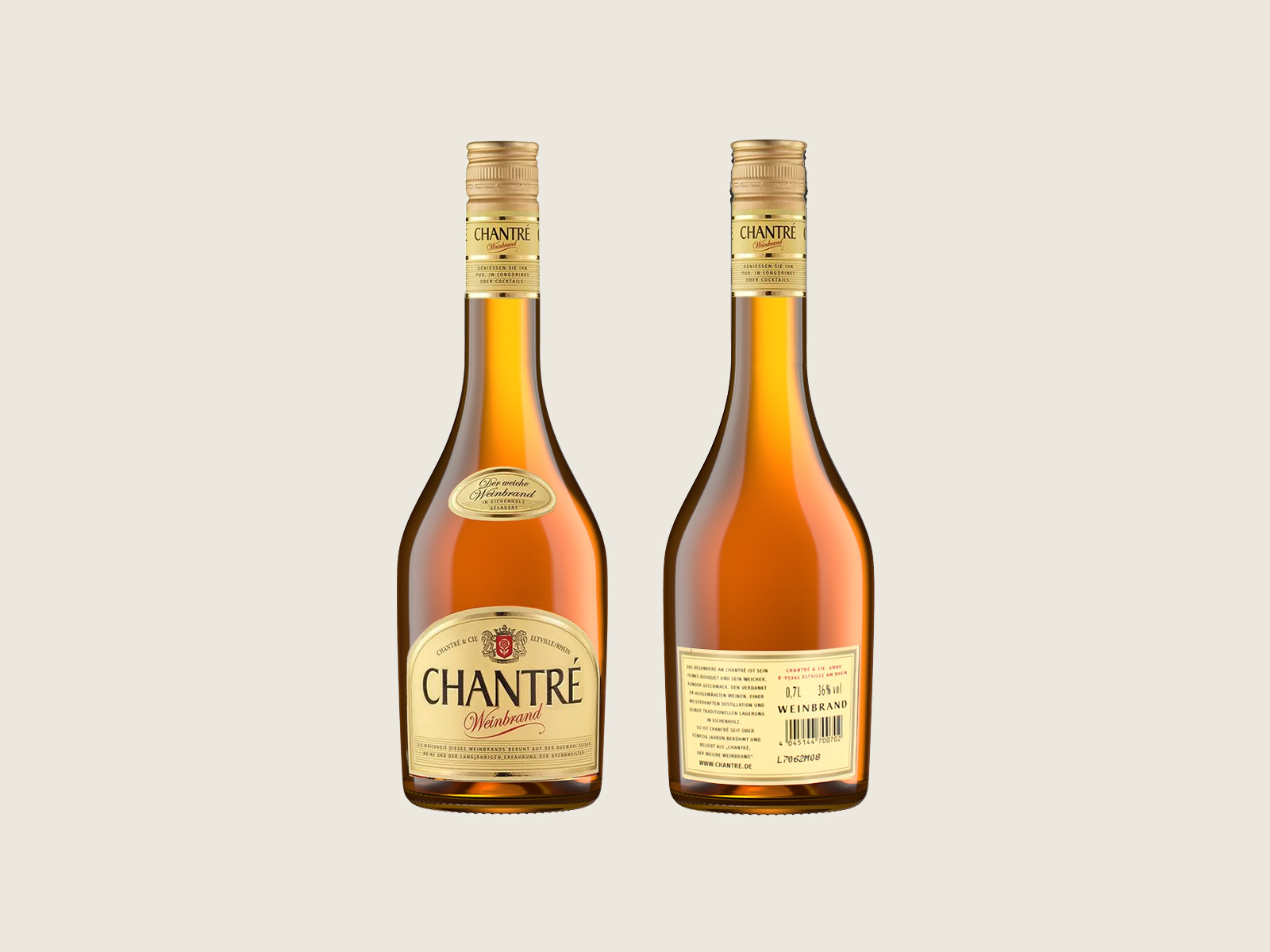
Before
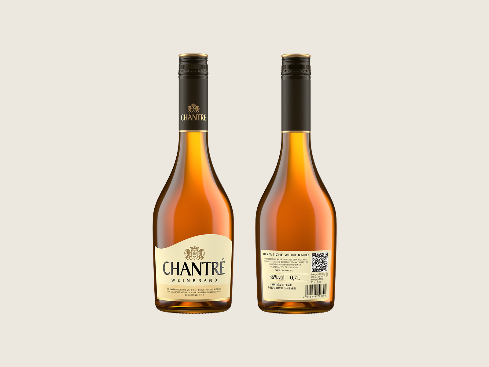
After
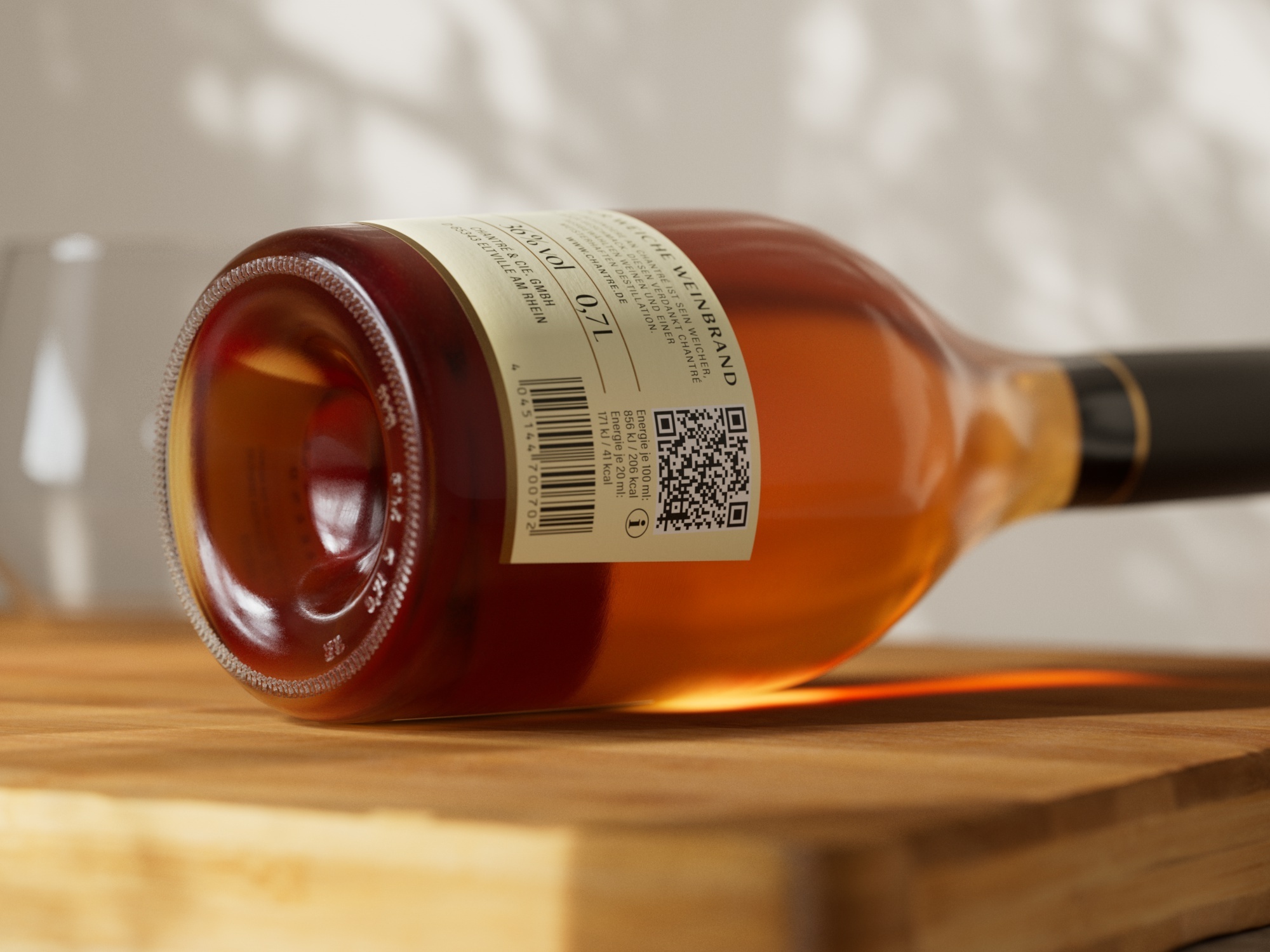
“We are delighted with the positive feedback and the resulting extensive relaunch, which will give our image a clear boost in terms of modernity and visually emphasize the high product quality that has always been our hallmark.”
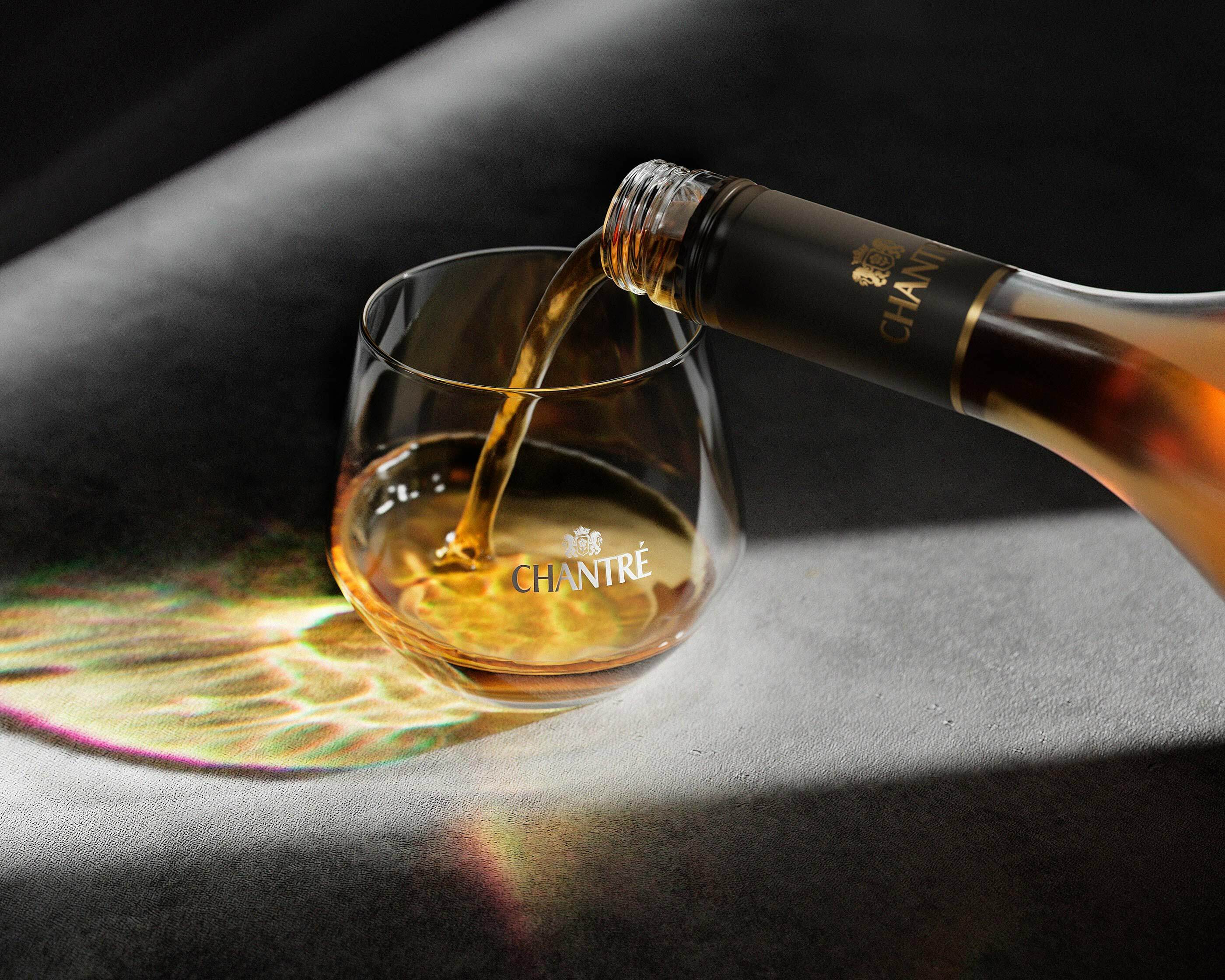
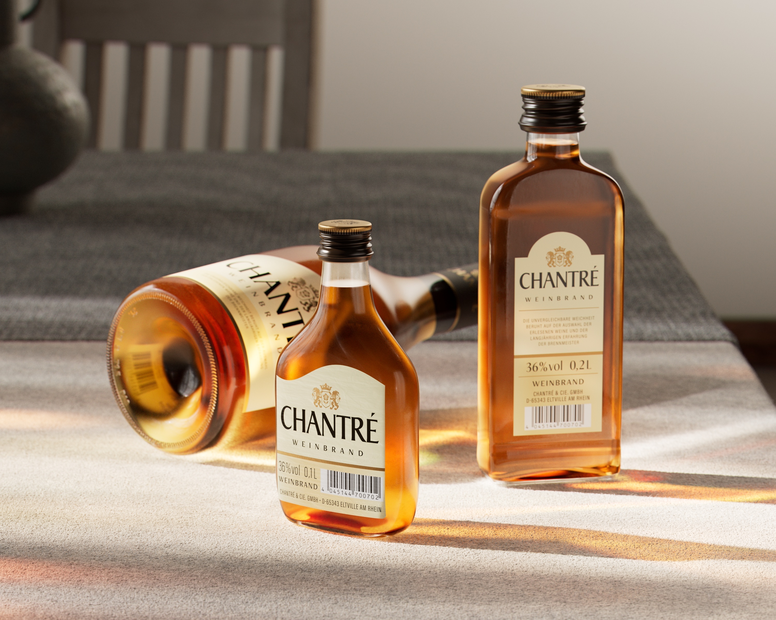
The remaining Chantré container sizes will also appear in the new design in the future, with more modern labeling and the matt black cap design, which was particularly convincing in the Mafo.
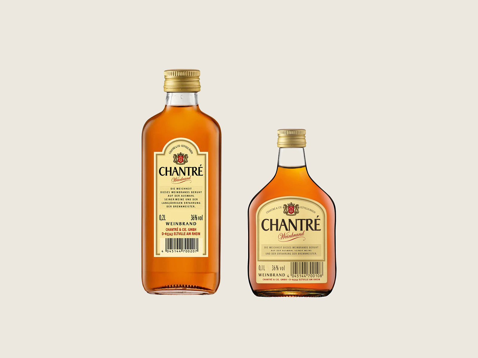
Before
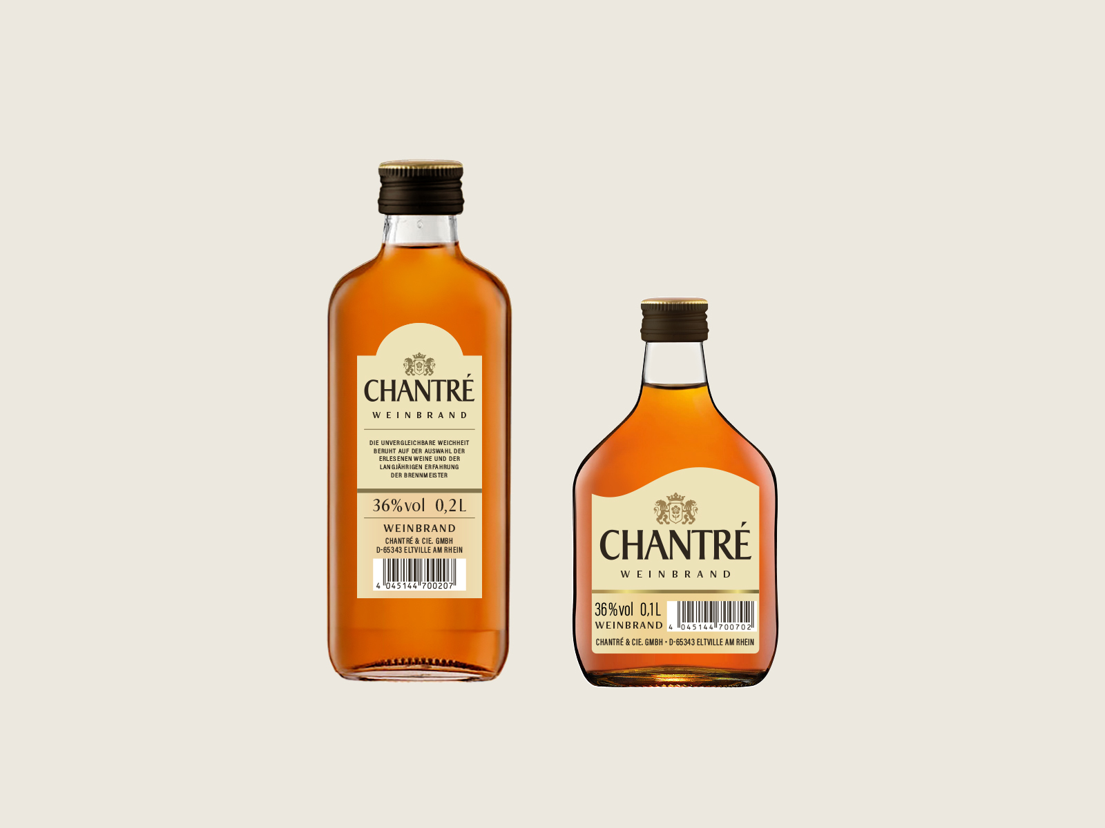
After
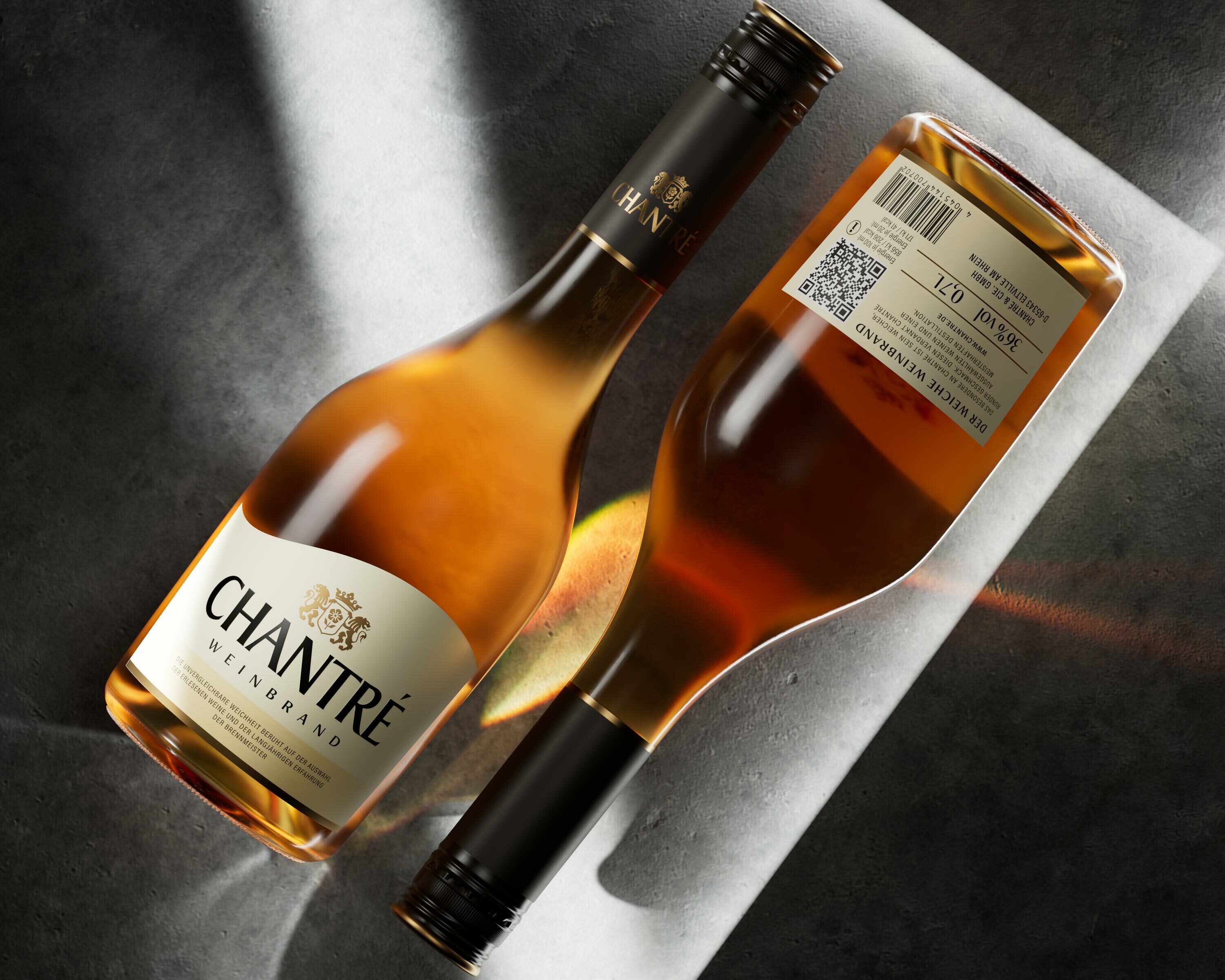
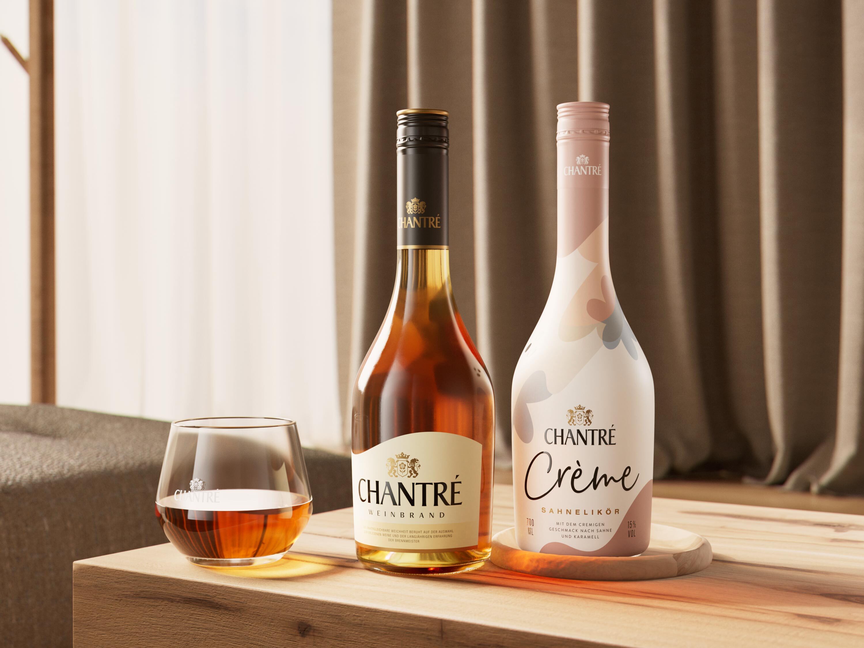
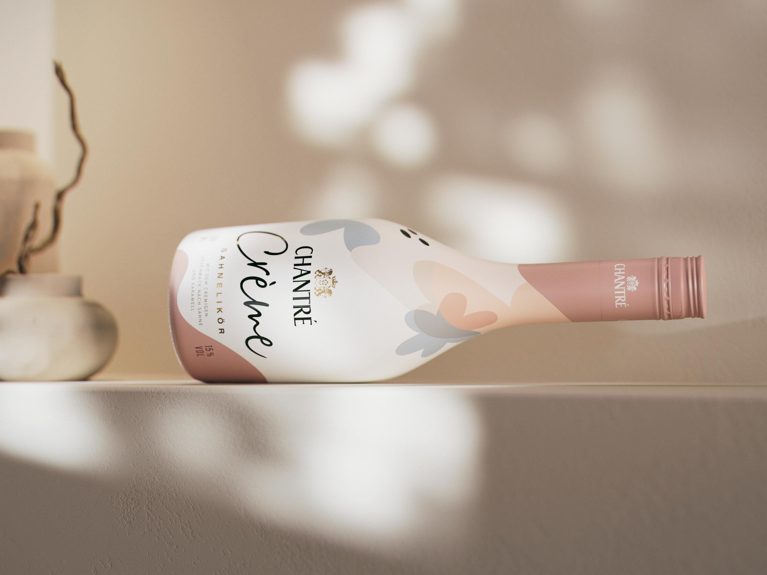
The rebranding of Chantré brandy marks the start of further strategic measures. With the expansion of the product range and the launch of a new cream liqueur, the brand is increasingly targeting a younger and particularly female target group.
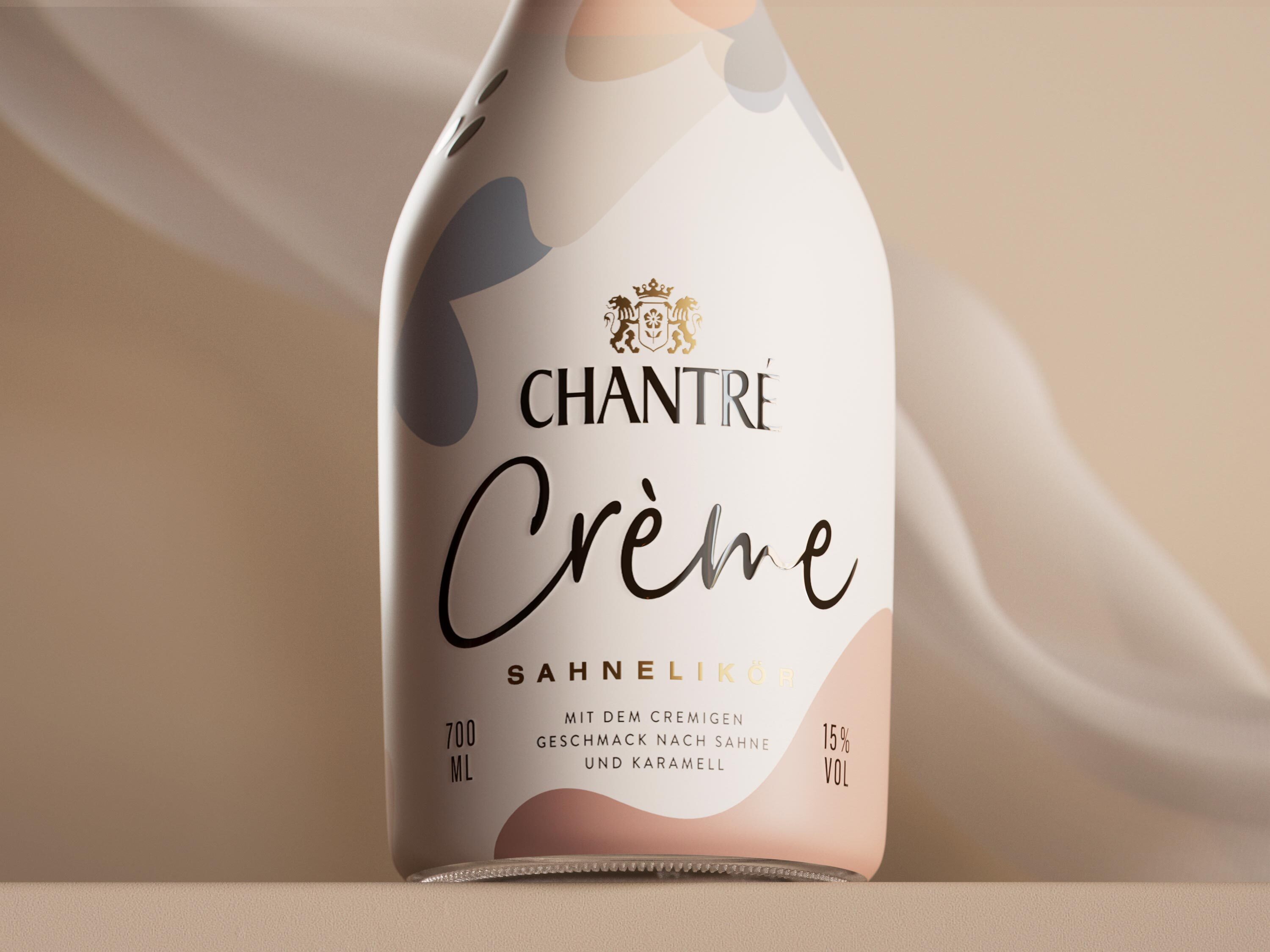
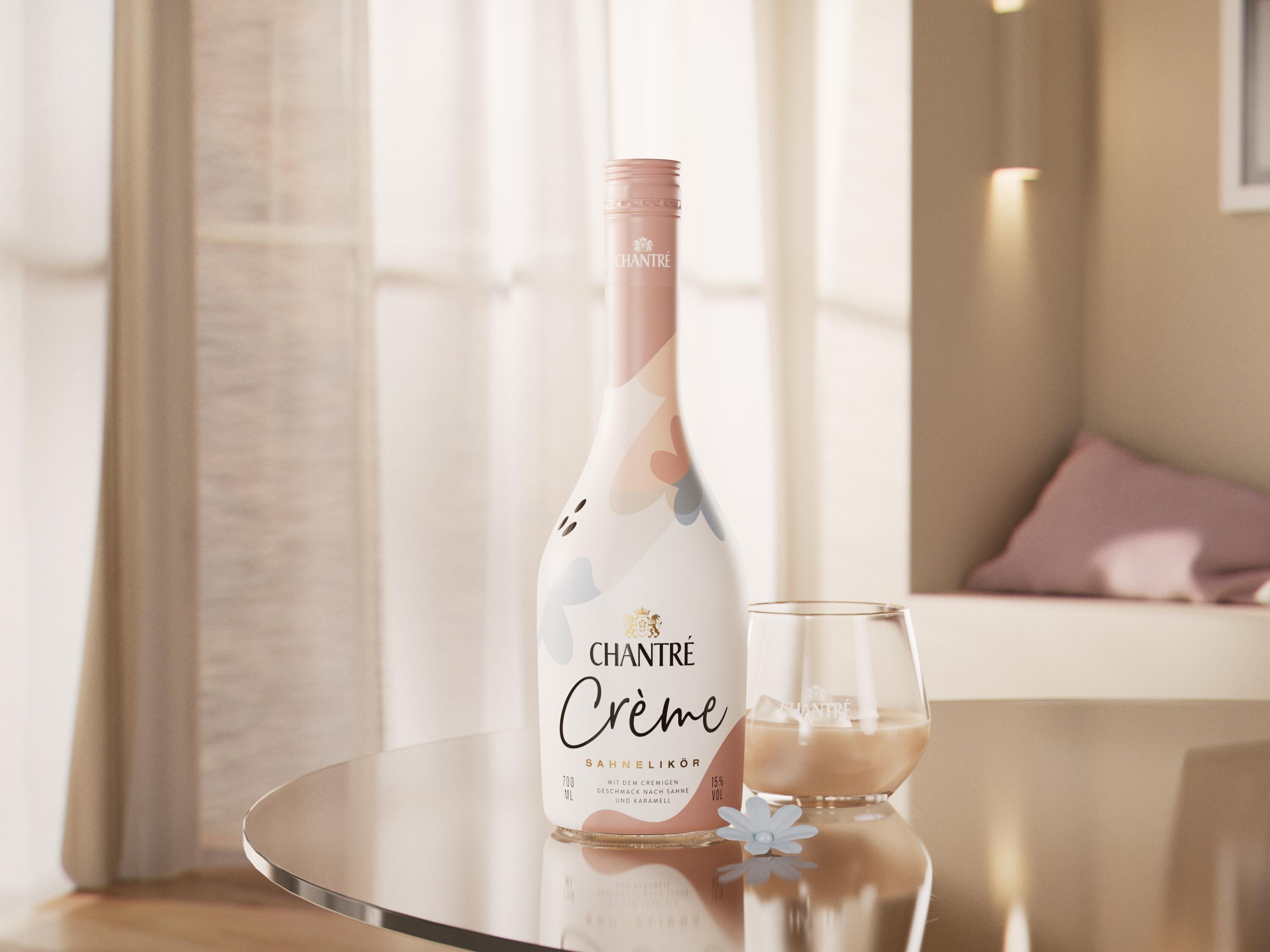
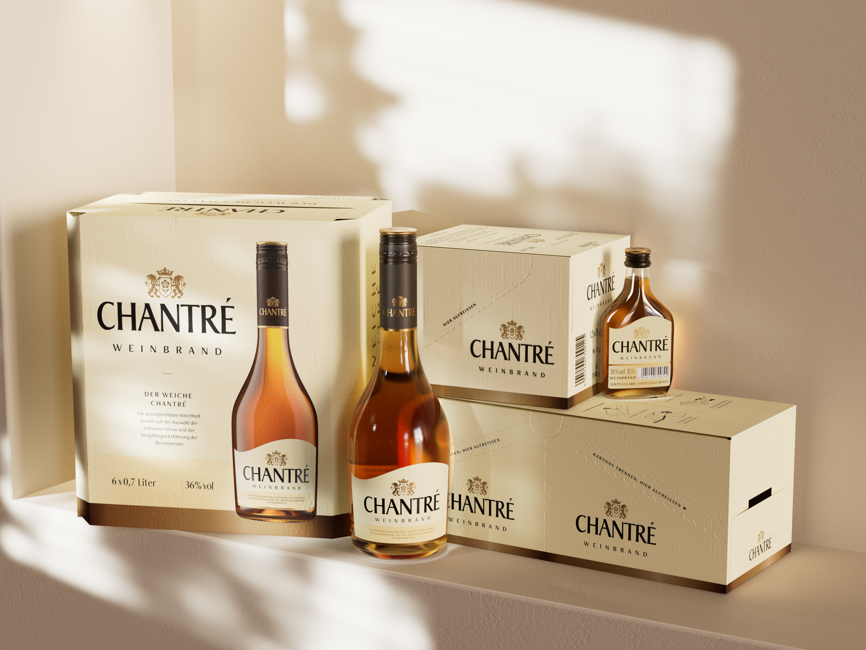
At the POS, Chantré also features an attractive new design on the shipping cartons. The focus is on the striking illustration of the bottle and the appealing color of the warm, soft liquid.
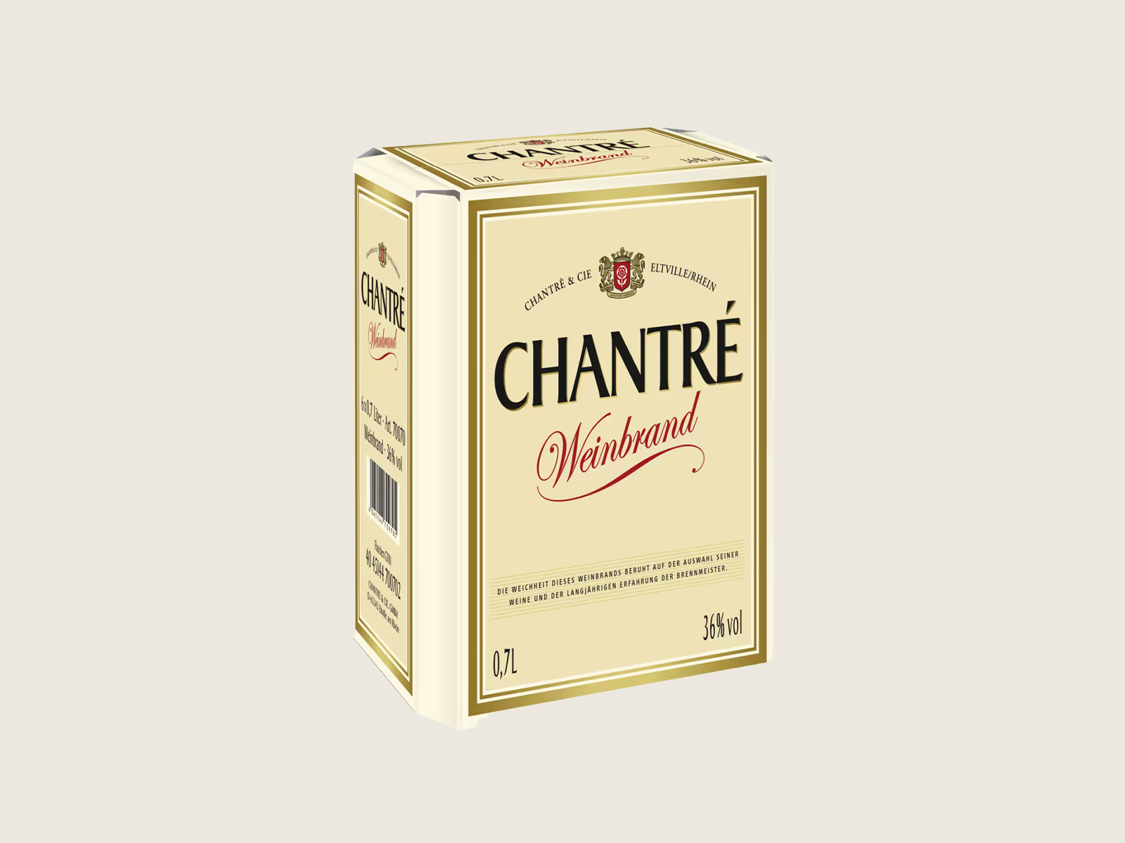
Before
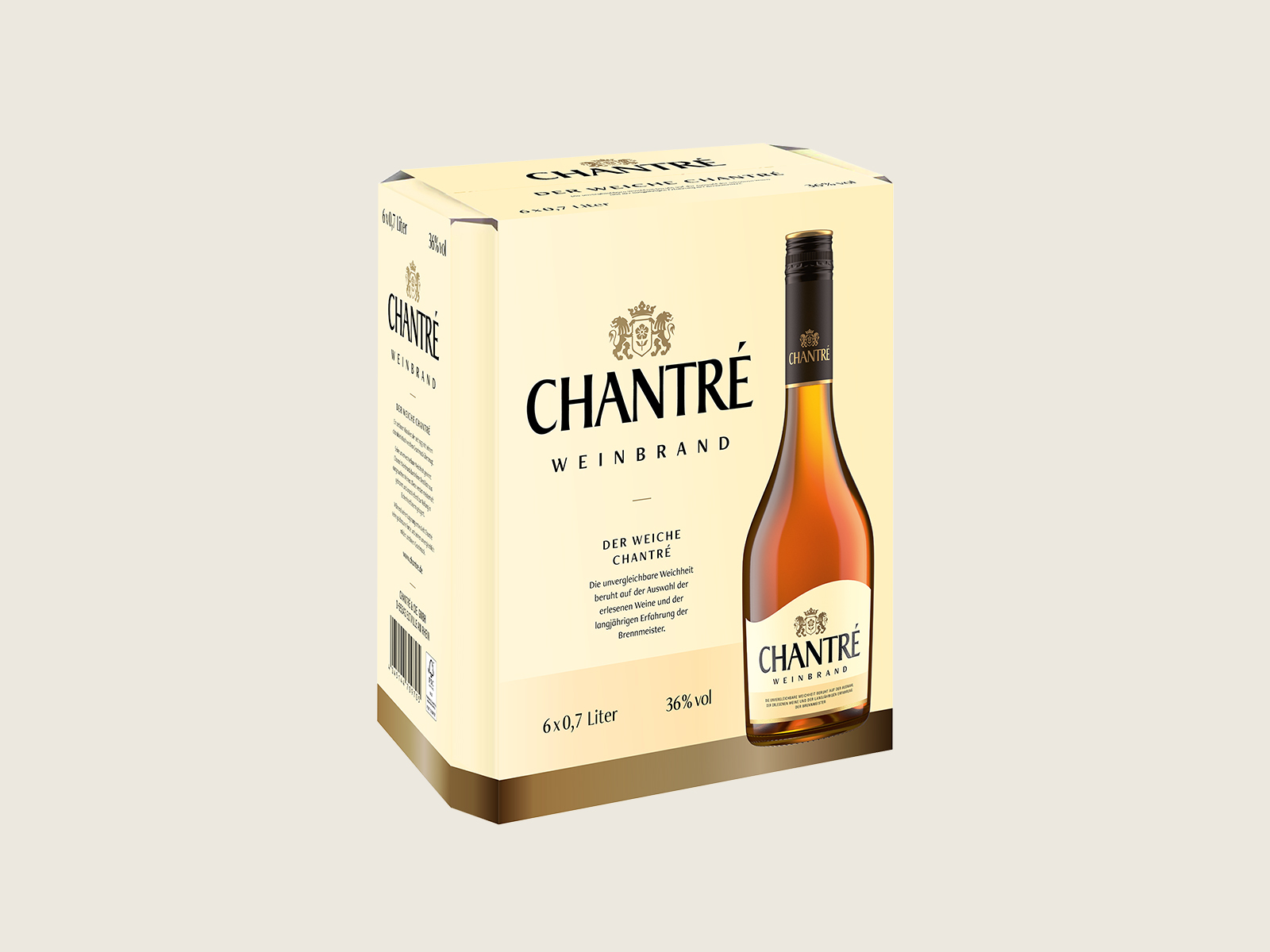
After
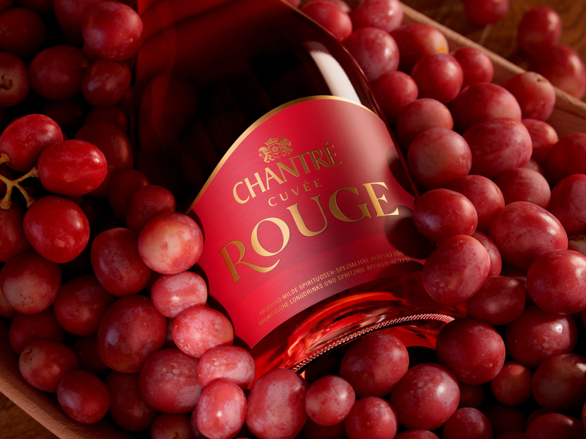
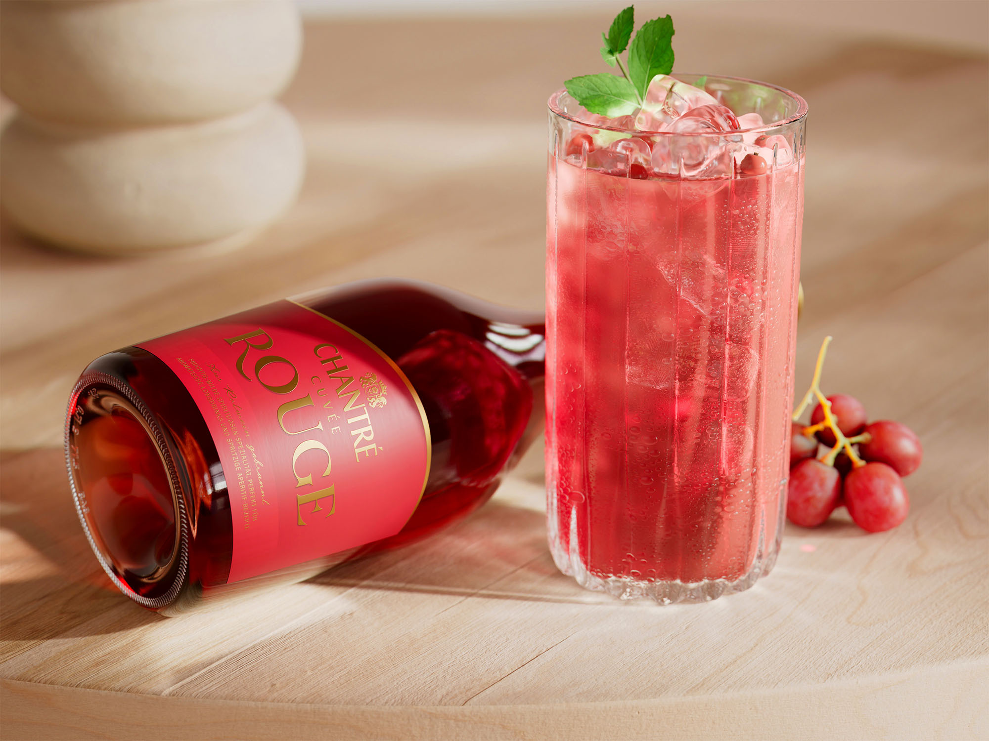
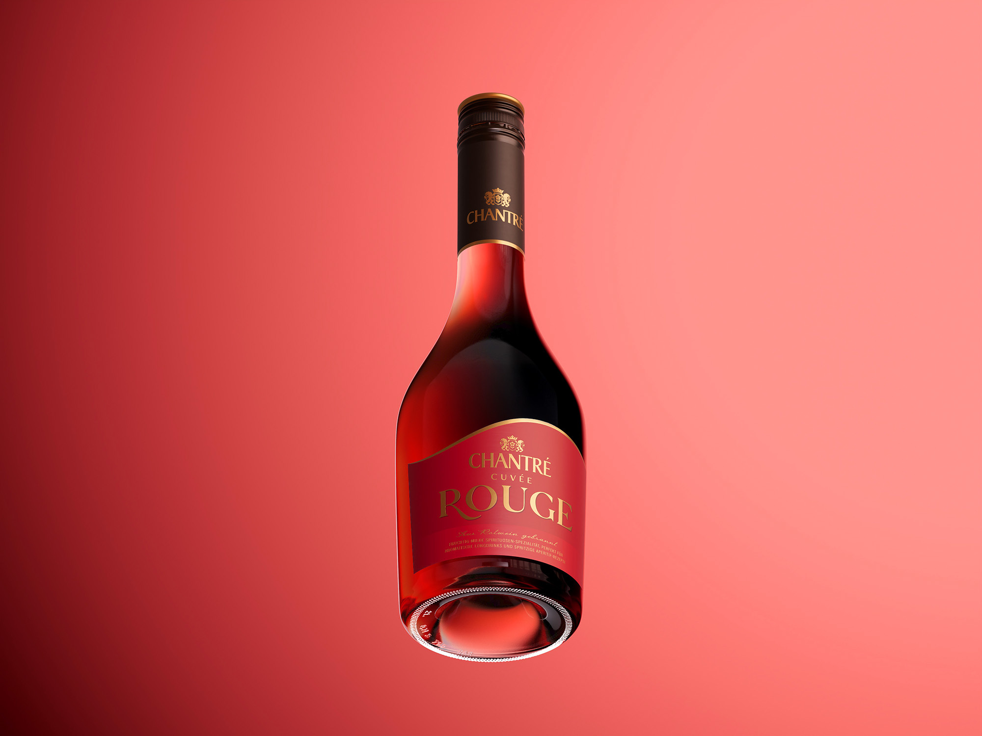
In addition to the use of new fonts and colors, the focus of the communication work was on creating dynamic 3D packshots. These photorealistic, high-resolution renderings are indistinguishable from traditional product photography and are superior to it in many respects. Appealing 3D product visualizations are thus available for print and online communications, which can be individually adapted in any desired perspective.
Source: