Müller's own brand CV (Cadea Vera) offers highly effective facial care for all requirements.
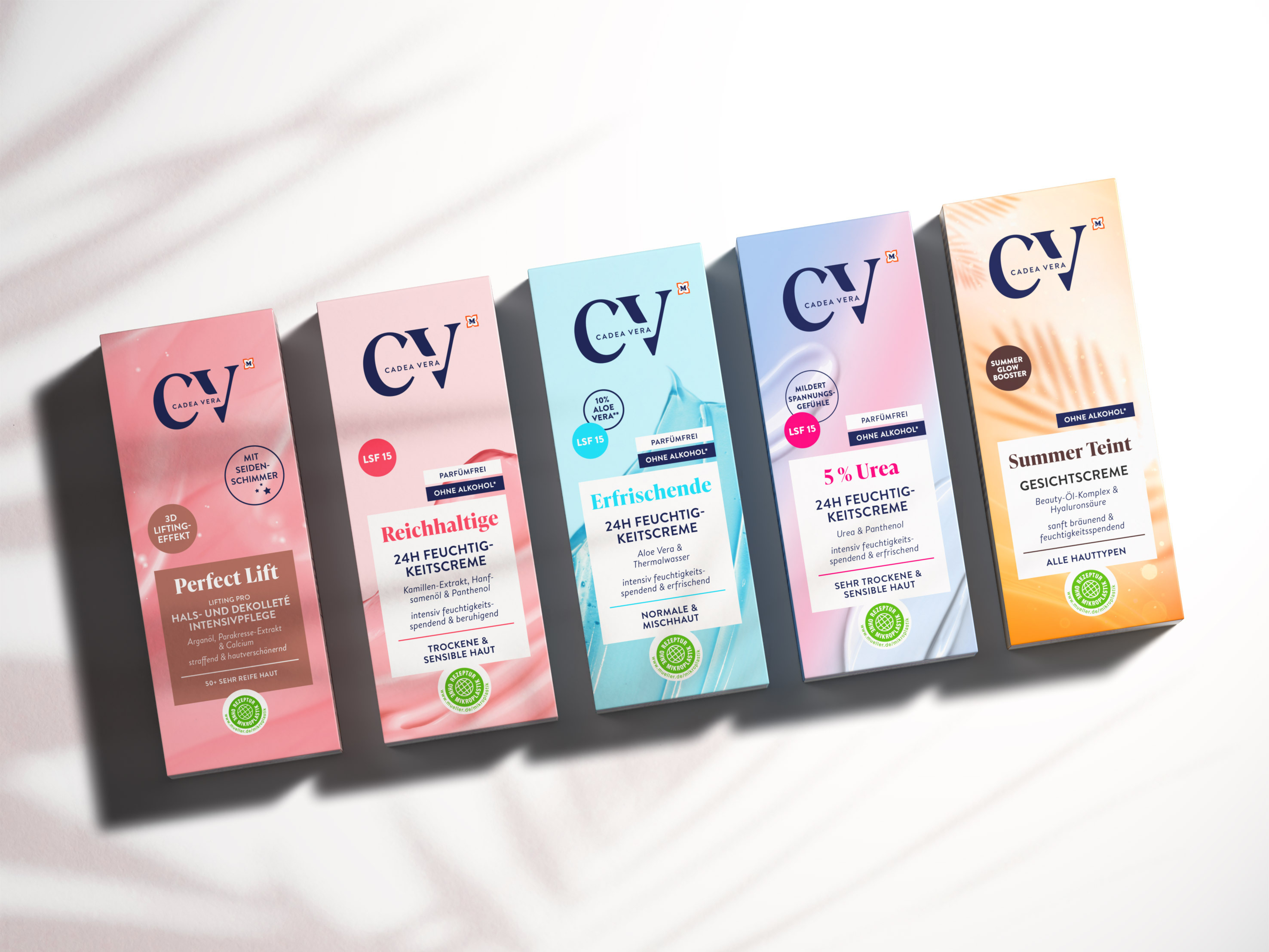
The design of the 120 articles of Müller's own brand CV no longer corresponded to current market conditions. A very large brand logo, poorly legible fonts and dominant background images were distracting from the product claims. The challenge for us was to create a new, coherent design concept that could be applied to all products, optimize their segmentation and at the same time increase brand awareness at the point of sale.
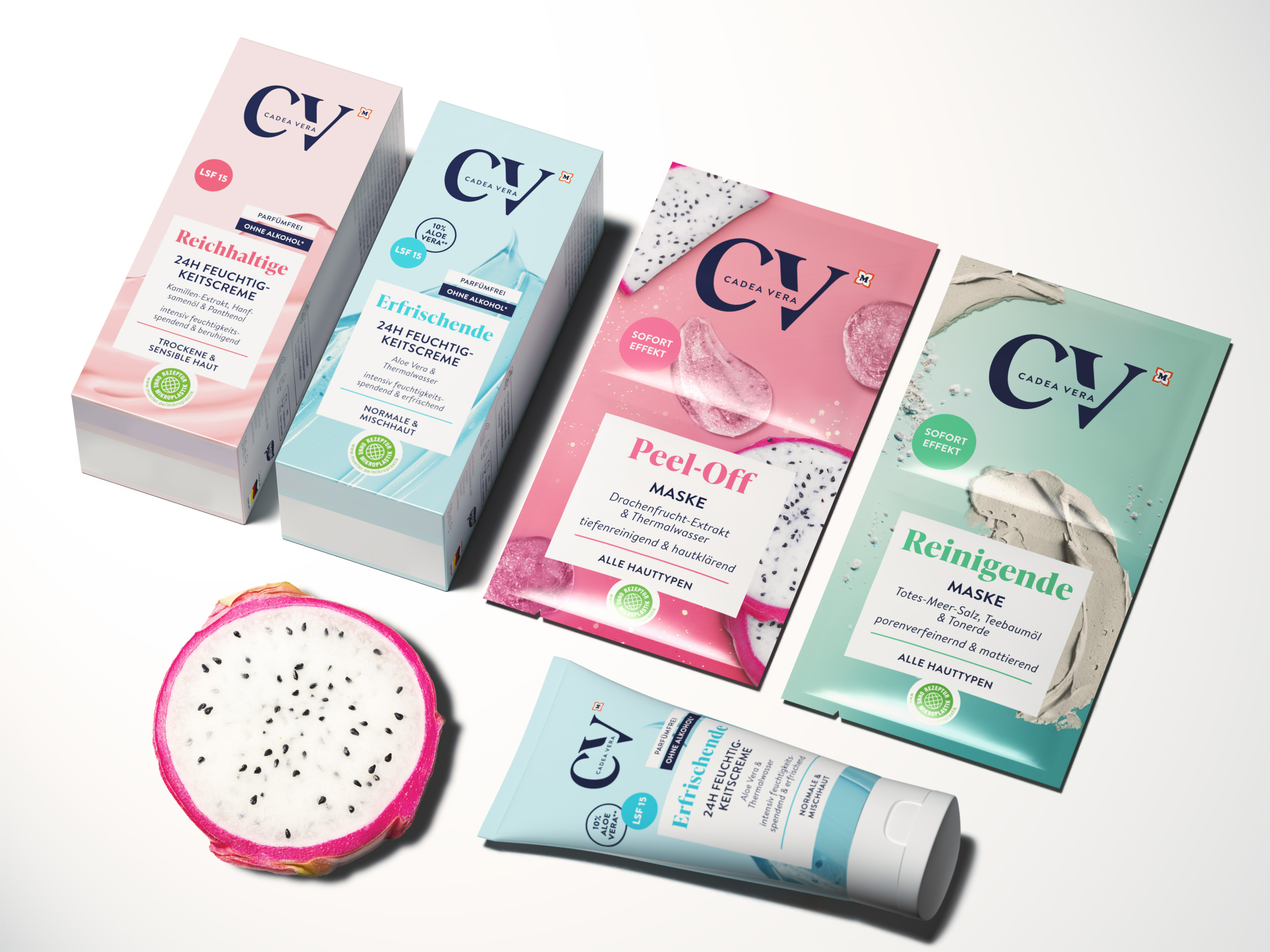
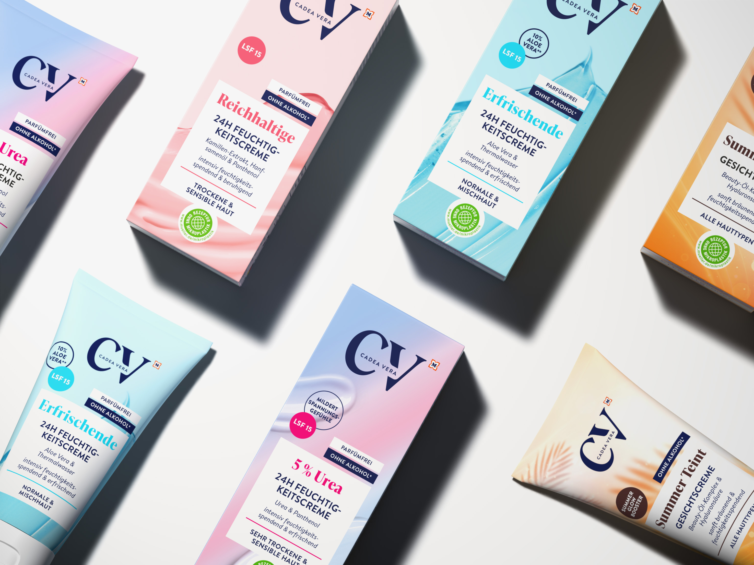
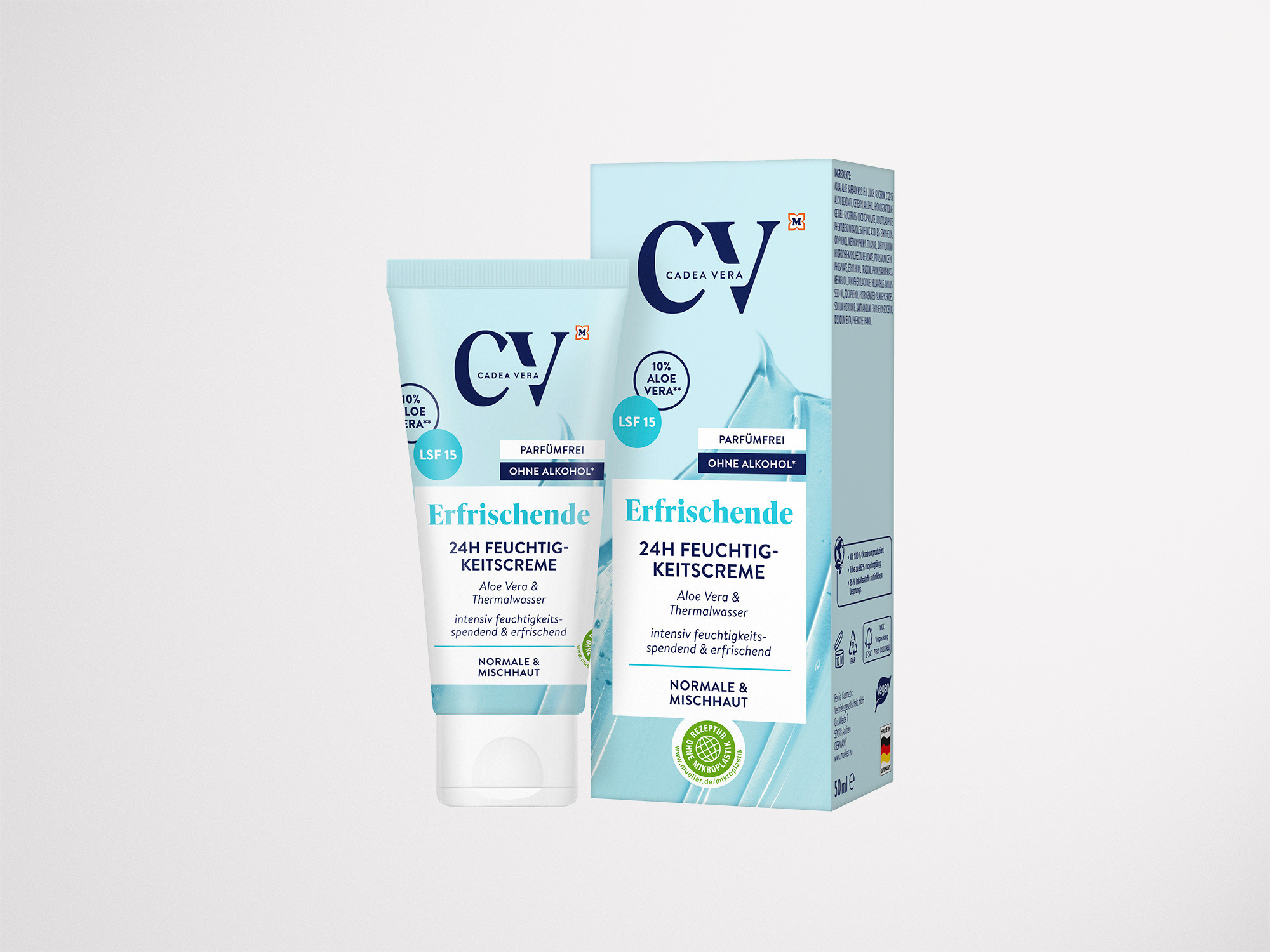
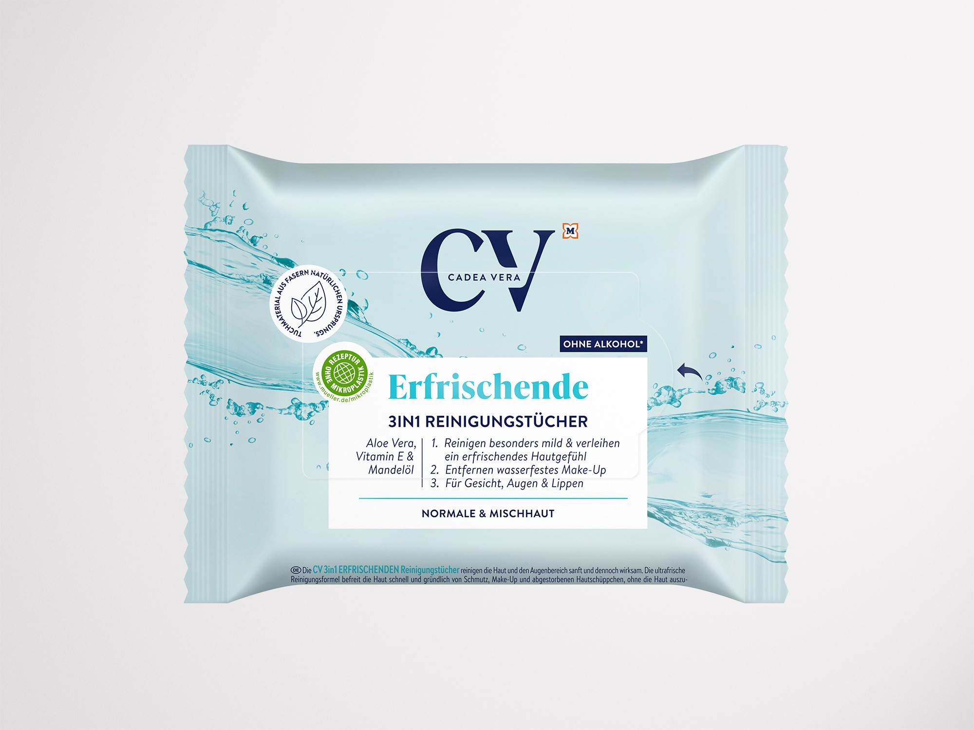
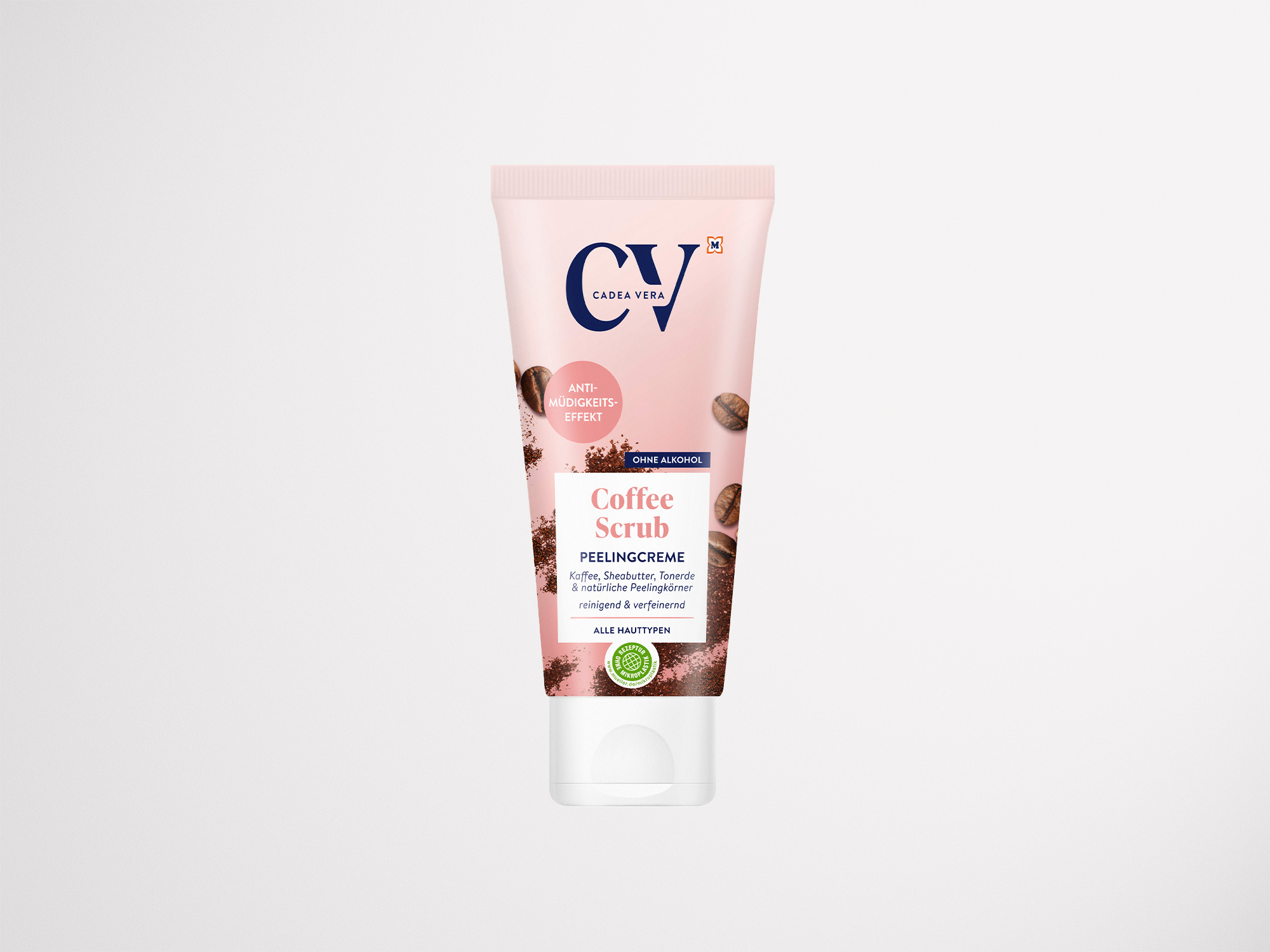
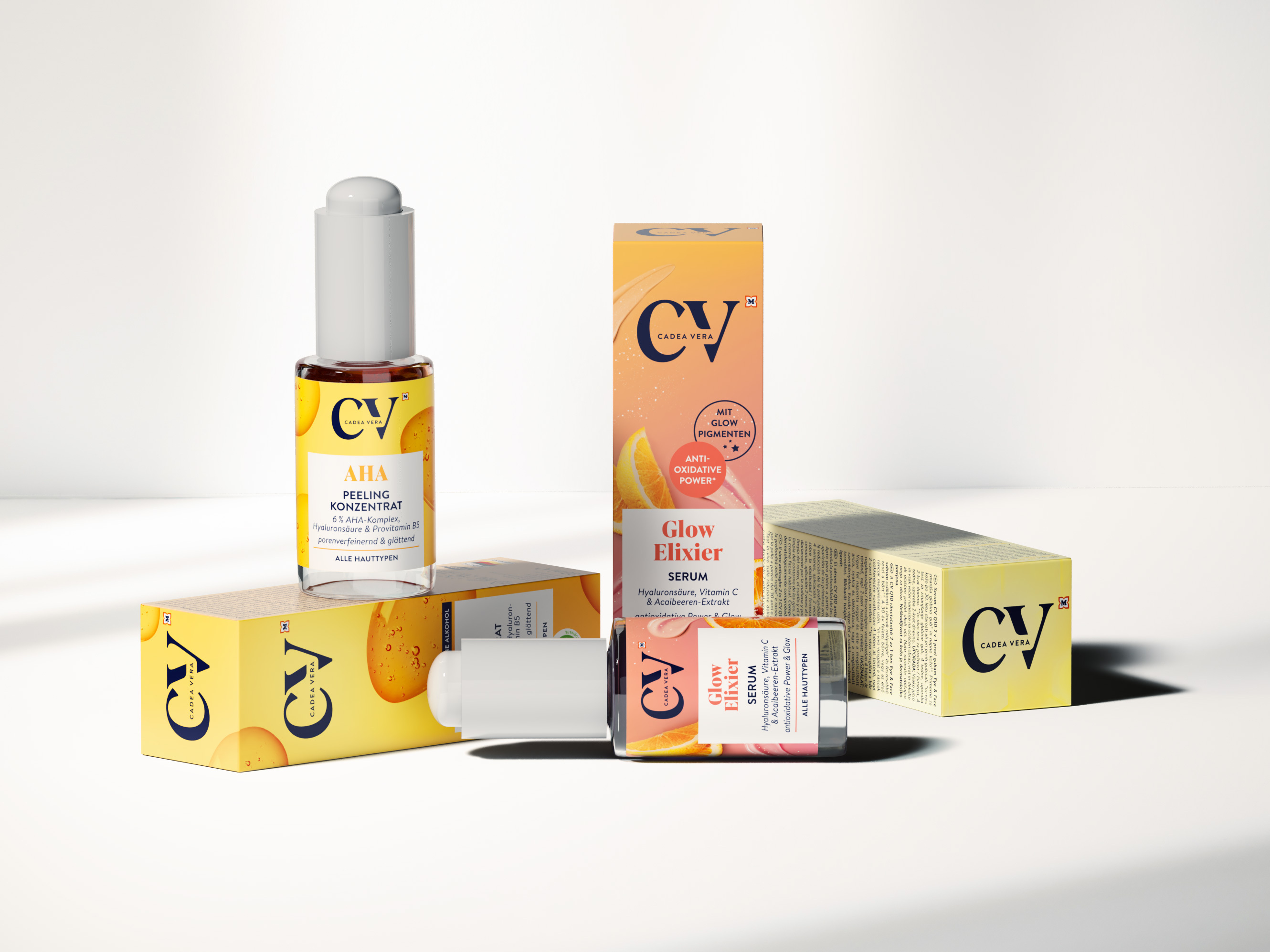
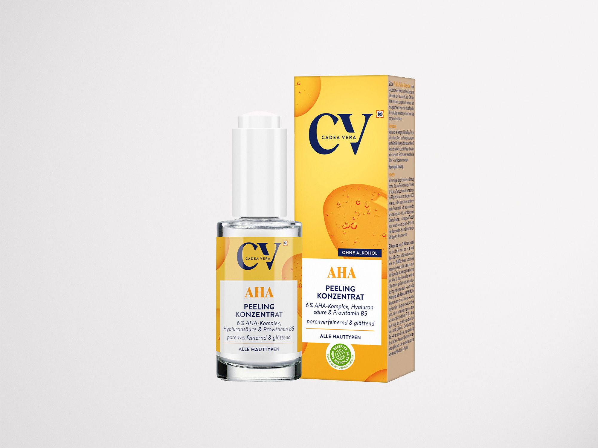
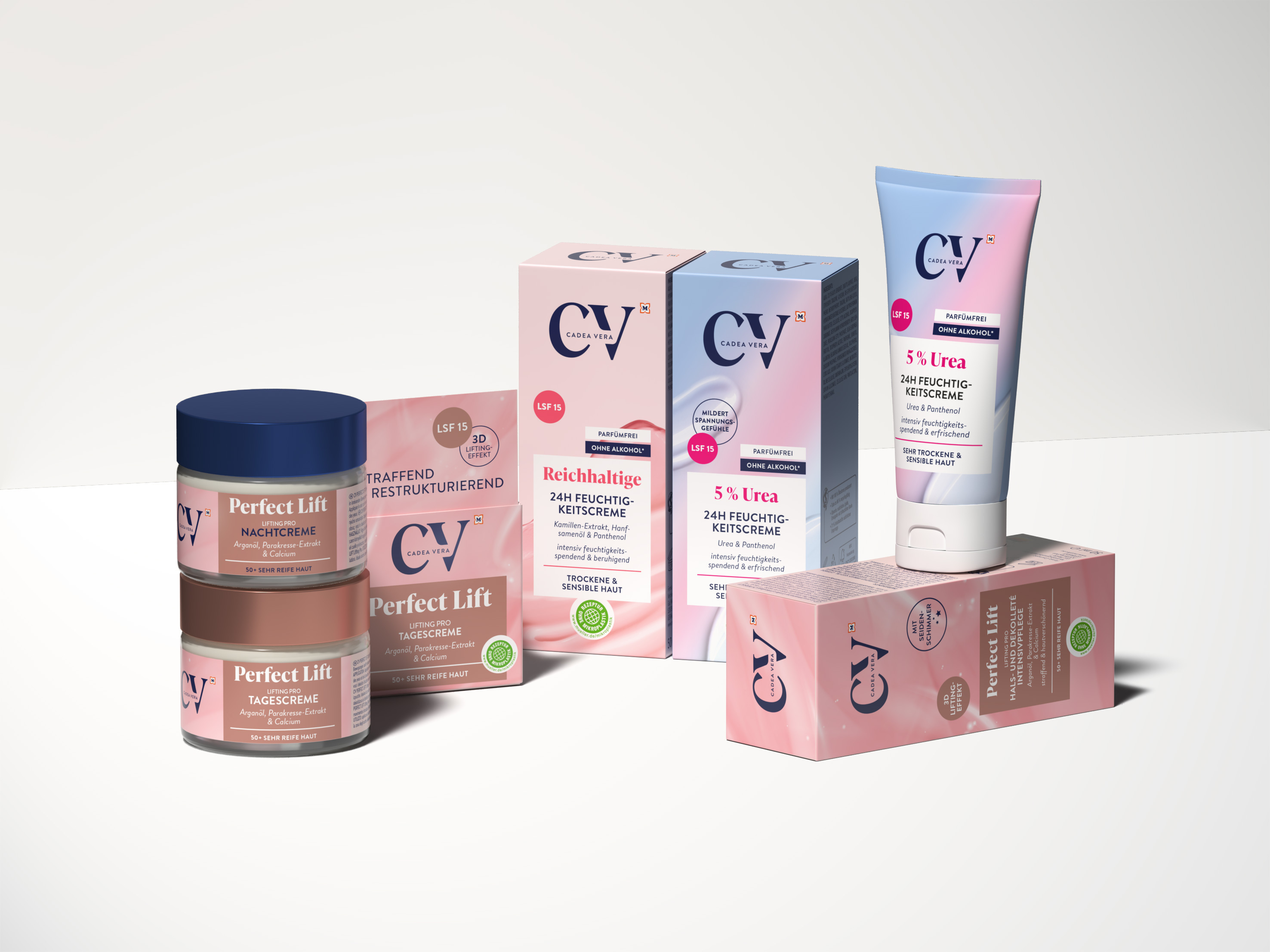
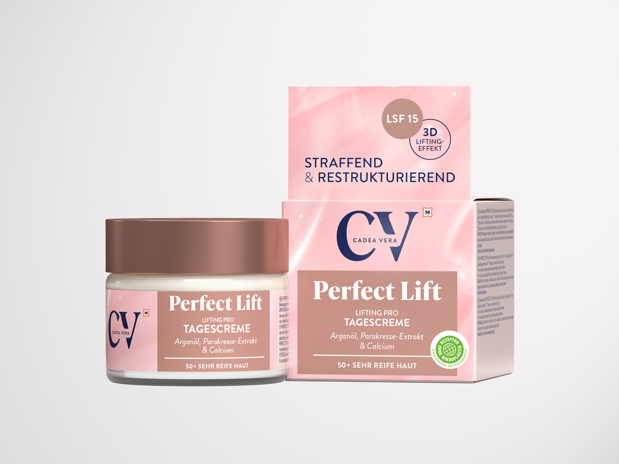
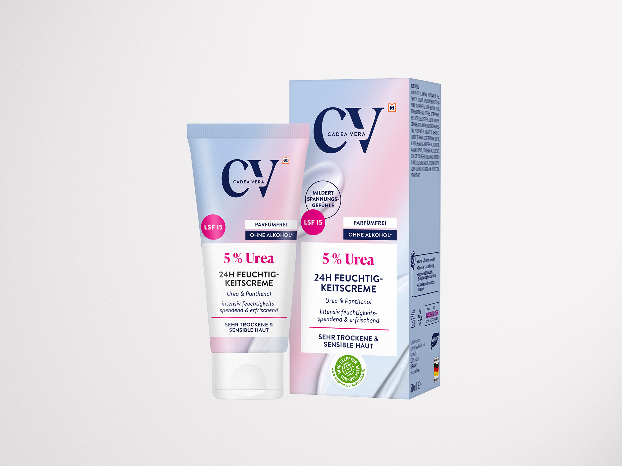
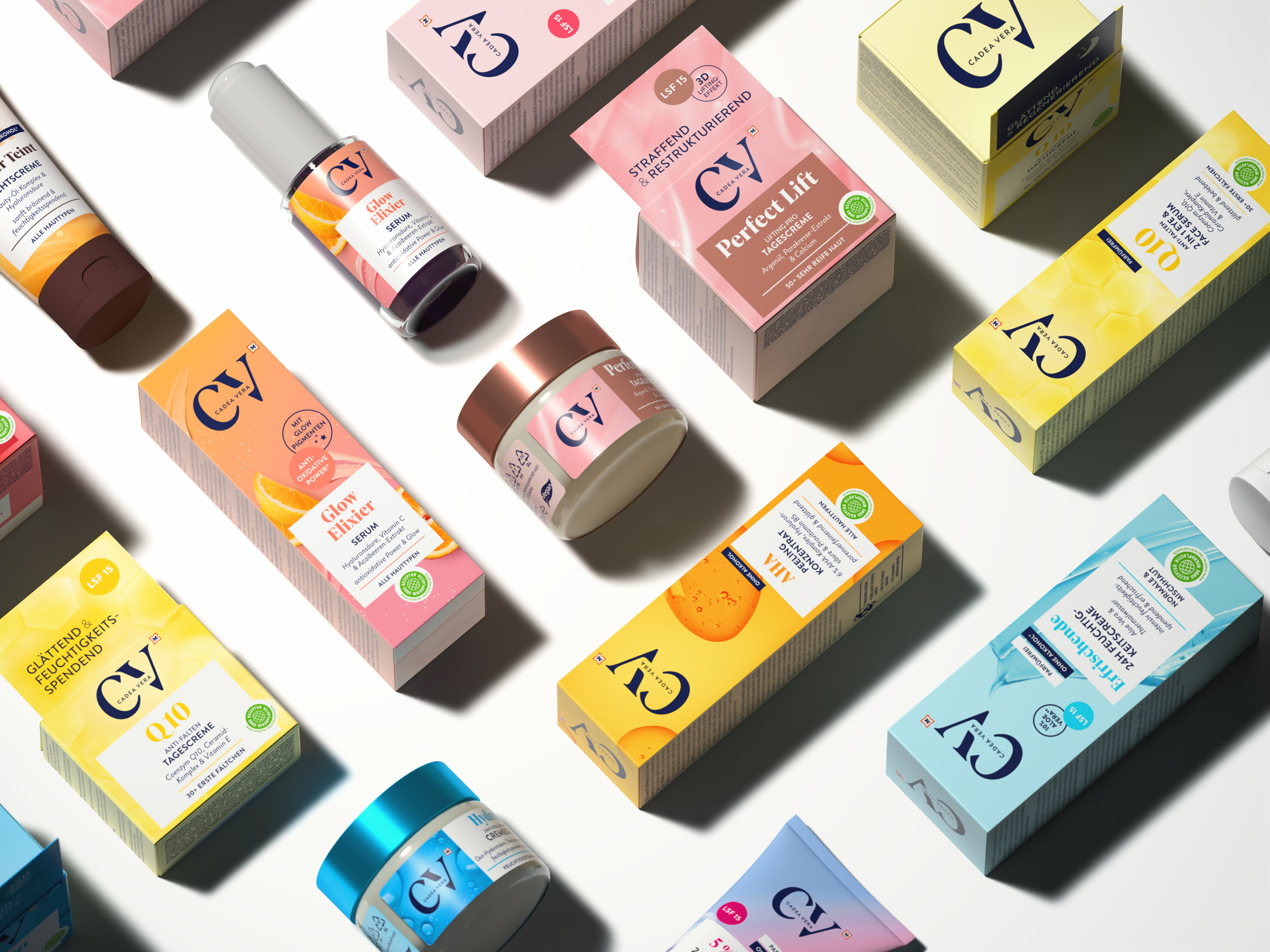
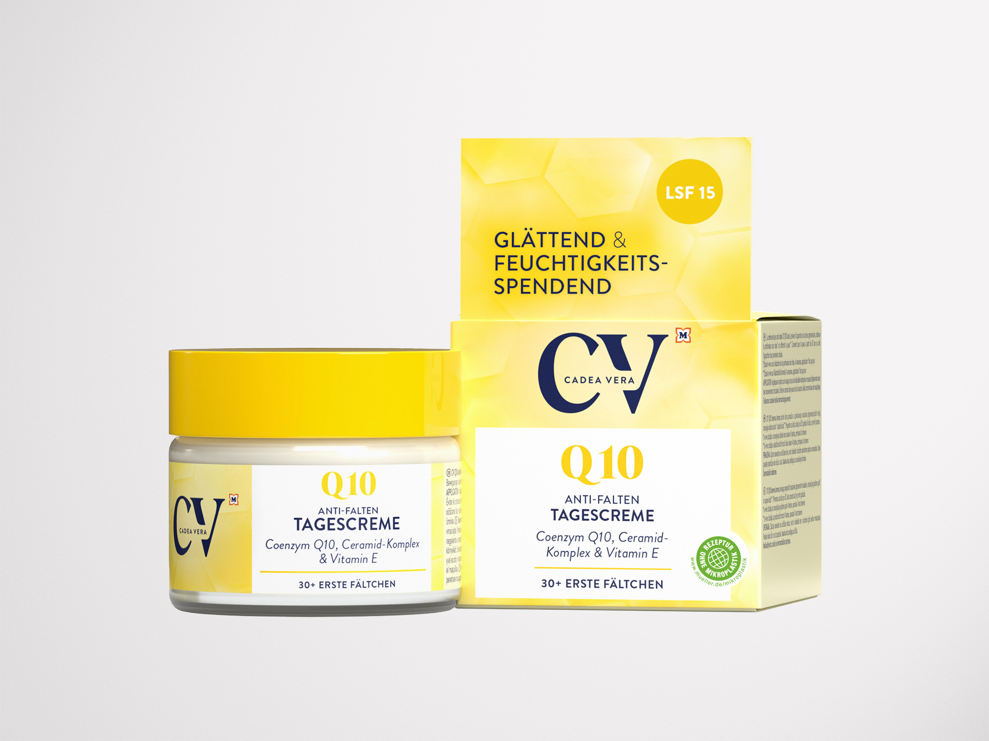
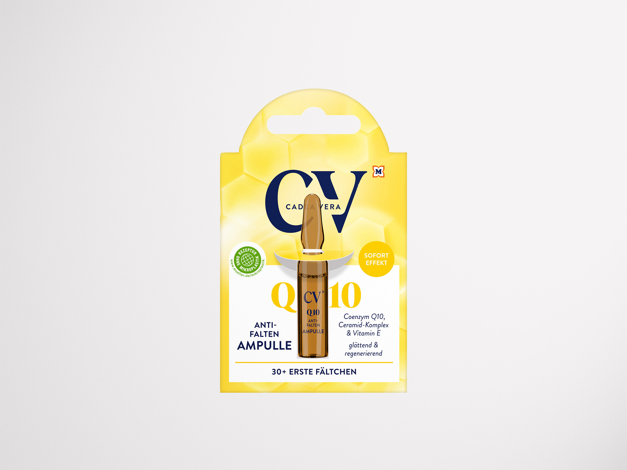
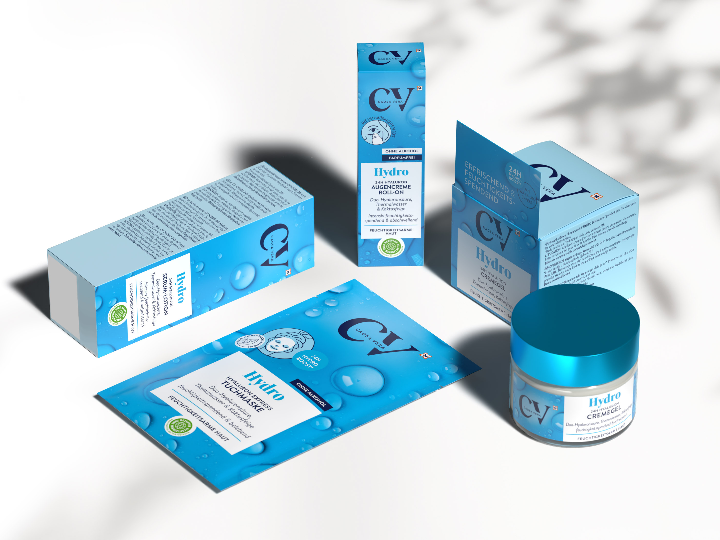
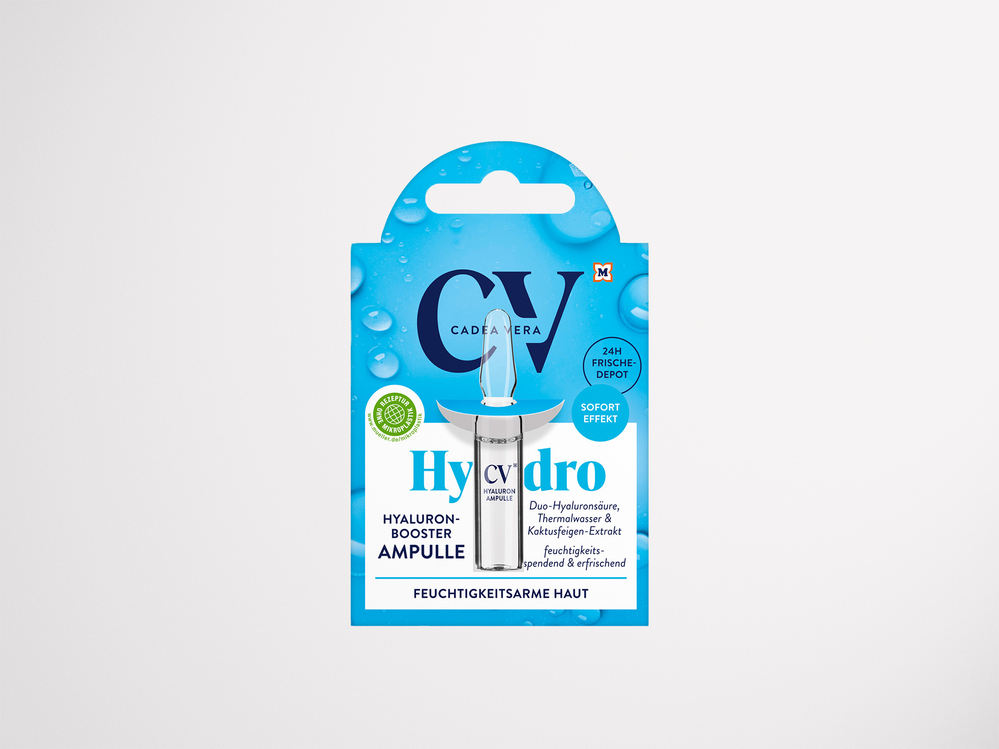
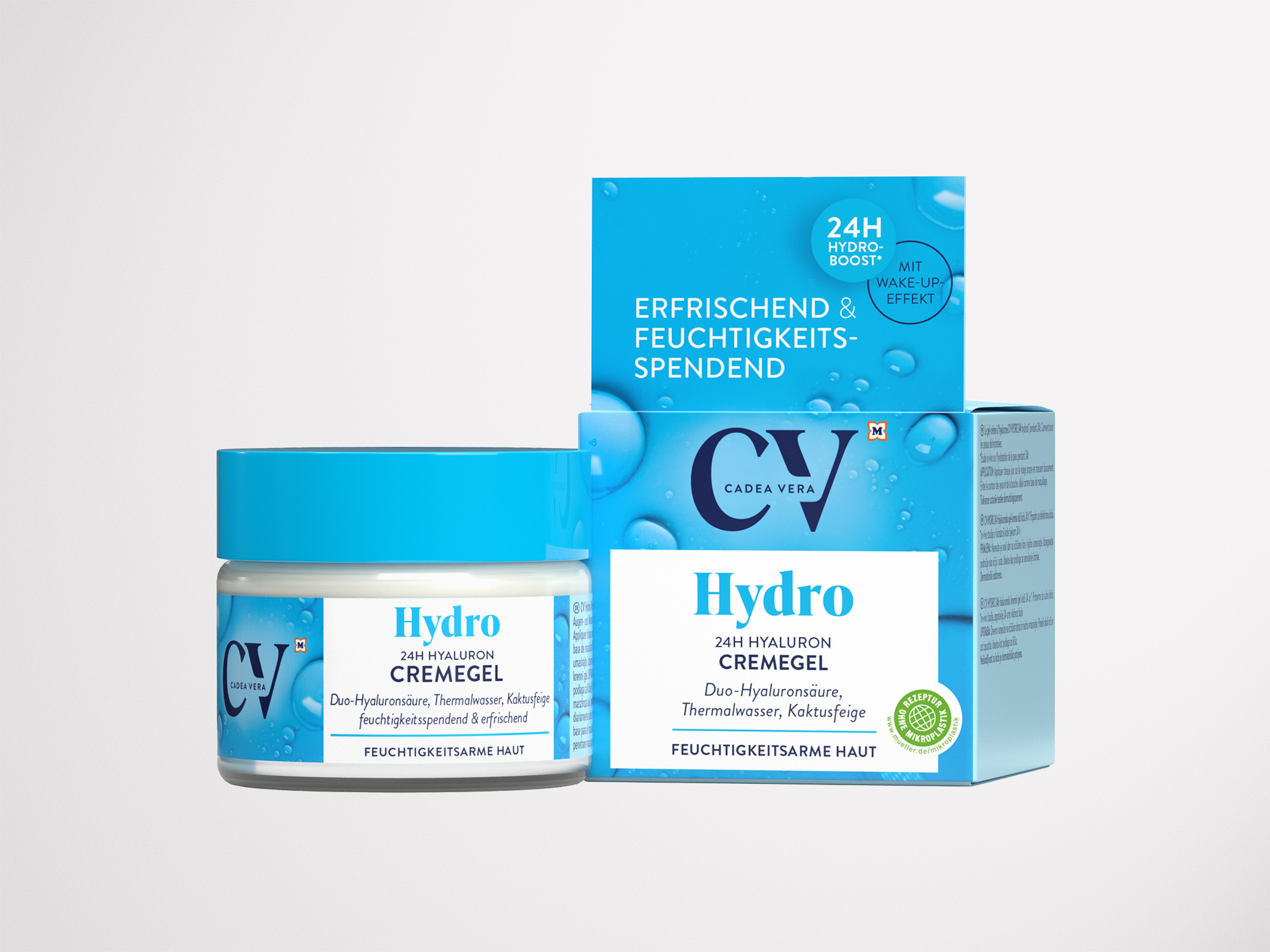
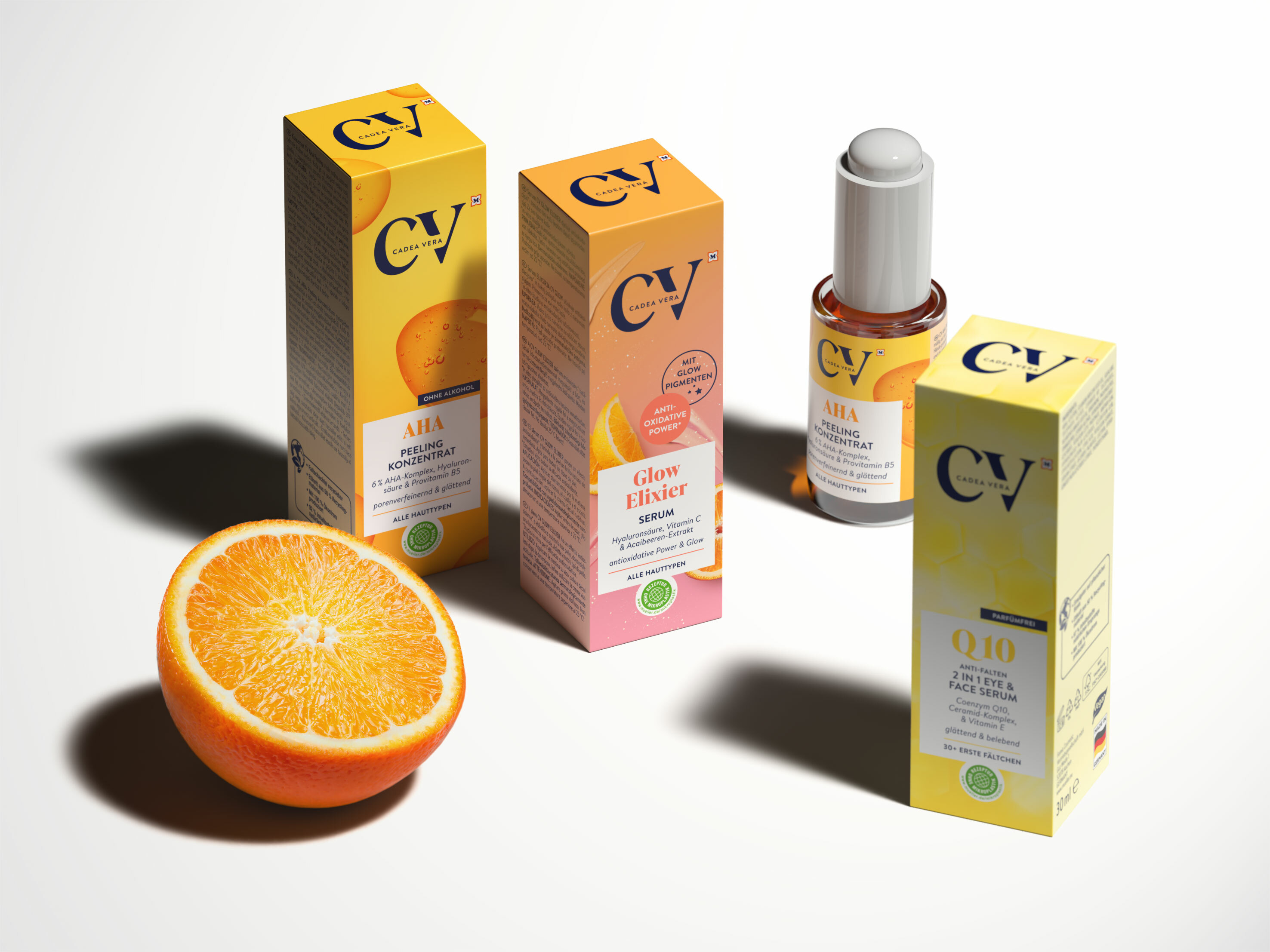
We have developed a new, bolder brand and packaging design for CV that is eye-catching on the shelf and appeals to the different target groups in the best possible way. From now on, this will be ensured by a coherent brand bracket that ensures cohesion within the range, with an easy-to-understand color coding system and a uniform information architecture. The optimized brand logo and the use of new fonts and characteristic imagery also contribute to a higher-quality brand image.
With its technical appearance, the old CV logo did not fit in with the overall appearance of the brand. The brand name written out in full within the pictorial logo seemed cramped and the typeface of the two lines also appeared unbalanced. In the new logo, the brand initials C and V are now set harmoniously. Together with the serifed Antiqua font, this gives the brand an independent, cosmetic look. The placement of the brand name, written out on one line, also increases legibility.
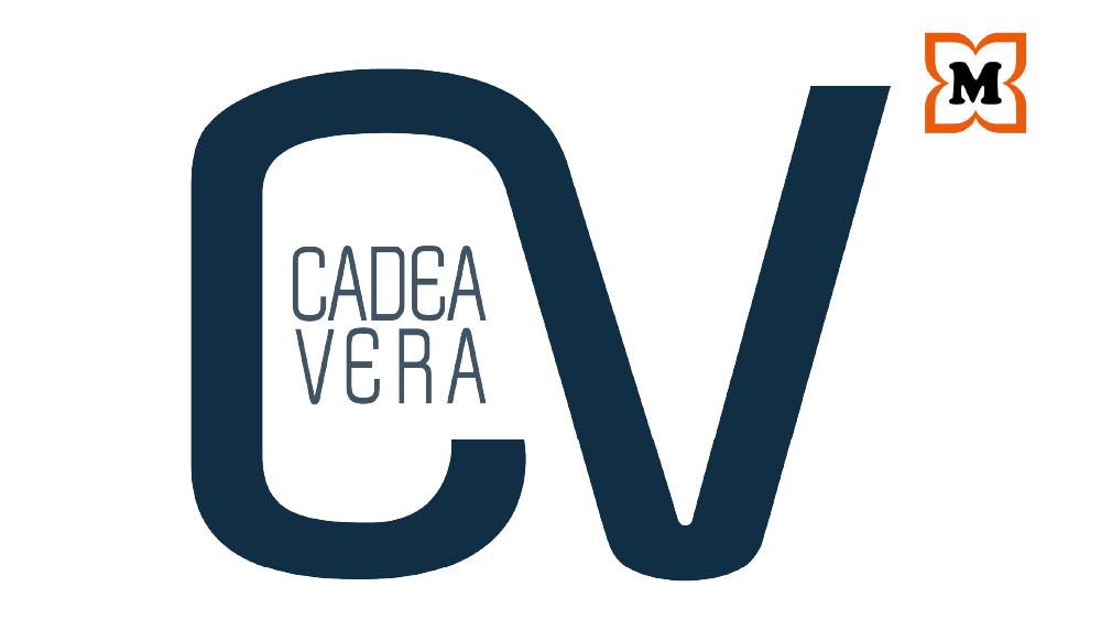
Before
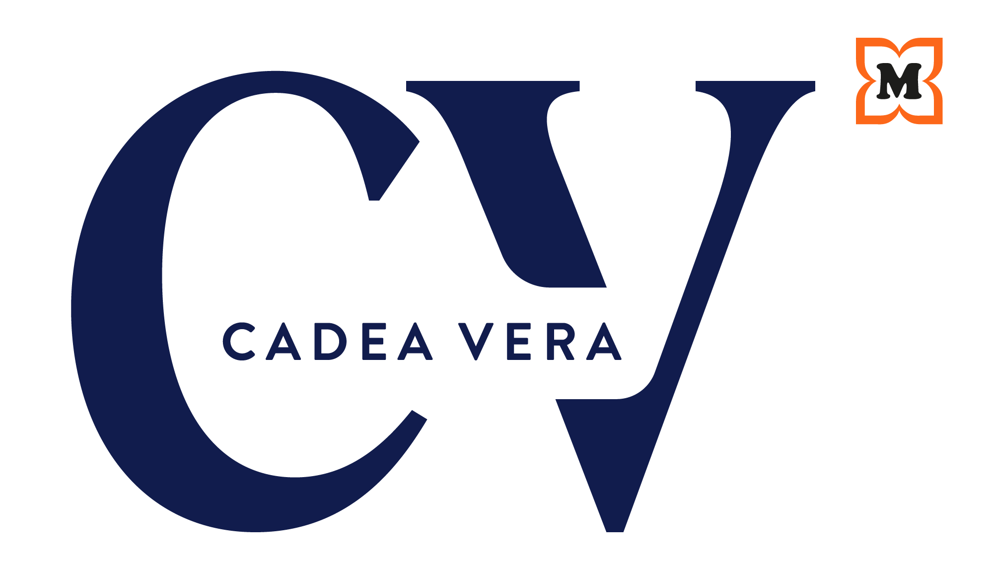
After
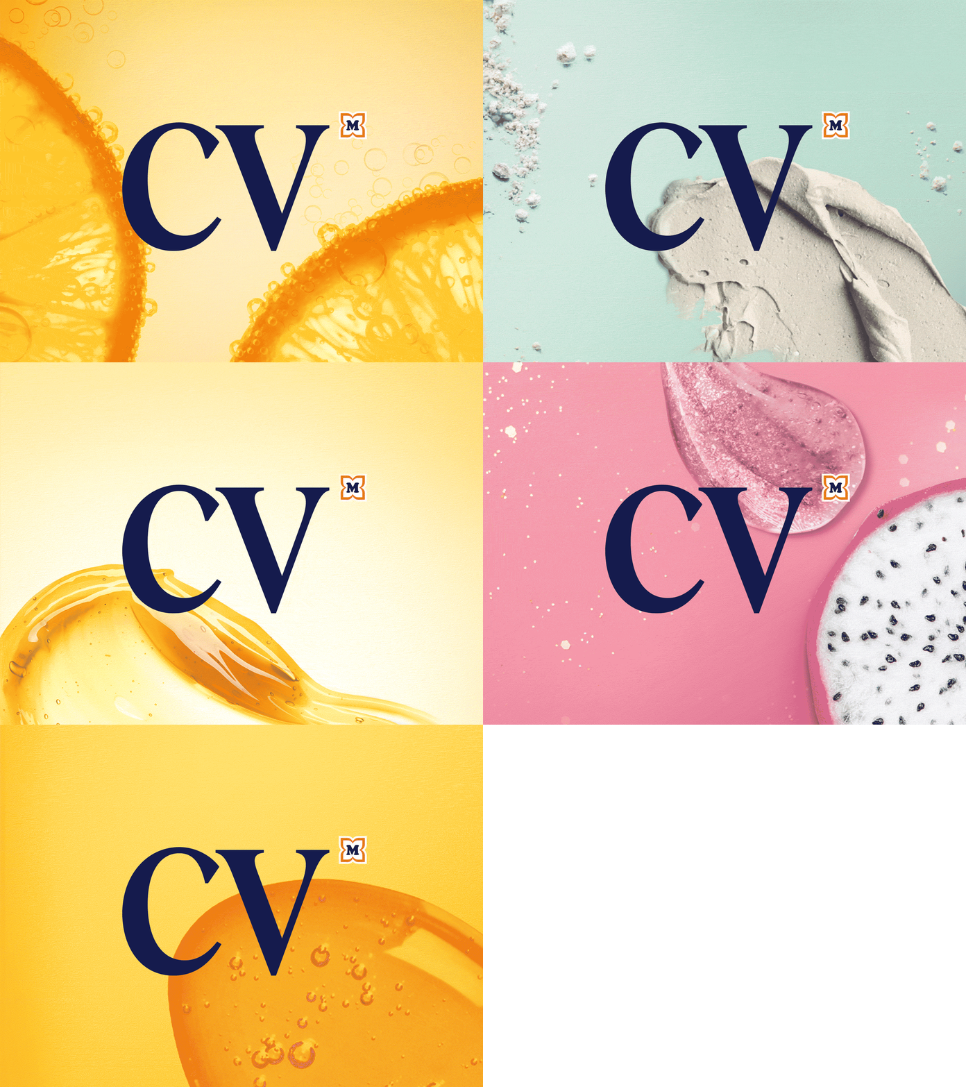
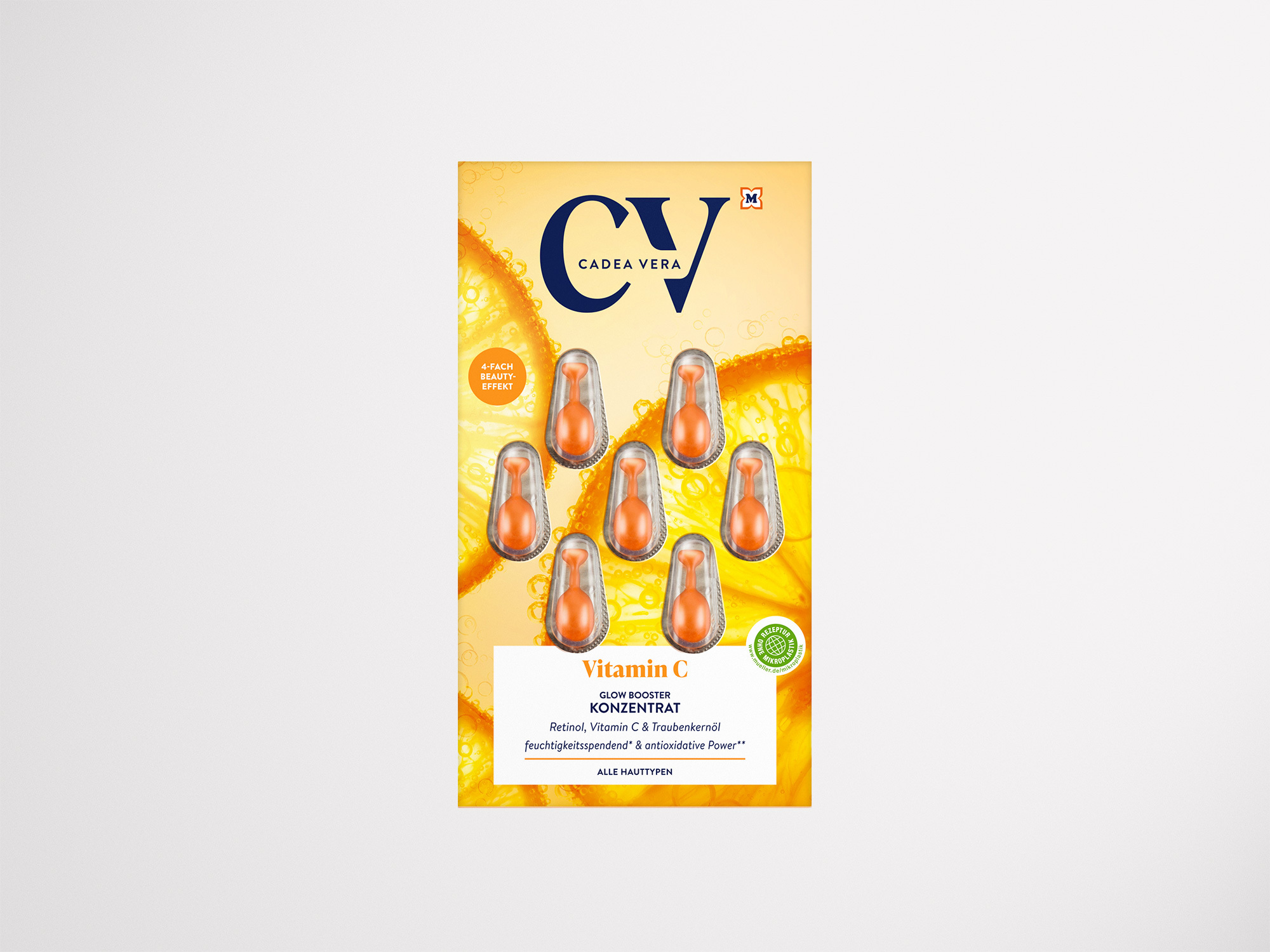
Photorealistic images of ingredients, detailed shots of consistencies and typical category moods (e.g. honeycomb structure) form the basic concept for the key visuals.


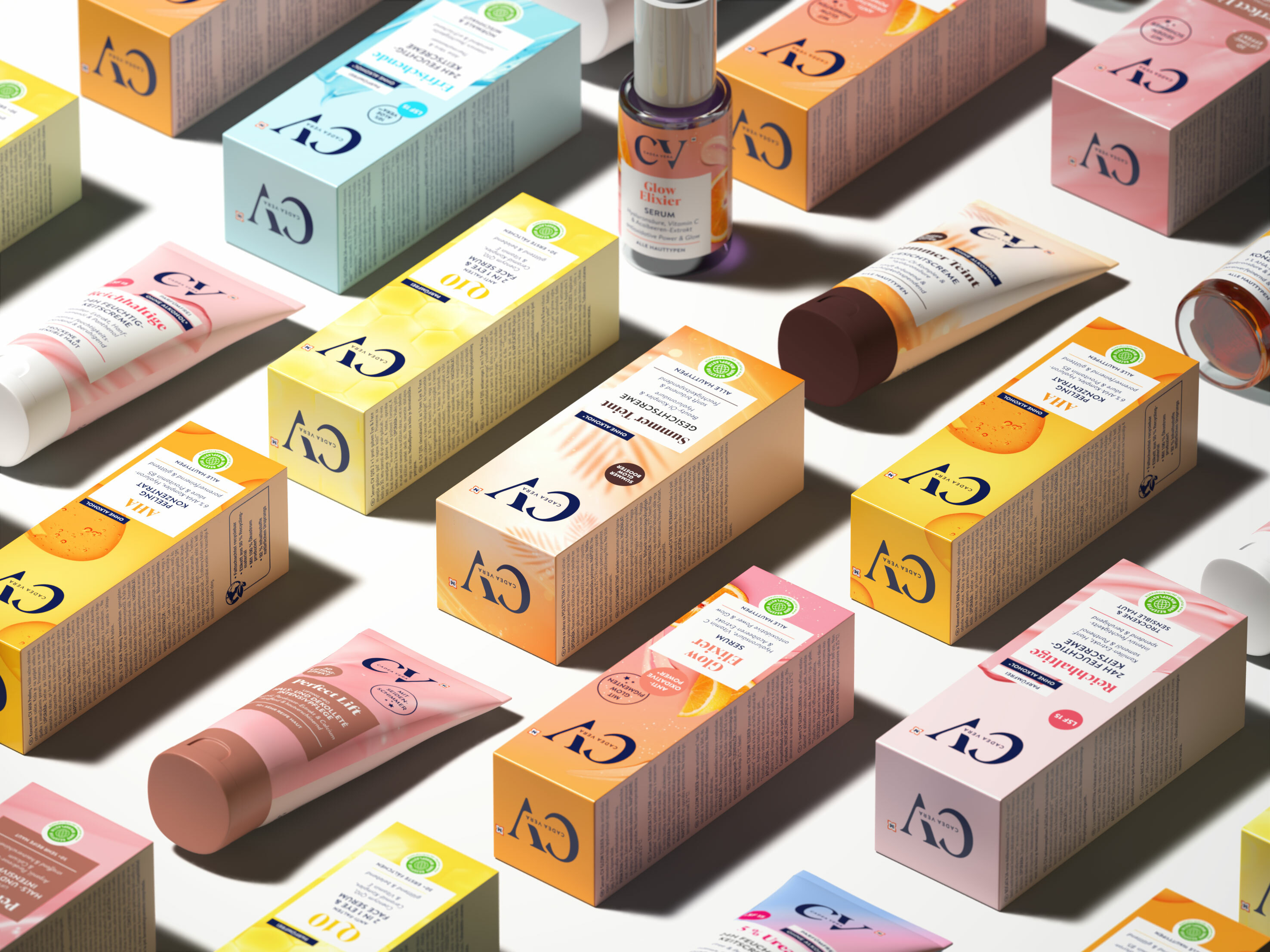
A well-differentiated color code system for the various series ensures quick orientation within the product range.
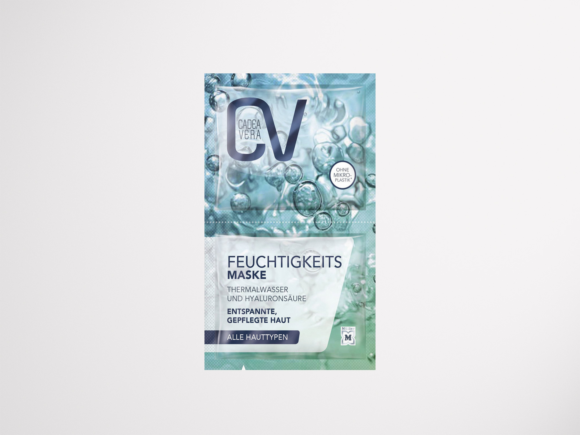
Before
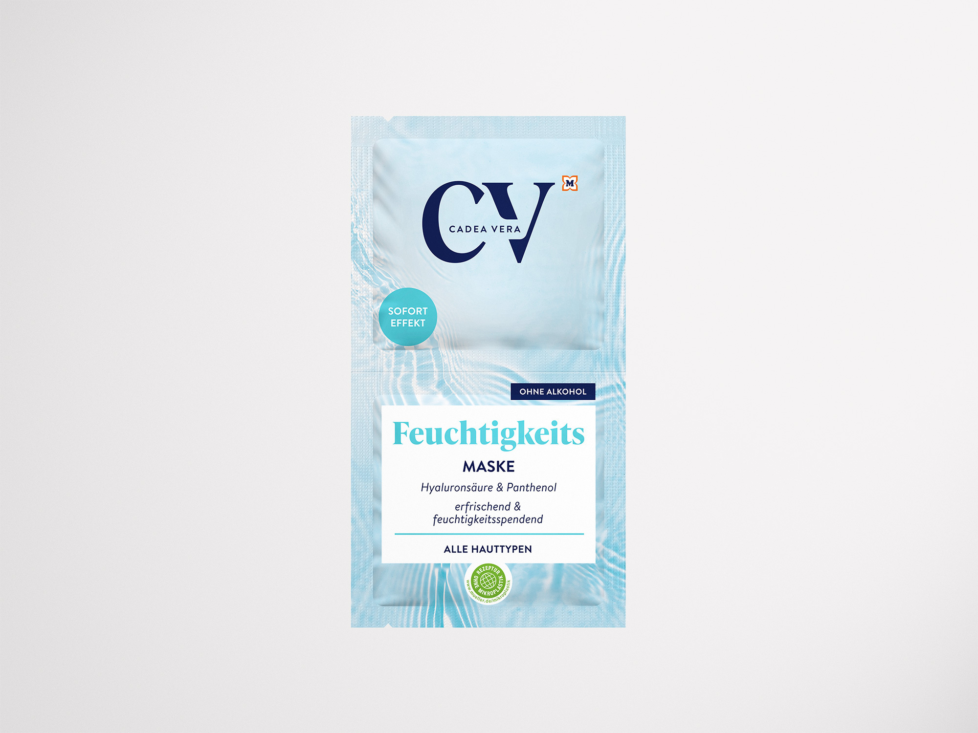
After


Source: