Wie möchtest du starten?
11.09.2025
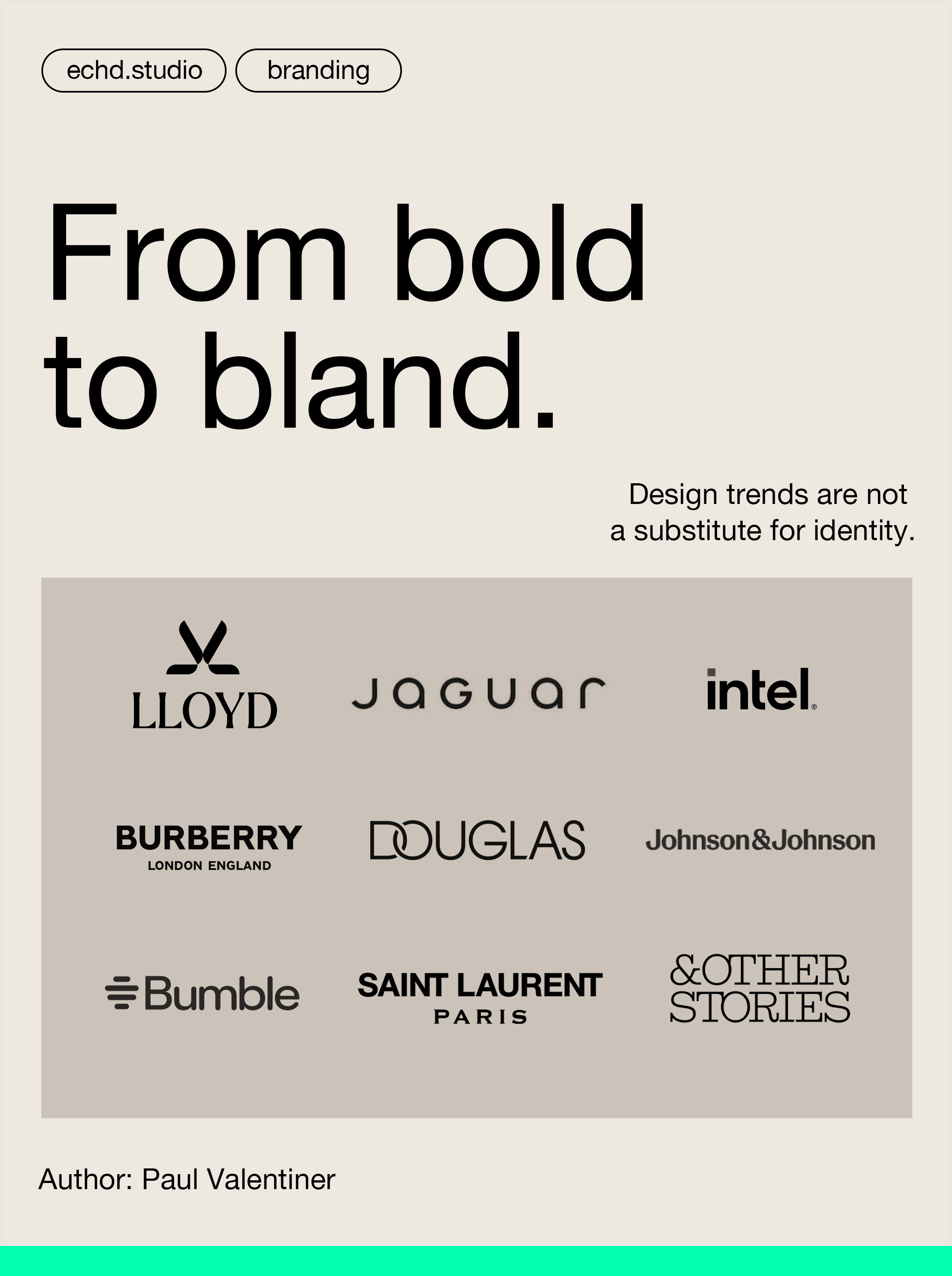
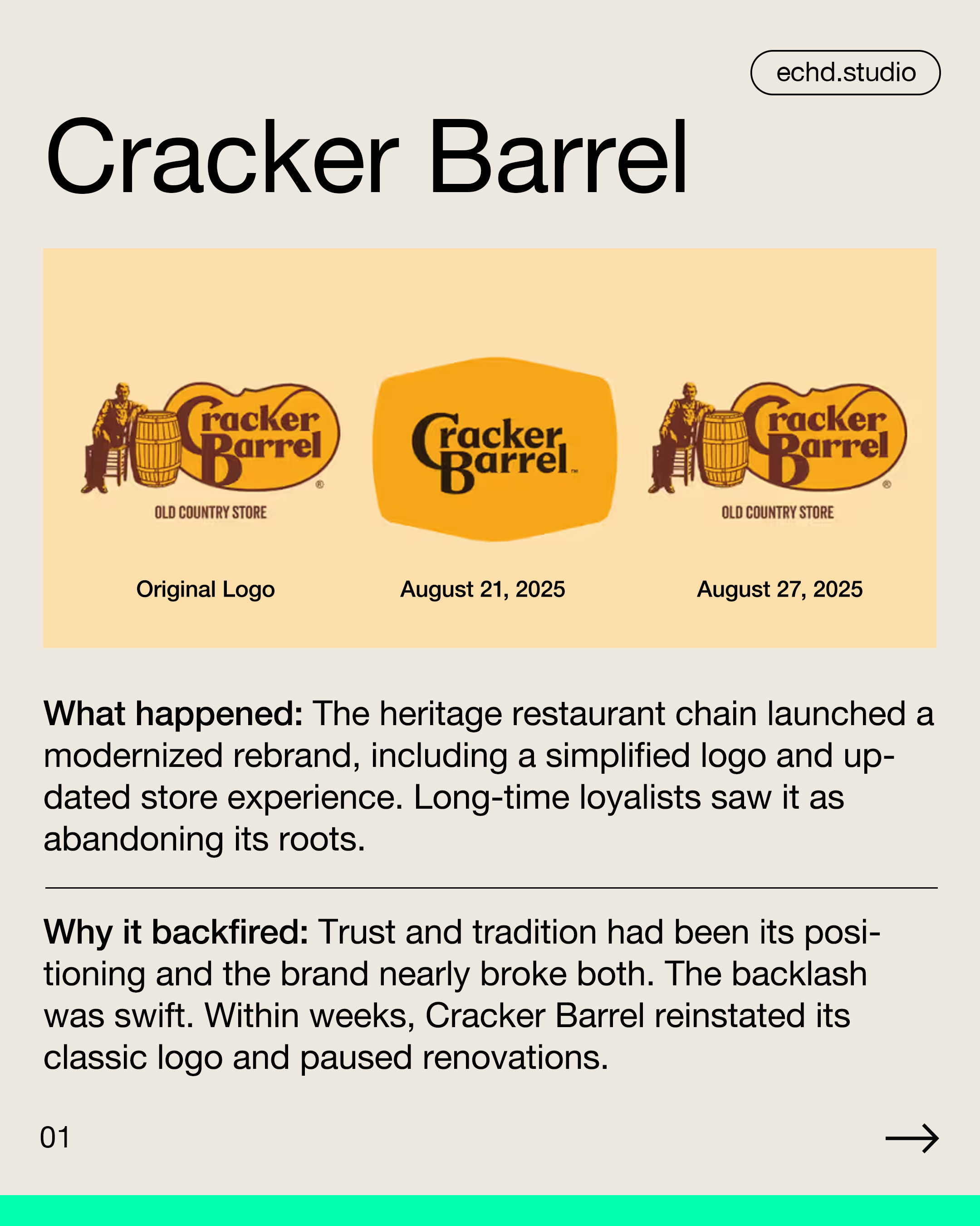
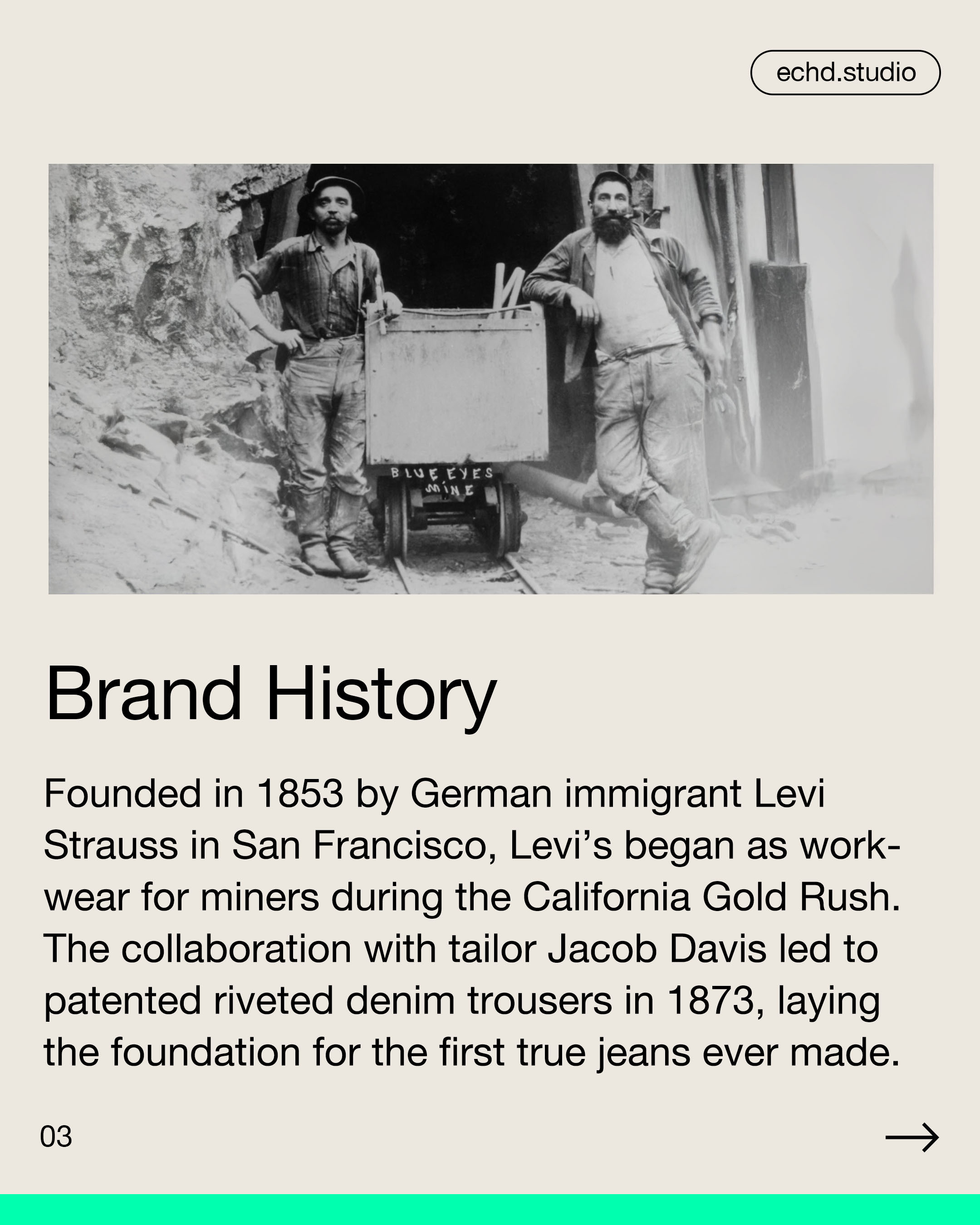
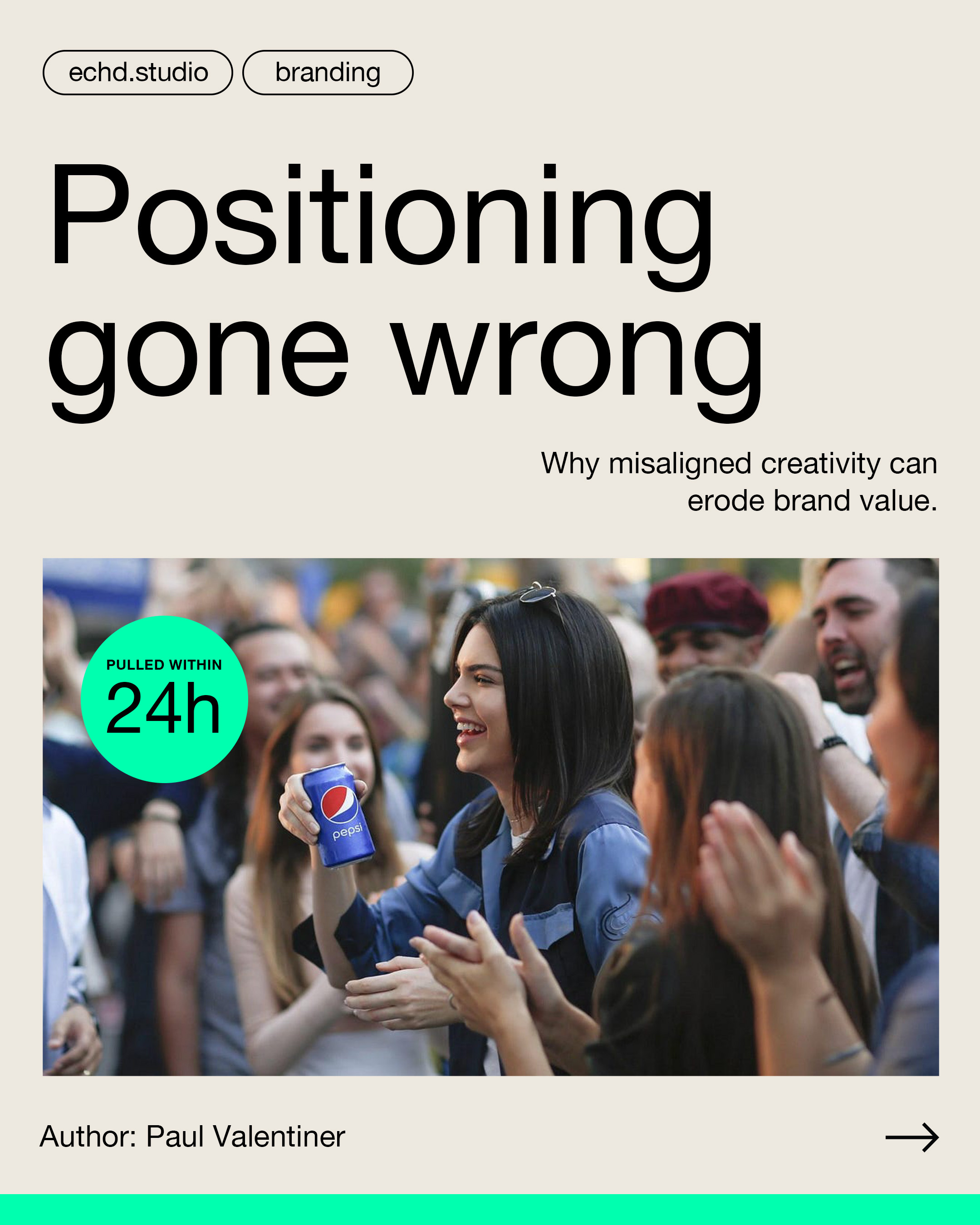
More and more brands shy away from standing out visually. Instead, they blend in, out of fear, uncertainty, or simply because they follow what looks like a trend.
The cost?
Their uniqueness.
Yes, I know this critique isn’t new on LinkedIn. But I want to frame it through a different lens: Brands are alive. And what’s alive needs character, recognition and emotional presence, especially in its visual identity.
Let’s not forget:
Many of these brands have spent years (and millions) building a distinct image.
They invested in differentiation, recognizability and a strong visual presence.
And now? They give it up for a moment of visual conformity.
👉 A strong brand appearance is not a fashion trend.
If your design only follows the zeitgeist, your brand loses its profile and with it, people’s interest.
What living brands need instead:
Visual courage that doesn’t mean being loud, design that stands out rather than fits in and consistency that goes beyond the next design trend.
Let me be clear:
This isn’t about pointing fingers at agencies.
Many of these new logos are well-crafted and technically solid, no doubt.
But when it comes to strengthening brand positioning and differentiation, they fall short.
The good news?
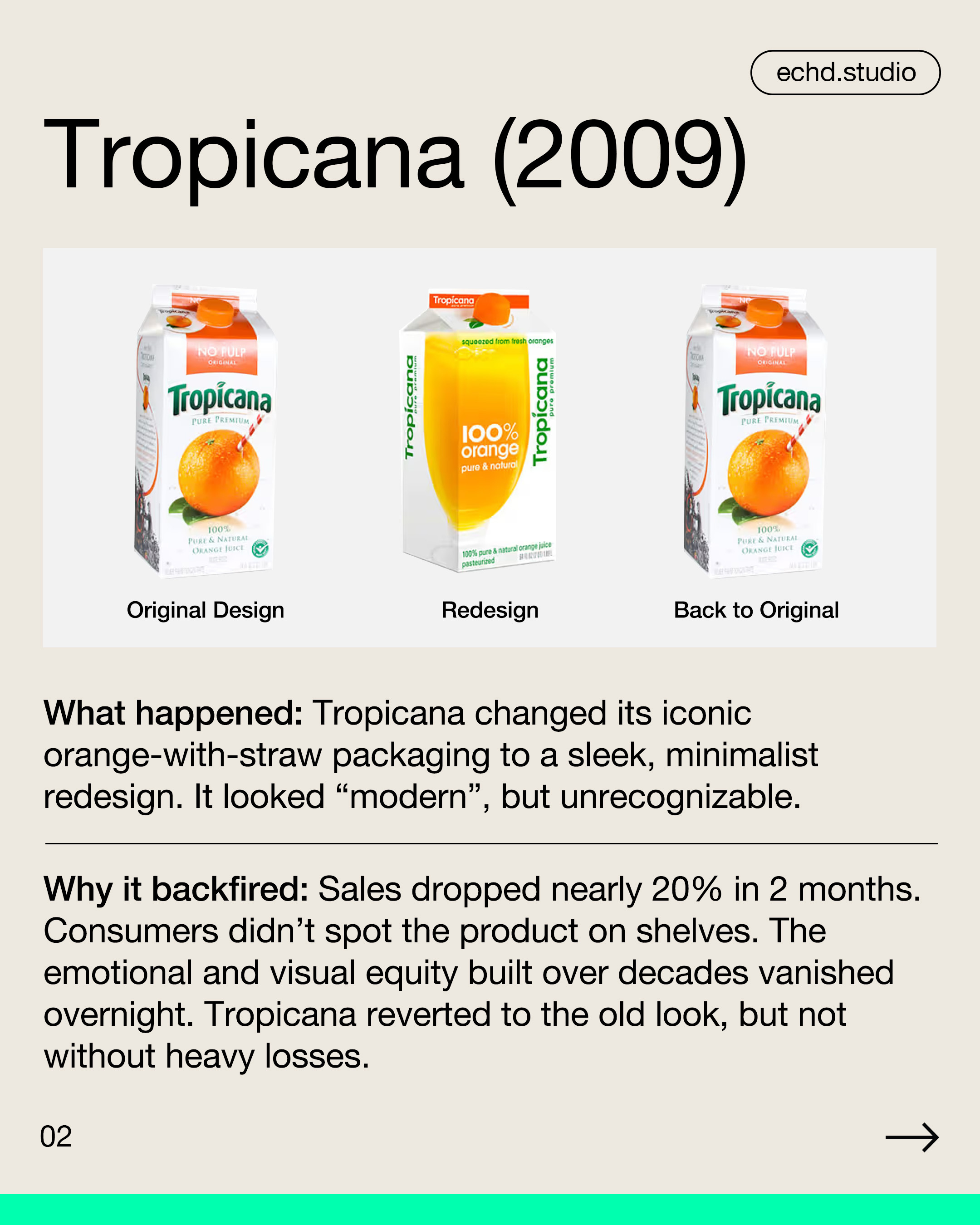
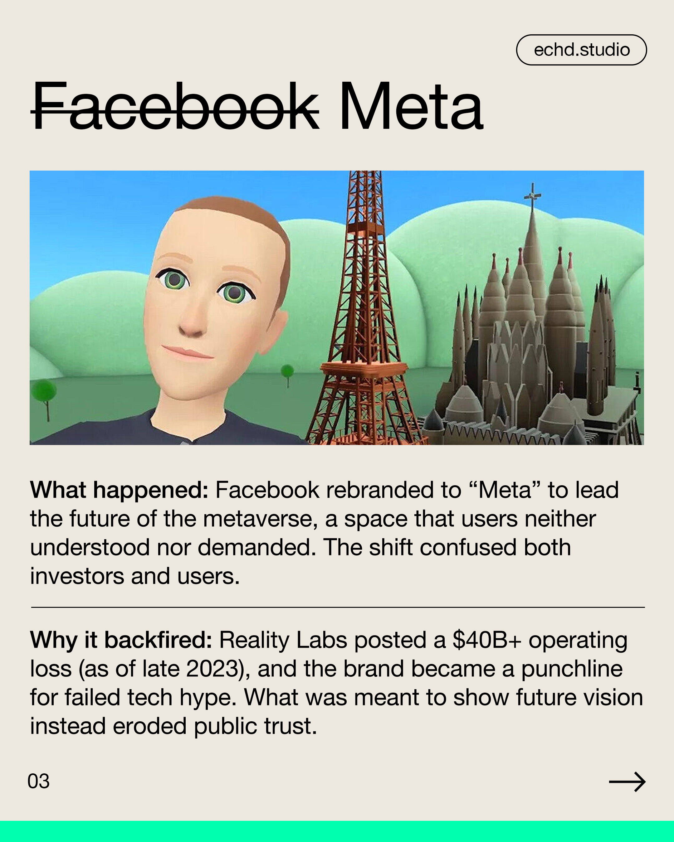
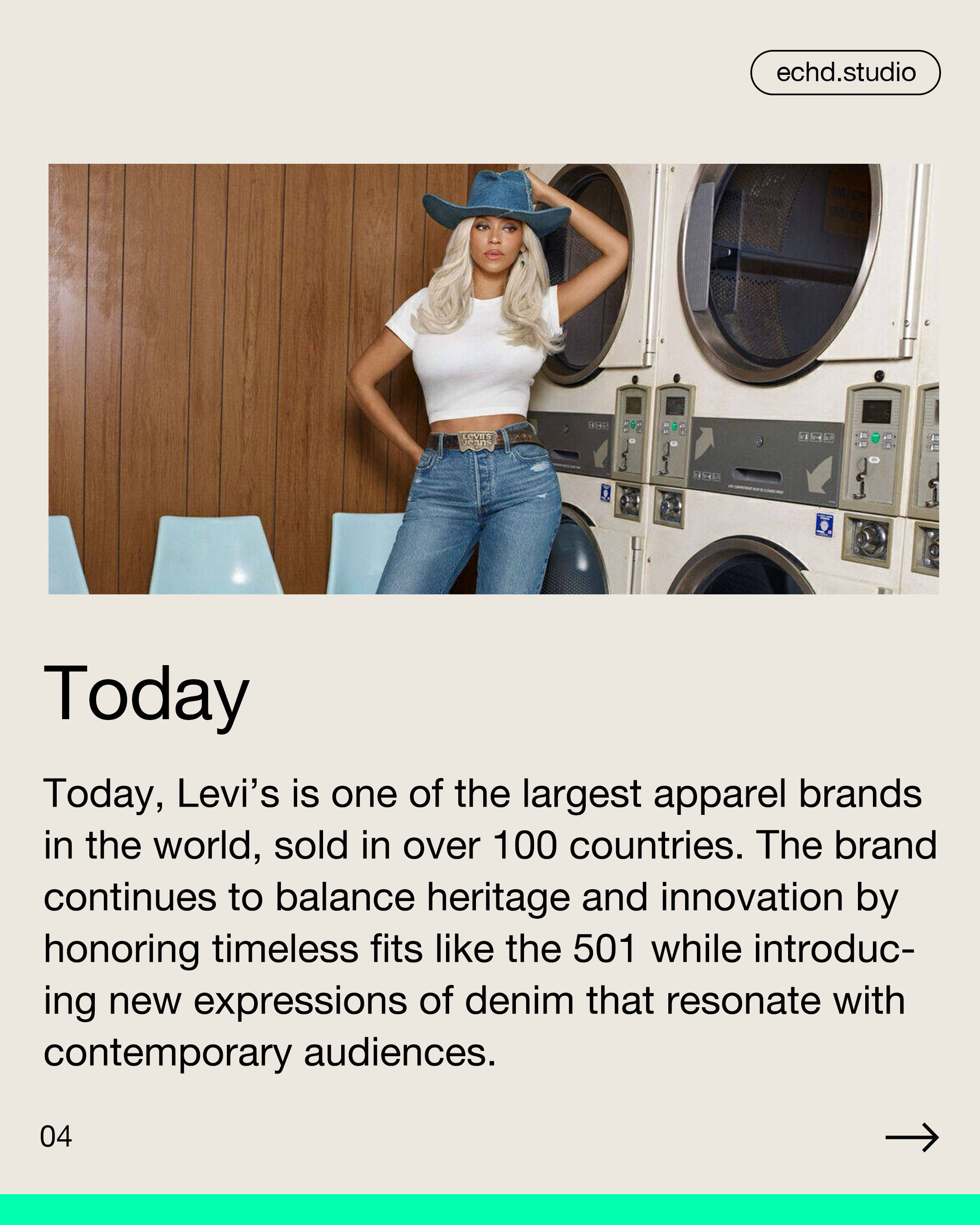
Some brands are already rethinking and are returning to previous versions of their visual identity. That’s encouraging.
Because brands that stay true to themselves in uncertain times
are the ones that stand out when clarity returns and who endure.
👉 Curious how distinctive your brand image really is?
Book your free 30-minute Brand Check or let’s talk about a visual refresh that’s rooted in strategy. Link in bio or on our website.
#LogoDesign #Branding #GraphicDesign #VisualIdentity #Rebranding #DesignTrends #BrandStrategy #DesignInspiration #Minimalism #BrandDifferentiation