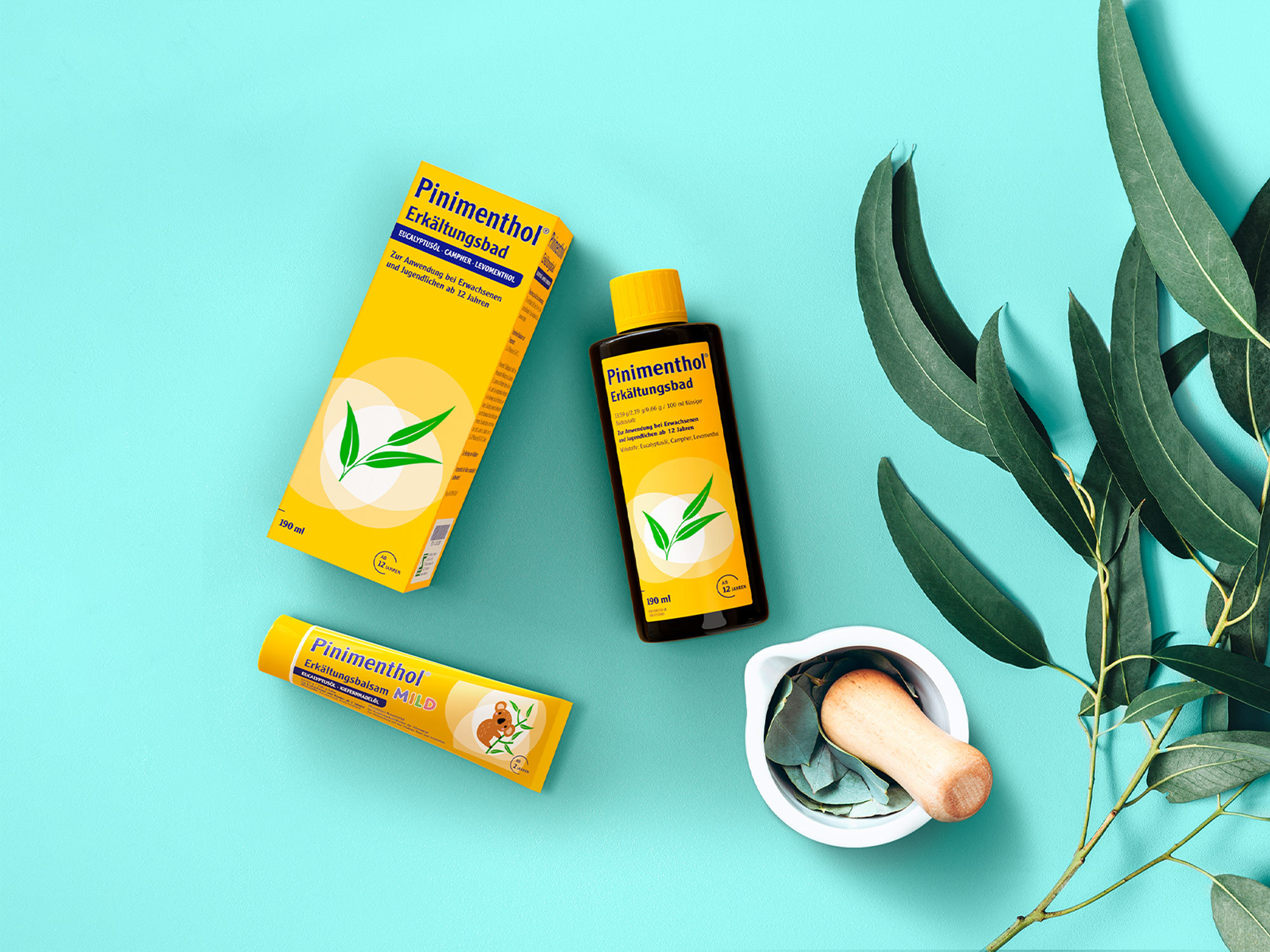
The market leader Pinimenthol has stood for naturally effective cold baths and ointments for the whole family for 70 years. As part of the relaunch, the products had to be harmoniously modernized without losing their strong recognition value.
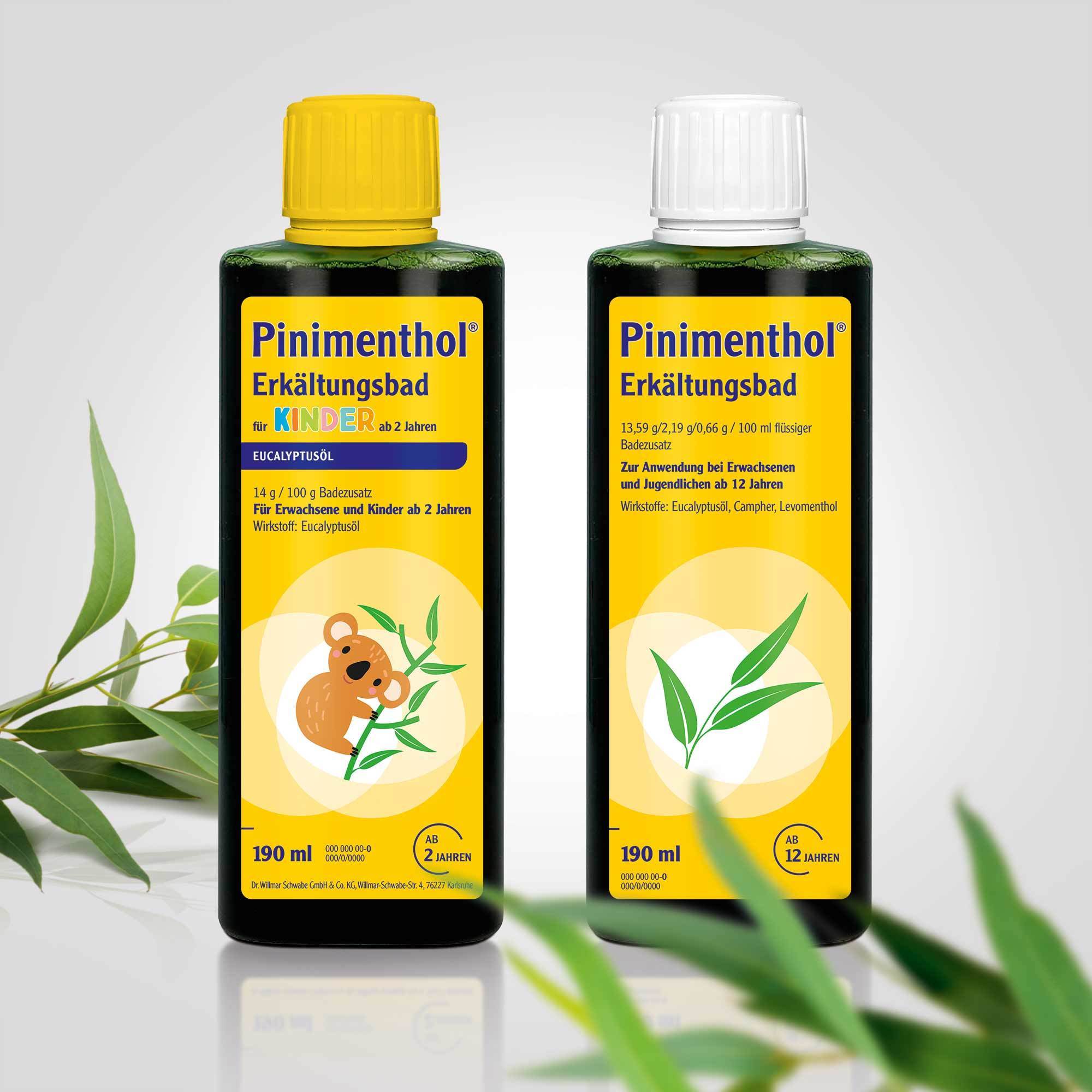
Gently revising a traditional product, strengthening the differentiation between children's and adult products and improving the information hierarchy while maintaining recognition for the core user base: these were the essential points for the relaunch of Pinimenthol.
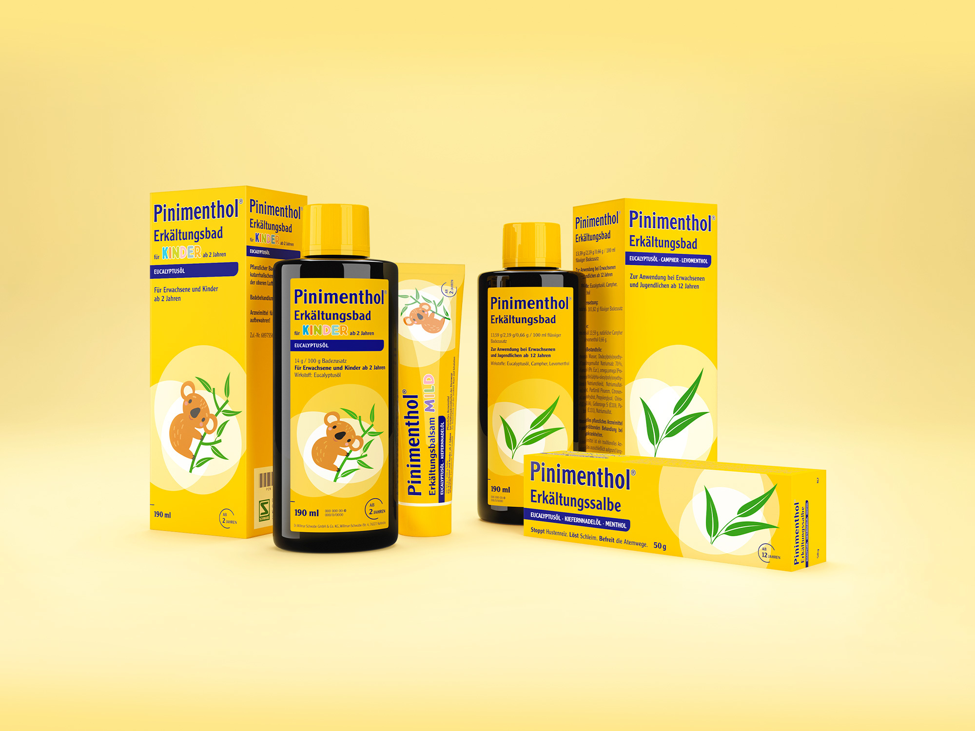
The traditional images of people have been replaced in favor of a strong key visual system. The bright circles of the key visual symbolize the effect of the essential oils during use, while the eucalyptus clearly portrays the main ingredient. The colorful “Kinder” lettering and the contemporary koala illustration reinforce the differentiation between the varieties and the important emotionality of the packaging designs. We have retained the proven brand colors yellow and dark blue, thus ensuring the products' recognizability
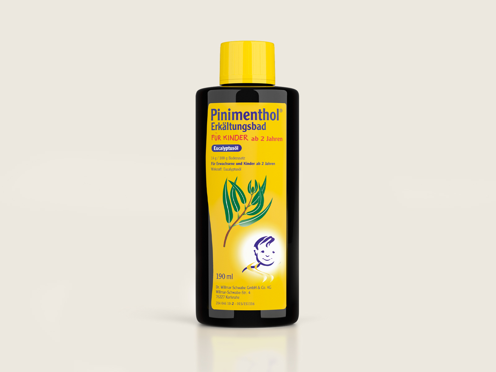
Before
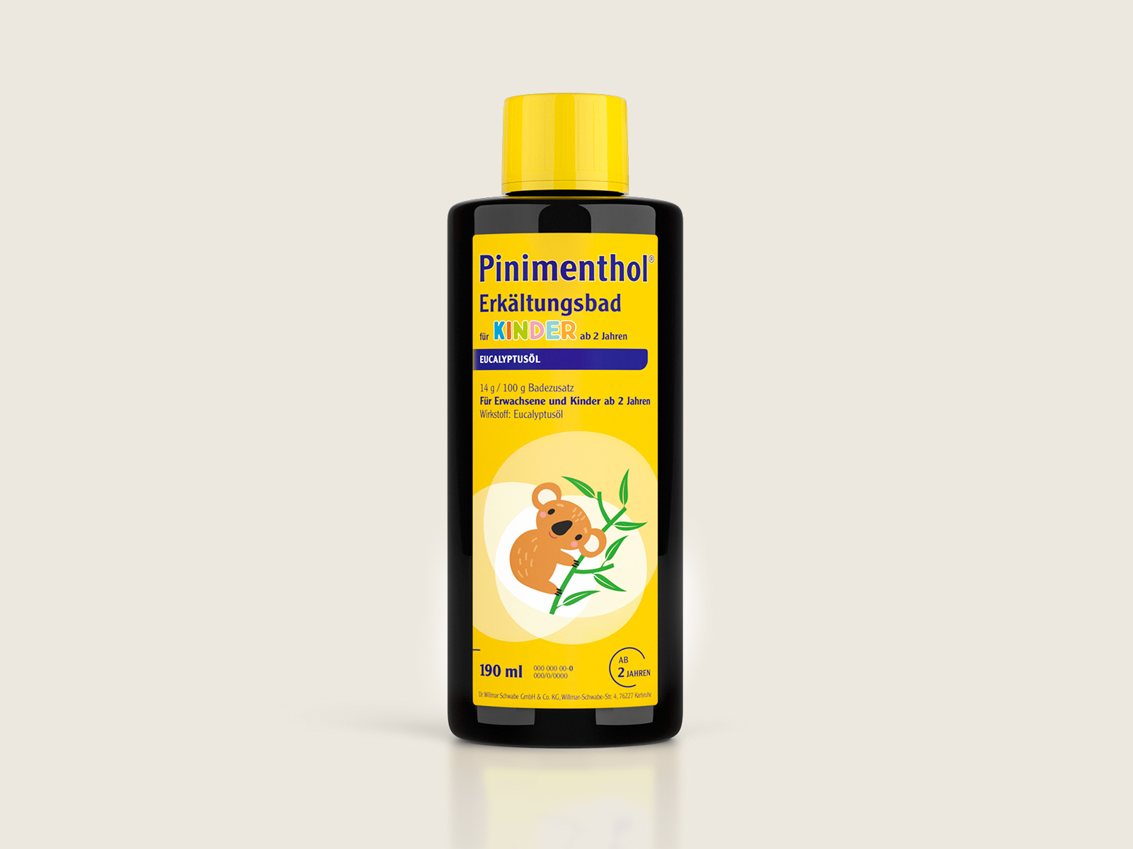
After
Source: