Modern reinterpretation for Hametum, the brand from Dr. Schwabe that started it all
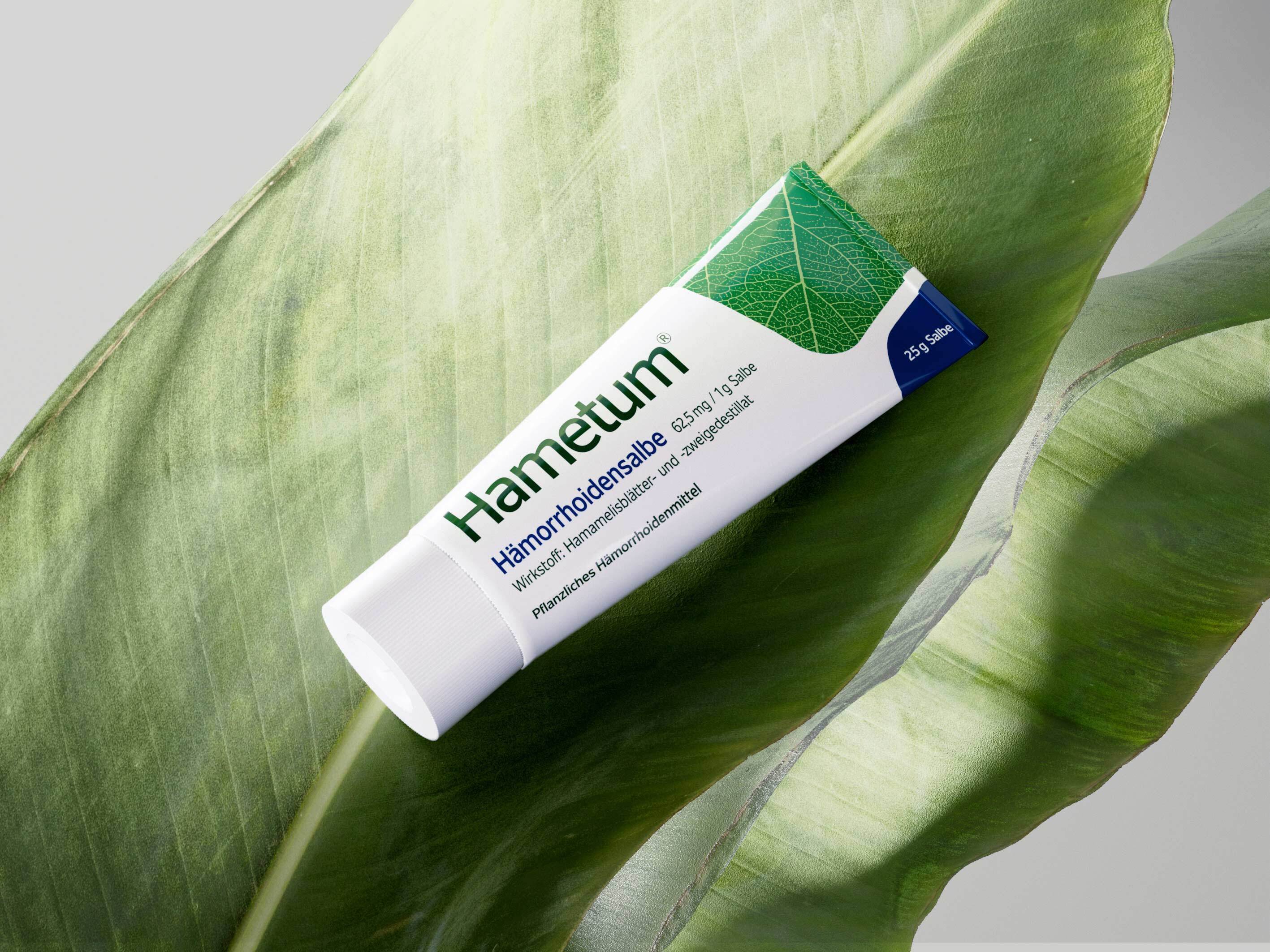
The traditional German brand Hametum can look back on 140 years of brand history and has continuously developed its product portfolio over time and adapted it to the needs of its target groups. However, the overall appearance of the brand and packaging no longer seemed up-to-date and was ready for a modernization. The aim was not only to strengthen the positive brand perception and eliminate design weaknesses, but also to build on Hametum's many years of tradition and experience.
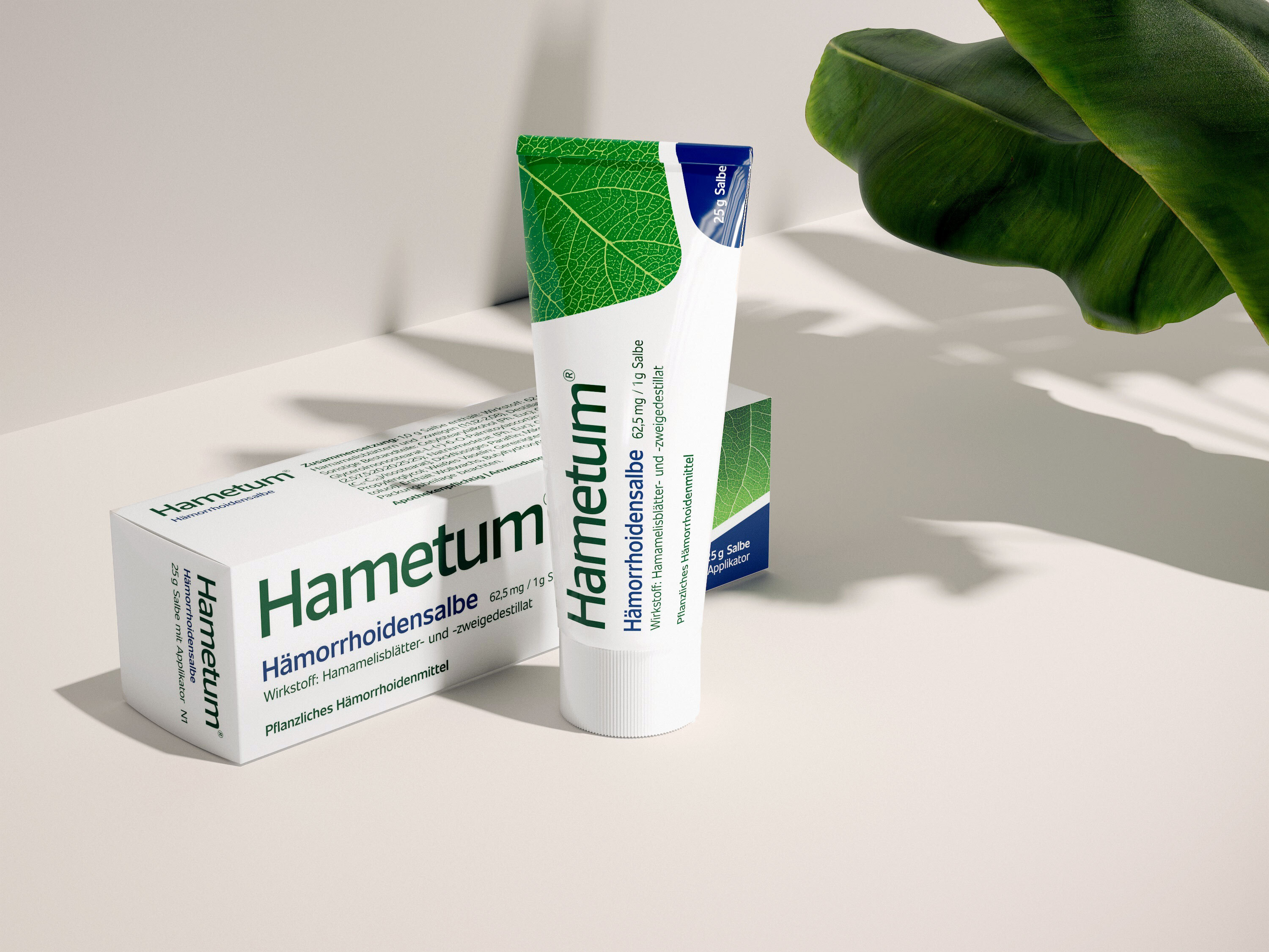
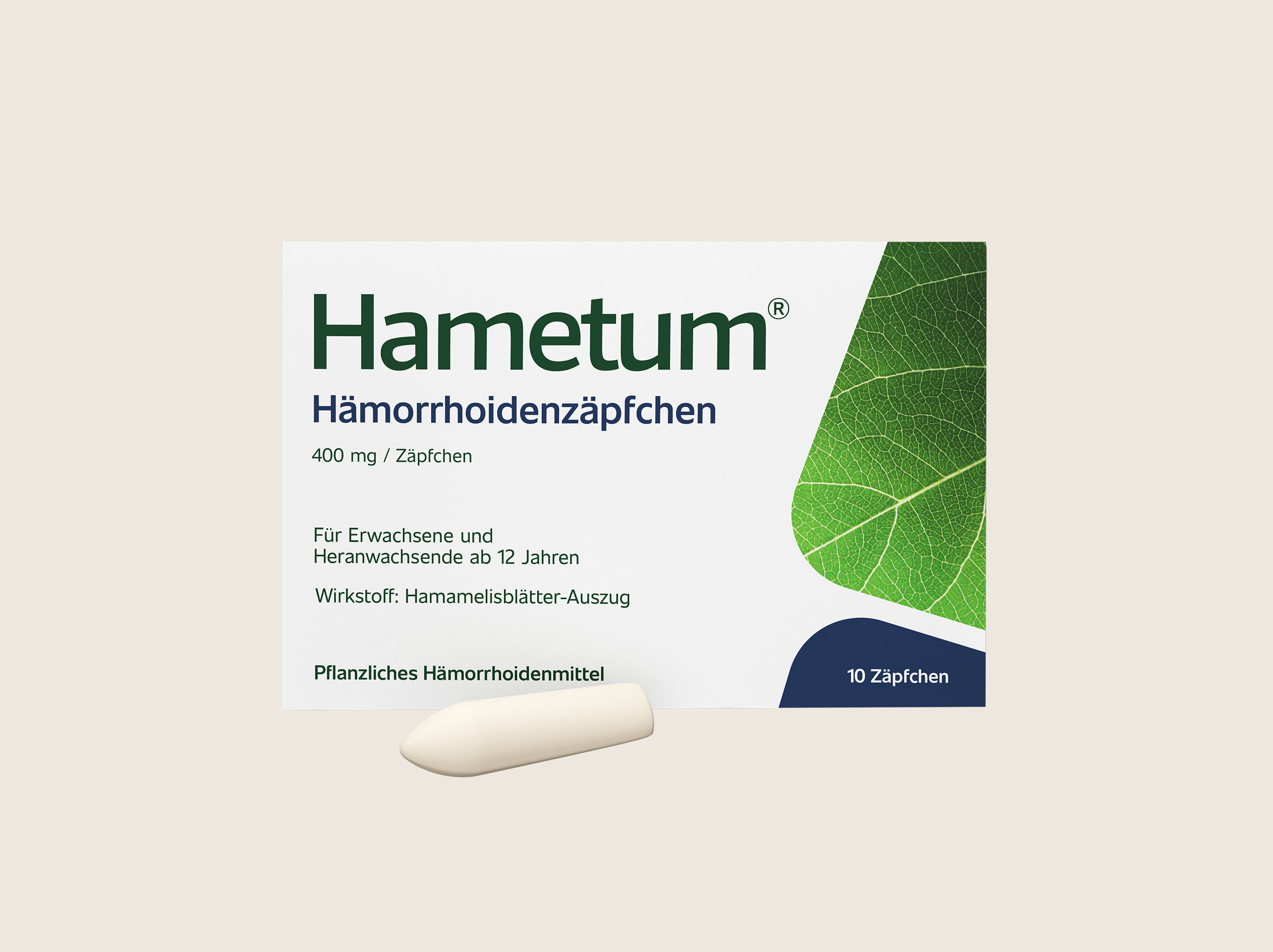
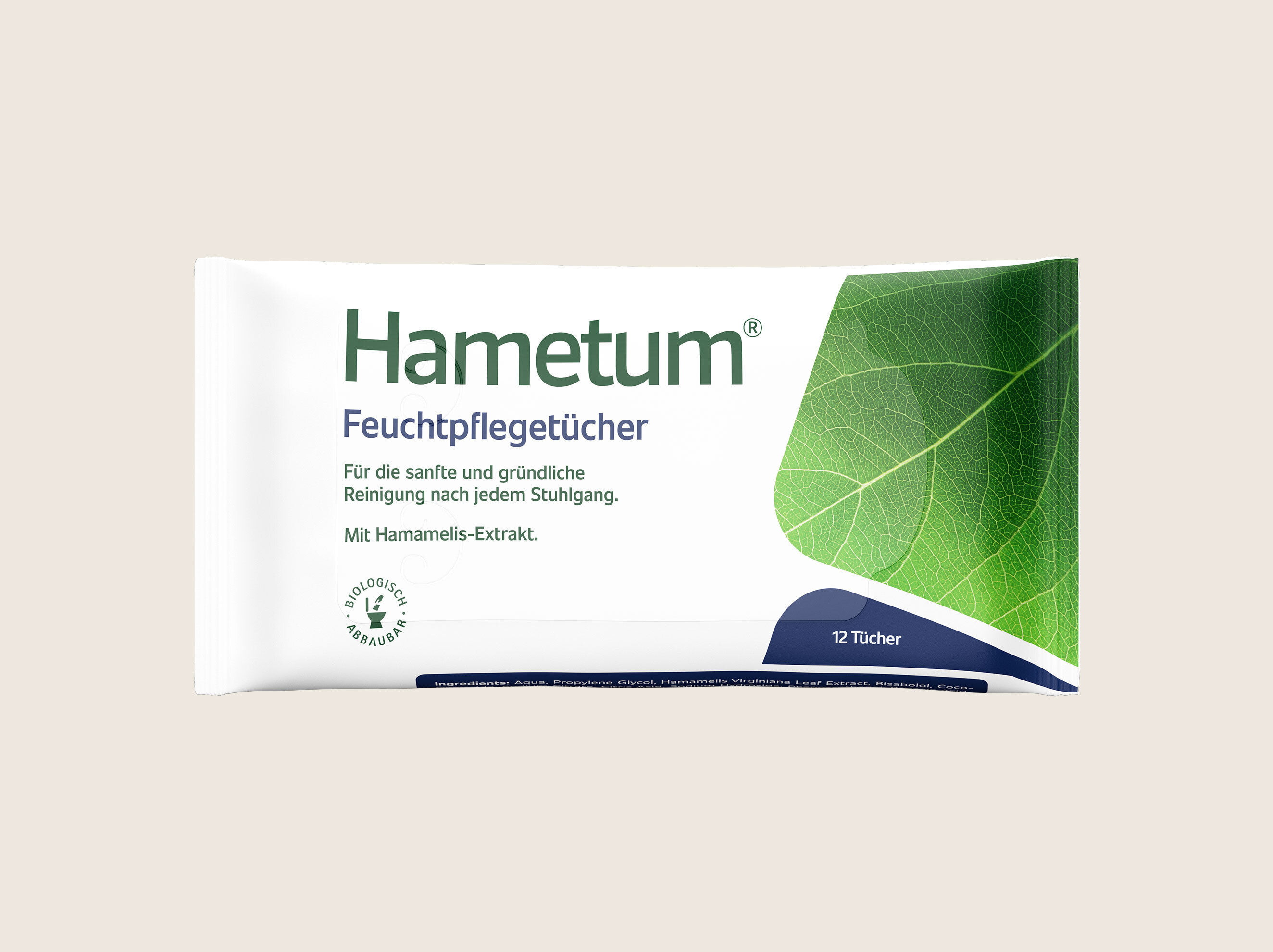
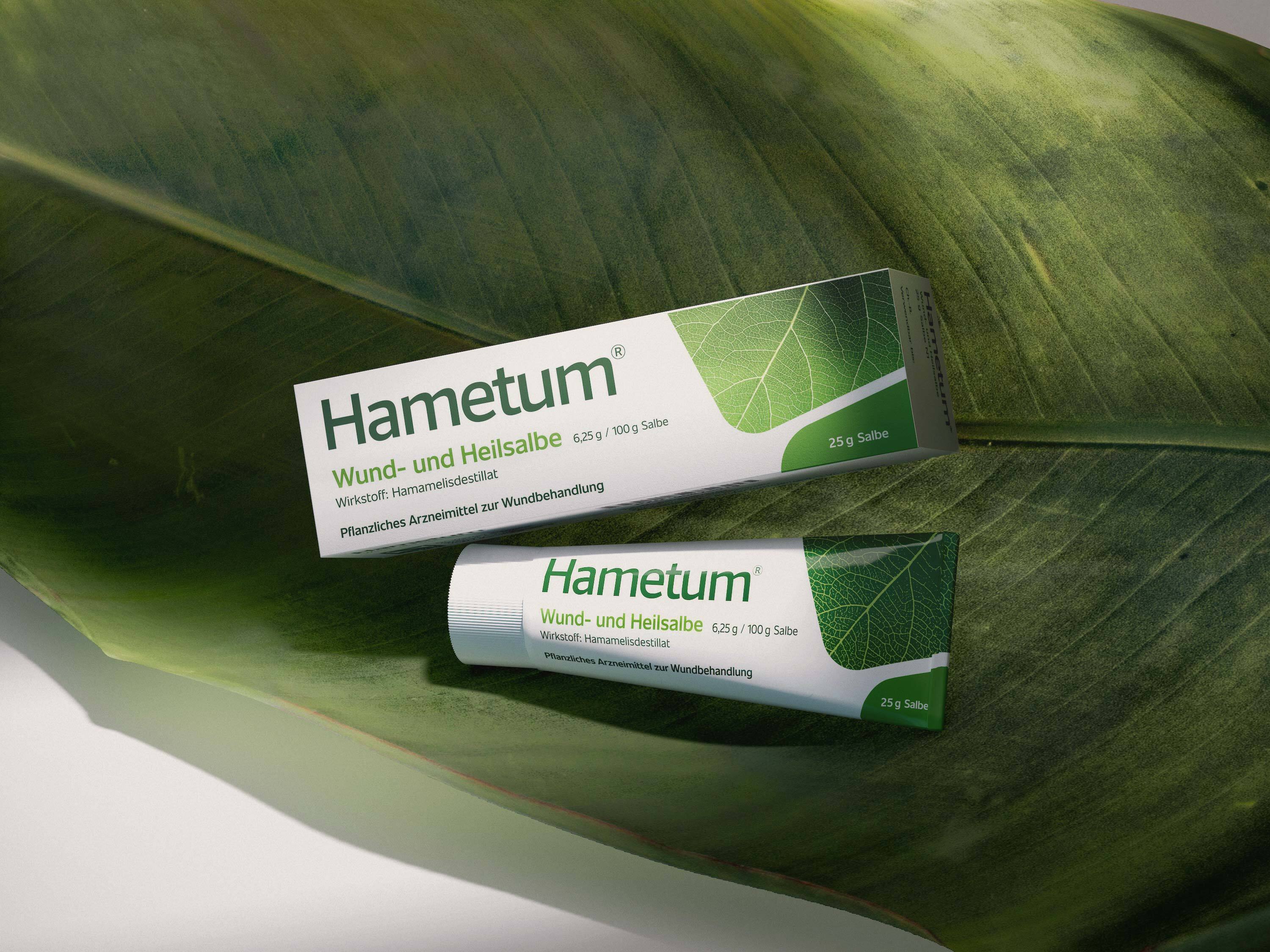
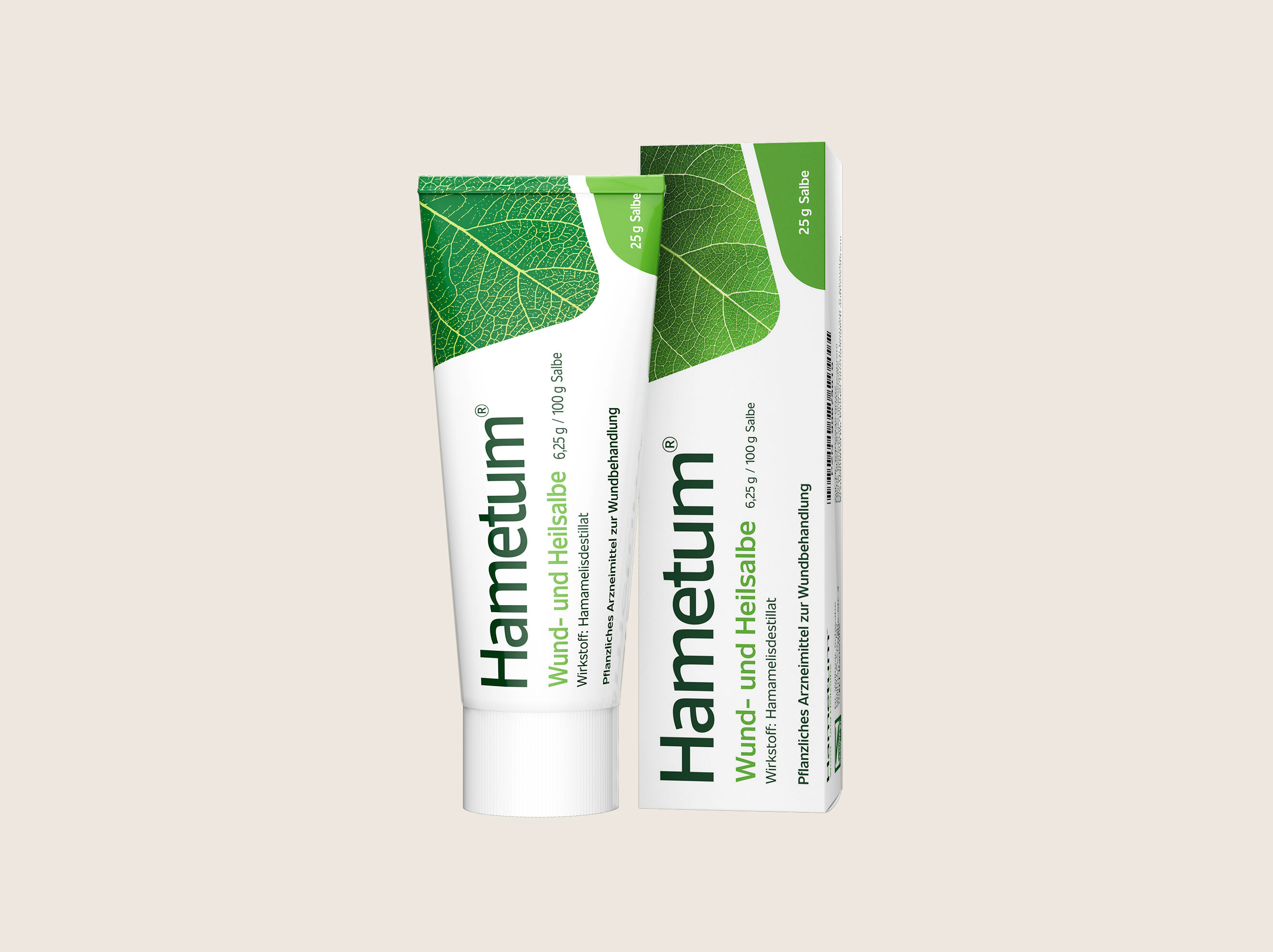
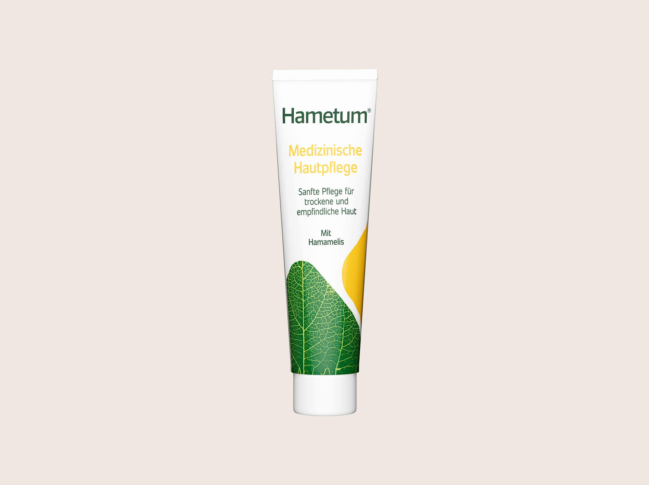
In order to guarantee the success of the relaunch, we paid particular attention to communicating the USP of the products, the herbal effectiveness, to the end consumer in an eye-catching way. This was achieved through a modern composition of organic shapes, the key visual with high recognition value and an optimized logo that radiates calm and competence and thus underlines the brand's guiding values.
When redesigning the logo, the outdated typography, which had a restless appearance due to its design weaknesses, was replaced. From now on, Hametum's new concise brand lettering is characterized by a competent and at the same time organic appearance, it appears calmer and visually more balanced, modern and at the same time timeless. The color scheme of the logo was also optimized and a metallic effect was added for a high-quality look that radiates credibility and trust.

Before

After
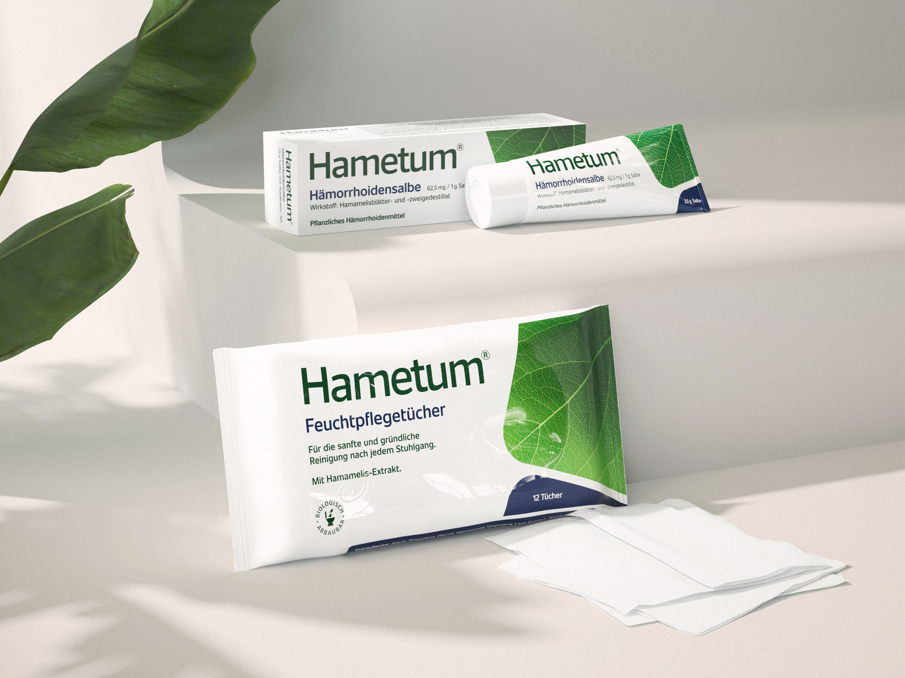
The previous design language seemed pointy and incongruous with the product. Through the use of organic shapes and the further development of the plant-based key visual, the overall image now appears much more coherent.
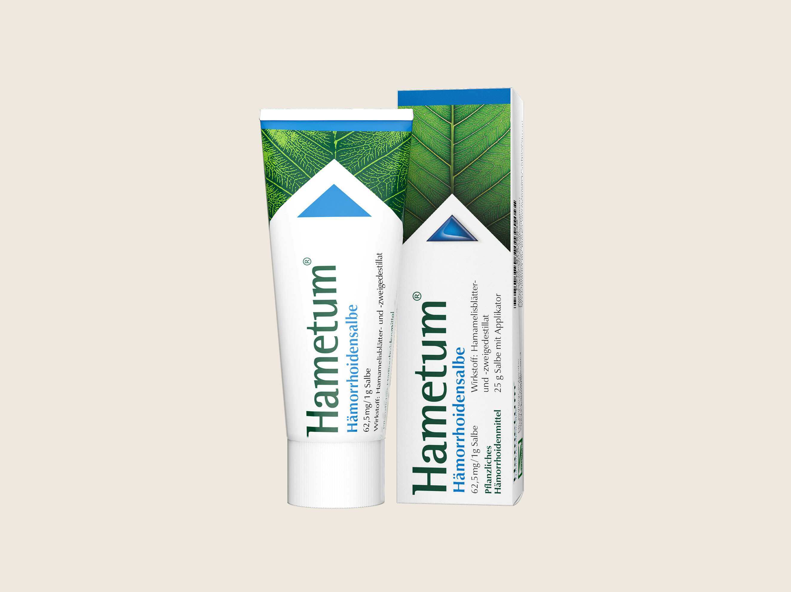
Before
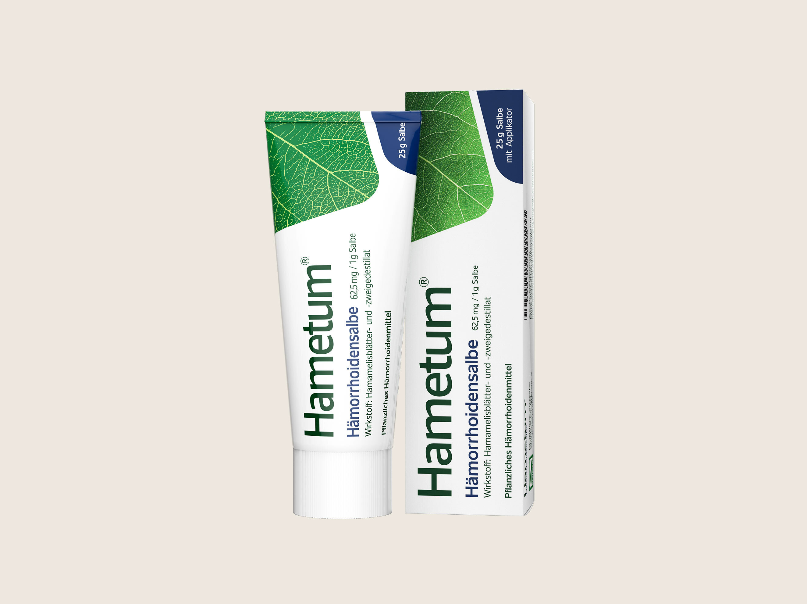
After
Source: