News from our designstudio

news / 3/1/2022

Oh so peachy!

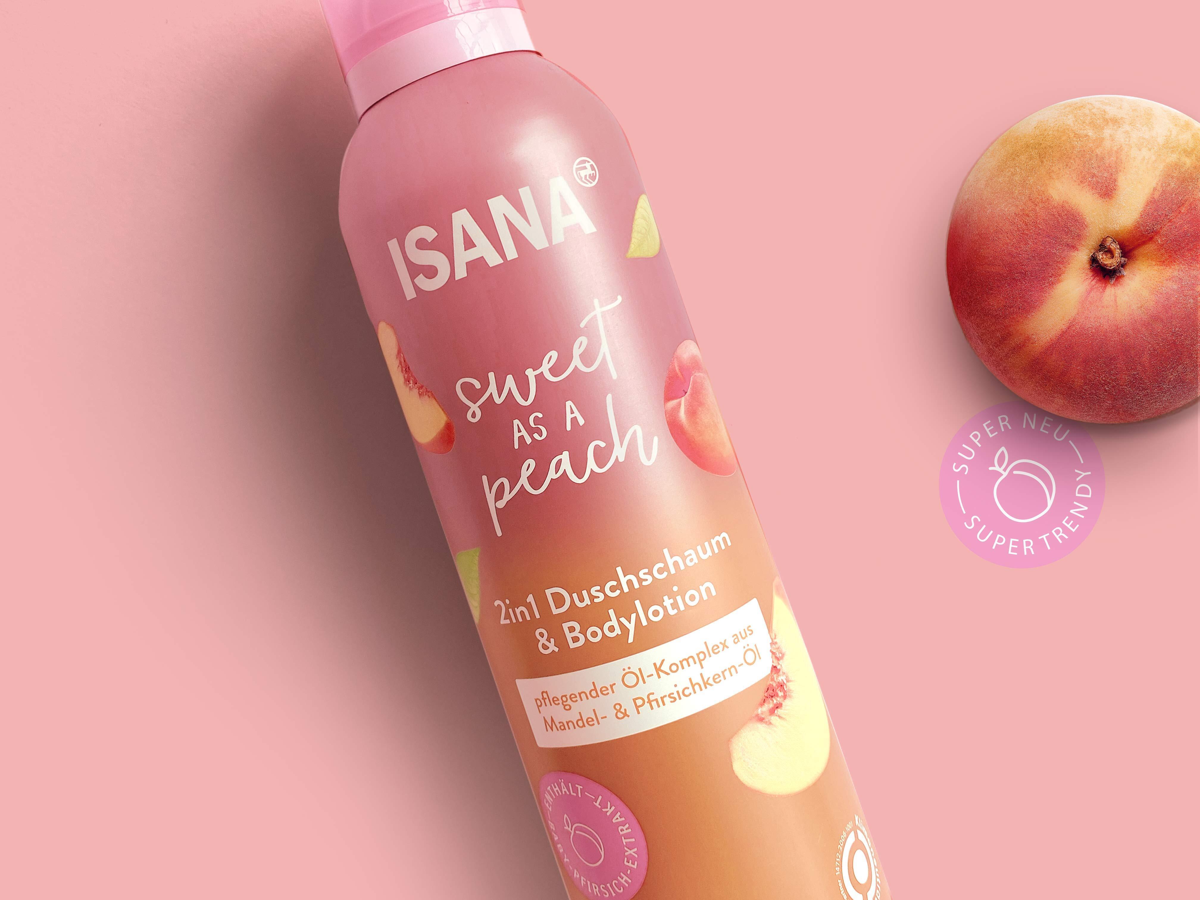
Spring has arrived with the bright “Sweet as a peach” series that we recently designed for Rossmann's own brand ISANA. In addition to bright, beautiful colors and a color gradient, this time the focus was on the interplay of metallic foil and matte elements. The cheerful series, consisting of Body Fragrance, Solid Shower, Body Oil, 2in1 Shower Foam & Body Lotion, Hair Oil and Hair Serum, is a visual highlight in the current Isana trend tower.

Learn more
news / 2/3/2022

Wir like to do things differently!

And sometimes we take that literally. This is what happened in the latest issue 01/2022 of creativ verpacken. In it, our trio of managing directors Nadine, Lisa and Max once again explain in words the reasons for renaming our agency and the core of our new direction. On the back page, we then let our ad speak in deeds: eye-catching, surprising and entertaining. Simply different. And in the end you might ask yourself, which side is actually upside down here?

You can find the whole interview online at https://www.linkedin.com/pulse/neuer-name-kommuniziert-werte-echd-studio

Learn more
Geschäftsführung Paul Valentiner, Nadine Hartmann, Max und Lisa Wenzel news / 11/24/2021

From khdesign to echd®

We are moving.

Goodbye lighthouse. Thank you for the last 45 great years. We're taking a lot from you, but it's time for a new look. A new name that finally describes exactly what we are. Goodbye khdesign - from now on we are echd.

Learn more
news / 6/10/2021

Naturally attractive!

An emotional, customer-oriented design that attracts attention at the POS and offers consumers orientation with clear packaging communication: these were the most important challenges for the relaunch of the natural cosmetics brand Terra Naturi.

In the current issue of creativ verpacken, you can find out more about our approach to developing the new, expressive packaging design for the 120 or so products of Müller's own brand.

Learn more
news / 5/6/2021

Create an identity for products.

Creating identification, developing visions and finding individual solutions: In an interview with the Frankfurt Rundschau, Nadine, Lisa and Max talked about the role packaging plays for each individual product, how such a design process actually works and which factors need to be taken into account. You can now find the whole article online at fr.de/rhein-main/o...

Learn more
news / 3/3/2021

Modern, attractive, emotional

A new, modern look for Sanostol - the nutritional supplement for children and the whole family that has been tried and tested for generations. In the 1/2021 issue of creativ verpacken, our Managing Director Max talks about the exciting challenge of this relaunch. You can find out what is important when modernizing family brands today, why a stronger emotionalization with the help of a new visual world is so important and how we have transported the core brand values of Sanostol into today's world with brand-appropriate design concepts.


You can find the digital edition of creativ verpacken online via www.creativverpacken.de und our case study here: https://khdesign.de/arbeiten/sanostol
Learn more
news / 11/23/2020

Back to the future

In the latest issue of creativ verpacken, our Managing Director Nadine talks about how we took the traditional German brand “Sans Soucis”, with its 80 years of care expertise, into the future. You will find out how we defined the relevant core brand values and the strategic approach in order to then implement these in the new packaging design. This also included the development of a new word/image brand and a new slogan. The repositioning of “Sans Soucis” retained the existing values of the brand character and yet modernized them in a targeted manner. In this way, we have created a contemporary and memorable further development of the brand. You can read all about our approach and implementation in the November issue of creativ verpacken! And you can get an insight into our work here: https://khdesign.de/arbeiten/sans-soucis

Learn more
news / 9/30/2020

A new Look!

As part of a relaunch, we have given the special SyNeo 5 antiperspirant with 5-day effect a new clean and modern look that perfectly showcases this innovative product and its long-term effect. Since 1995, Thomas Brunner Hygiene GmbH has been developing highly effective yet skin-friendly antiperspirants for which we have also developed a new communication concept in addition to the new packaging design. The new claim “Five days worry-free” emphasizes the reliable effect of the product and at the same time states its unbeatable USP. The front pages, which have now been reduced to the essentials, not only ensure a tidy, clear look, but also a greatly improved hierarchy of information. The men's range with a black lid and darker color scheme is now easier to distinguish from the unisex products and the product-defining number “5” is even more prominent. This ensures a target group-oriented approach and the clear recognition value of the products.

Learn more
Zurück
5